Short
Short
Recovery Math Check — Lose Half, You Need to DoubleFirst, four rules.
1. The market is always right.
2. Every price is already set.
3. Every view is a quantum view — stay flexible, keep every state open.
4. All evolution comes through repetition.
Only one hard term in this post. Recovery multiple — after a loss, how many times over the money you have left must grow to get back to where you were. Lose half, and it is 2x.
Ask why an investor lost, and the answer names a stock.
Sit with enough outcomes and a different pattern shows up. Much of the damage happens in places that have nothing to do with which name was chosen. And the more uncomfortable part: the accounts that blow up do not belong to people who never made money. They usually belong to people who made a lot of money first.
That last sentence is the whole post. Everything below is an attempt to explain it.
What this post does
① — the loop that runs behind the results: why the person who won big is the one who blows up
② — the arithmetic that makes it worse: the exact recovery-multiple table
③ — the things that do not feel like events: cost, the gap, concentration, currency — and one model applied to two different things
④ — before you buy: size, and where you get out
⑤ — after you buy: what to measure to know where in the loop you are — plus today's 5-minute check
④ and ⑤ are the point. ①–③ exist so you can do ④ and ⑤. And up front: this post is not advice about what to hold. It is a frame for reading your own account.
What to look for in this chart — the broad-market index, weekly. The story below runs the same way in any market. Mark one stretch where a big rise was followed by a big fall. That is where the loop in ① actually turns.
① The loop that runs behind the results
In one sentence. A big win feels like evidence and grows the size; a big loss creates urgency and reaches for the fastest tool. Nowhere in that loop is there an asset name.
Look at what a big win actually does.
It does not feel like luck. It feels like evidence — proof that you see what others miss. From that day, size grows, decisions speed up, and disagreement gets harder to hear. The market did not change. The reader changed.
What does a big loss do? It creates urgency. A voice appears: get it back now. In that state, a person reaches for whatever moves fastest. More leverage, thinner names, shorter time frames. At exactly the moment it is hardest to bear, more risk gets taken.
Put the two together and the loop closes.
Win → confidence grows
Confidence → size grows
Big size → an ordinary dip hurts abnormally
That pain → urgency
Urgency → reach for the fastest tool
→ and back to the start
Reread the loop and notice what is missing. There is no asset name anywhere in it. It runs the same way in a broad index fund, a single stock, a metal, a contract with an expiry, something that trades on weekends. The tool sets the speed of the loop. It does not change the loop.
One habit keeps feeding it. Money the market hands you does not feel like money you earned. Gains feel like chips, and chips get pushed back onto the table — usually into a faster version of the same idea. Index gains into single stocks, single-stock gains into something with leverage. The money never leaves the table.
A few years on, the account swings hard and net worth is roughly where it was. Thrilling years, not wealthier ones. Nothing was ever taken off the table, so there was nothing to keep.
② The arithmetic that makes it worse
In one sentence. Losses and gains are not mirror images. Lose half and you need to double, and the wall rises faster than the hole deepens.
From here on it is pure calculator, and almost nobody checks it before they need it.
What to look for in this chart — a spot where the fall goes deeper. Read how far it is below the peak as a fraction , find that line in the left column of the table below, and read the right column. That is the multiple needed to climb back from there.
Drawdowns are measured from the big number ; recoveries from the small one. So:
lost · left · multiply by
one in five · 4/5 · 1.25
one in four · 3/4 · 1.33
one in three · 2/3 · 1.50
half · 1/2 · 2.00
three in four · 1/4 · 4.00
nine in ten · 1/10 · 10.00
The relationship is one line. Multiply by 1 ÷ (what is left). Every entry in the table is an exact fraction. No rounding anywhere; one minute verifies all of it.
Read the right column slowly downward. The wall does not rise evenly. It rises faster than the hole deepens. Lose half and you need double; lose three quarters and you need four times. Past some depth, an ordinary market will not deliver that climb in any reasonable amount of time.
Now connect this to ①. Someone in a deep hole is not aiming only for break-even. They usually still want the year they had planned. So the climb they believe they need is steeper than the table says. Where can such a climb be found? Only in the fastest, most leveraged, thinnest things.
The arithmetic itself pushes a person toward the most dangerous tools, at exactly the moment survival is hardest. Not psychology — arithmetic. Psychology only sets how quickly you obey the push.
Which gives this section its reason to exist. Avoiding a large drawdown is worth more than catching any large rise. A slow account that never fell by half beats a brilliant account that fell by half once — even if the brilliant one had more great years. That is why professional risk management has limits. It is not about confidence. It is the device that keeps compounding alive at all.
③ The things that do not feel like events
In one sentence. Most of what erodes an account never arrives as a headline. Cost, the gap, concentration, currency are quiet, and so they do not get counted.
Cost accumulates every year in the same direction as returns. It does not care whether the year was good or bad. It does not feel like an event, so it never gets recorded as one.
The gap comes from behavior, not analysis. It is the distance between what the asset returned and what the holder actually took home. It opens when you enter after the rise and exit before the recovery. The asset's record is unchanged. Only the holder's record differs.
Concentration is usually called conviction. More honestly, it is a bet that this particular thing will not be the one that breaks. Sometimes it is exactly the one. You find out afterward, and afterward is the one moment when that information cannot be used.
Currency is a position nobody chose. Hold something priced in another country's money and you hold that money too. In some stretches it decides more of the result than the asset does.
Then there is what happens when one model is applied to two different things. Cyclical assets and compounding assets need different eyes. A commodity cannot innovate its way out of a downturn — supply and demand both respond to price, and that response takes time nobody can shorten. A company can change what it does. Applying one mental model to both is a quiet, repeated error, and it lasts longer because it feels like consistency.
What to look for in this chart — where liquidity dries up. Find the stretches where the volume bars thin out and the price moves sharply — where the two overlap. That is the shape of "the day you need it is the day everyone needs it."
Liquidity is not a property of the market. It is a property of your position. There is no problem until you need it, and the day you need it is usually the day everyone else does.
In futures, time itself has a cost. Contracts expire, positions roll, and the roll works for you or against you even while the underlying sits exactly still. Someone who never checked the roll concludes the logic was wrong. The logic may have been fine.
Duration means rate sensitivity. A bond fund is not a savings account with a nicer name. Its price moves for reasons unrelated to whether the issuer is sound.
④ Before you buy — size, and where you get out
In one sentence. Everything here is a decision made before buying , and while it is still on paper it is free to reverse. It is the only stage in this business where anything is free.
Position sizing is the most skipped step in investing, and the reason it gets skipped is the least defensible one. It is the most boring.
A position too large to survive an ordinary dip gets closed at the worst moment — not because the analysis was wrong but because the size was. The analysis never even gets tested. It is liquidated before the test arrives.
1 Size — will an ordinary dip (that asset's usual swing) leave the plan unchanged?
If the size cannot survive it, the analysis is over before it is tested.
2 Exit — not a price target but the condition under which you will admit you were wrong. Write it before entering.
Written afterward, it is not an exit. It is an excuse.
3 The wall — from today's balance, what is left after losing one in five, one in three, half — with the multiple from ② next to each.
4 The nameless ones — cost, the gap, concentration, currency, the roll, duration: which of these attach to this position.
All four have nothing to do with the name. And all four are free before you buy.
⑤ After you buy — where in the loop are you
In one sentence. After buying, check which cell of the loop you are in , and judge favor not by name but by three axes — depth, speed, and the share that was decided before you bought.
Three things to confirm first.
1 Which cell — after a recent win, do you want to size up? After a loss, are you eyeing a faster tool? Either one means you are inside the loop in ①.
2 Depth of the hole — how far below the peak, as a percent. Read the required multiple from the table in ②. Past 2.00, the arithmetic starts pushing.
3 Money off the table — of what you made, has any left the table? If zero, the account swings and net worth stands still.
Then the axes for what is favored — not which name, but which state.
Axis 1 Depth
A recovery multiple of 1.25 and one of 2.00 turn the same decision into different outcomes.
The shallower, the more an ordinary market gives it back. The deeper, the less it does.
Axis 2 Speed
The same loss from a tool that turns the loop fast (leverage · thin names · short time frames) moves to the next cell faster.
Slow tools are favored not for return but for time.
Axis 3 Share decided before buying
Of your recent closed positions, how many ended for reasons that were already set before you bought — cost, the gap, concentration, currency, size?
The higher that share, the more the fix is procedure, not stock selection.
Write +, 0, or − on the three axes. If axes 1 and 2 are − (deep and fast), what you need now is not a better name but smaller size and slower speed.
Today's 5-minute check
Both are cheap, and both are uncomfortable in a useful direction.
One — the wall. Take today's balance as it is and write down what it becomes after losing one in five, one in three, and half. Next to each, write the multiple needed to get back using the one-line rule above. Tape that page where you enter orders. Three minutes, and it is the cheapest risk manager anyone can hire.
Two — the ledger. Write down the last ten positions you closed. Next to each, write one word for why it ended that way — not the company's name, but a word from the sections above: cost, gap, concentration, currency, wrong model, liquidity, roll, duration, size, loop. Then count how many of them were already decided before you bought.
Three — the exit. For everything you hold now, check whether "the condition under which I admit I was wrong" is written down. If not, write it now. It is still on paper, so it is still free.
Whatever that number is, it is the share you can still reverse.
Closing
What everything here has in common is that it is all decided before buying.
None of it requires calling a company, a cycle, or a direction. None of it requires information others lack. And all of it, while still on paper, can be reversed for free.
An honest limit. ② is arithmetic and holds everywhere; ① and ③ are patterns seen across many outcomes, not a diagnosis of any one account. Which items attach to yours is what the ledger in ⑤ tells you — I do not know it.
The market is not targeting anyone. It does not know you exist. It pays whoever stays calm longest and stays solvent longest , without preference, in every asset, for as long as you keep showing up.
Calm, and solvent. Writing the rules down in advance is the cheapest correction available to us.
This post is not advice about what to hold. It is a frame for reading your own account.
So the last question is this. Of the last ten positions you closed, how many were already decided before you bought?
Whatever that number is, it is the share you can change in the next ten.
For education and record only. Not a recommendation to buy or sell.  Long
Long
US30 1D Technical Analysis: Rising Channel challenged The Dow Jones (US30) has broken below the lower trendline of the ascending channel that guided the rally from April through August. The channel had consistently produced higher highs and higher lows, but the recent decline has pushed price beneath this support structure, marking a shift in the near-term technical landscape.
Bollinger Bands
Price has moved below the Bollinger midline and is now trading closer to the lower band, highlighting a loss of upside momentum following the rejection from the August highs. While previous pullbacks into the lower Bollinger Band attracted buyers, the latest decline has produced a more muted response, suggesting recovery momentum remains limited for now.
51,583 Major Support
With the channel support now broken, focus shifts to 51,583, which represents the next significant support level below the current price. This area previously acted as a key reaction zone during earlier pullbacks and could become an important area where buyers attempt to regain control.
Should selling pressure intensify, the next major reference level sits near 49,672, which marked the base of the broader advance earlier this year.
54,000 Remains the Key Resistance Zone
The August peak near 54,010 continues to act as the dominant resistance level overhead. Before a retest of the highs becomes realistic, buyers would need to reclaim the broken channel support and establish acceptance back above the 53,100–53,700 region. Until then, rallies may continue to encounter resistance within the former support zone.
Momentum
The RSI is currently holding around 43.5, recovering slightly from its weakest reading since late August. Although the indicator remains below the neutral 50 level, the recent uptick suggests downside momentum may be starting to moderate after the sharp decline from the highs. At this stage, momentum reflects stabilisation rather than a confirmed recovery.
 Short
Short
DXY: Poised for a Breakout
Hello traders ; FOMC week, and the dollar might be the cleanest chart on the board right now.
DXY is at 99.41, up 0.32%, and the structure here is straightforward. Since the sharp drop at the start of August, price has been contained inside a descending parallel channel. Every attempt lower has been caught by the Support 1 zone around 98.90 to 99.15. Bulls held the floor of the channel each time it was tested.
The most recent test was the important one. Price dipped into that zone, rejected it sharply, and has now pushed back above both EMAs at 99.07 and 99.19. That's the first time in weeks price has reclaimed them from below.
Levels that matter
Price is now pressing the upper boundary of the channel. A decisive close above it, and then above the 100.00 handle, would end the corrective structure that's governed since August and put the July highs near 101.50 back in play.
Until that happens, this remains a channel and not a breakout. Failure here just means another rotation down toward Support 1.
Invalidation is clean: lose Support 1 on a closing basis and the structure breaks the other way, with Support 2 at 97.78 as the next reference.
The catalyst
Wednesday. Markets are pricing roughly an 85% chance of a hike, and rate expectations drive the dollar more than any technical level on this chart. A hike delivered with hawkish language is the fuel a breakout would need. A dovish surprise sends this straight back into the channel.
Levels first, conviction second.
Have a great trading week.
 Long
Long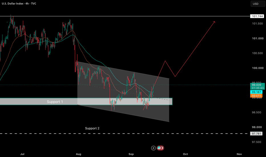
NASDAQ Pre-Market Range Sweep Indicator: Daily Setups Last WeekHow the NASDAQ Pre-Market Range Sweep indicator performed this week
This week, I wanted to look at how the NASDAQ Pre-Market Range Sweep indicator behaved day by day — where it gave setups, where it stayed quiet, and how those setups actually played out.
This indicator builds the pre-market range from 8:00 a.m. to 9:00 a.m. New York time.
After the range is formed, it watches what price does around it and looks for setups.
If price moves far enough outside the range — at least one full range width — the indicator can start looking for an entry outside the range.
If price returns back inside the range and confirms there, it can look for a return through the range.
The first important target is usually the middle of the range. If price has moved very far away, the nearest boundary of the range can already be a reasonable first target. The broader objective is the opposite side of the range.
The statistics table is not there to tell you which trade to take.
It is there simply to help understand how this range behaves: how often price returns inside, how deep that return usually is, how long it normally takes, and how far price can move away from the range before returning.
For me, this is useful because it gives some context before I make my own decision about the trade.
So let’s look at what happened during the week.
Monday - September 7
After the pre-market range was formed, price moved more than one full range above it, so we had the conditions to look for a SELL outside the range.
The entry was around 29572.
My stop would have been around 29610, so the risk was about 38 points.
The first technical target was the upper boundary of the range around 29554, but for me that target was too close compared with the stop.
If I am taking the trade, I want the risk-to-reward to make sense as well.
Price gave approximately 1R before reaching the middle of the range.
The midpoint was 29527.9, and price reached approximately 29528.7 — less than one point away — before going flat again.
So Monday was not a very active trading day.
Under my own rules, I would not keep this trade overnight. I would have closed it near the end of the day with a small profit.
If the position had been held overnight, price later reached the middle of the range and then touched the opposite side during the night.
Monday was a good example of why the indicator gives us the structure, but the trader still has to manage the position.
→
Tuesday - September 8
Tuesday gave us two SELL setups.
The first entry was around 29609 with a very tight stop at 29633.
That stop was hit.
This is a good example of the difference between putting a very short stop just behind the nearest high and putting it behind the actual structure.
A wider structural stop would have survived, but of course that also means accepting a different risk.
The second SELL entry came around 29598 after price confirmed back inside the range.
The stop was around 29651.
The partial target at the middle of the range was around 29566.
The lower boundary of the range was around 29512.
Price reached the midpoint first, then the opposite side of the range, and continued even lower.
This also shows something important about the pre-market range.
Price can sweep one side and return through the range, but at some point the market still has to choose a direction.
The midpoint is the first important target. The opposite boundary is the next one. After that, price can react from that level or simply continue moving in the same direction.
→
Wednesday - September 9
Wednesday was much cleaner.
After the range was formed, price moved more than two full range widths above it.
A SELL signal appeared around 29480.
Because the one-minute signal candle itself was quite large, I would definitely put the stop behind the nearest proper high, around 29539.
The first target was the upper boundary of the pre-market range around 29380.
In this case, the distance back to the range already gave a good risk-to-reward ratio, so I would simply take that target.
The trade reached it.
Price later continued toward the middle of the range as well, but for me the trade was already finished.
This is exactly why I do not always need to wait for the midpoint. If price is already very far away from the range, the nearest boundary can be enough.
→
Thursday - September 10
Thursday was completely different.
News created a very large pre-market range, approximately from 29255 to 29020.
Price stayed inside that range for the rest of the day.
There was no valid BUY signal and no valid SELL signal.
And that is also useful information.
The indicator does not need to give us a trade every day.
Sometimes there is simply nothing to do. Sometimes the best trade is no trade.
→
Friday - September 11
Friday gave a very good first setup.
Almost immediately after the range was formed, the indicator gave a SELL around 29446.
The stop was around 29470.8.
The target at the middle of the range was around 29320.
That was already a risk-to-reward of more than 1:3.
The trade worked and reached the target roughly within the next one to two hours.
What was also interesting is what happened later.
More than two and a half hours after the pre-market range had been formed, price moved outside the range again and another SELL signal appeared.
If we allow several signals and extend the signal window, we can see this second setup as well.
I don’t know how many traders really want to enter another trade late on Friday, close to the end of the US session, with the risk of being left in the position over the weekend.
But even if we had taken that signal, there was still an opportunity to exit with approximately 1:2 instead of waiting for a full return to the middle of the range.
So even the late Friday setup gave us something.
→
Final thoughts
The idea here is very simple.
Build the range.
Watch the sweep.
Watch how price returns.
And then decide whether the trade makes sense for you.
The indicator gives the structure.
The statistics give the context.
But the trader still has to decide where the stop makes sense, where to take partial profit, and when the trade is no longer worth holding.
Very simple indicator. Very simple strategy.
Please use it, enjoy it, and be profitable next week.
Education 

 Short
Short
ASX 200 Headed for 8400?The ASX 200 has just suffered its worst week in six months, thanks to renewed bets on RBA and Fed hikes amid soaring oil prices and bond yields. We are only halfway through the month, yet it already seems likely the ASX will snap its five-month winning streak. Signs of a reversal were there, given August’s shooting star marked a failed attempt to hold above the prior record high.
Interestingly, the ASX is narrowly lower over the past 12 months despite a particularly volatile period. The fact we have seen such wild swings around record highs reminds me of the saying, “tops are a process, bottoms are an event”. It also makes me wonder whether we could be witnessing a much deeper pullback. The ASX could fall to 8400 and still remain within its one-year range, so from that angle such a move seems plausible under current conditions — unless a bullish catalyst arrives, of course.
That said, it is not uncommon to see prices retrace early in the week following a sell-off the week prior. That means bears may want to first see whether prices can recoup some of last week’s losses before rejoining the bearish move.
Ultimately, my bias remains bearish while prices remain below 9000, with 8400 the minimum downside target. The March low also comes into view on a break beneath it. Though I am not sure we will see a bounce back to 9000, traders may want to keep a close eye out for reversal signals on the daily chart or lower timeframes.
MS  Short
Short
 Long
Long
Long 
# DXY Week W38-2026: Inflation Shock Pushes Fed Hike Bets Higher# DXY Week W38-2026: Inflation Shock Pushes Fed Hike Bets Higher, But COT Warns Speculative Longs Are Already Exhausted Above VWAP 99.325 | 14 September 2026
**Reference data** | week 2026-W38
- Symbol: DXY
- Week: 2026-W38
- Bias: bearish
- Conviction: skip
- Regime: ranging
- FX implication: mean_revert
- MTF alignment: bullish_mixed
- VWAP weekly: 99.325
- TrendSL weekly: 99.922
- Thesis snapshot close: 99.325
- Current market price: 99.389 (as of 2026-09-14T06:07:00+00:00; source yfinance:DX-Y.NYB:1m)
- US 10Y yield: 4.95%
- US 2Y yield: 4.56%
- US 10Y real yield: 2.55%
## Market Regime
The immediate backdrop is a pair of colliding forces. US inflation data released ahead of the September 15-16 FOMC meeting prompted traders to add to expectations for a Fed rate increase, while preliminary September consumer sentiment collapsed to 47.8 -- a reading that signals households are under pressure even as they price in more inflation (one-year expectations rose to 4.6%, long-run to 3.4%). Layered on top: oil shipping conditions became harder and more costly, injecting a fresh energy and logistics inflation premium into the pipeline. That combination -- higher rate-hike probability meets deteriorating real-economy confidence -- is exactly the kind of ambiguous macro environment that produces choppy, range-bound price action rather than clean directional trends.
The regime reads as ranging (confidence 0.70), with a mean-revert implication for FX. In practical terms, ranging means the market is not trending; breakout trades carry a higher false-signal risk, and fading moves toward range extremes becomes the higher-probability mechanical behavior. Price is holding just above the weekly VWAP at 99.325, with DXY trading at 99.389 as of Monday, 14 September 2026 at 06:07 UTC (source: yfinance DX-Y.NYB 1m, near-realtime). The TrendSL weekly at 99.922 remains overhead and uncontested.
## Main Drivers
The forces acting on DXY this week pull in genuinely opposite directions, and that tension is the story -- not a clean bullish or bearish setup.
-> **COT positioning: bearish (strongest driver).** Speculative longs appear stretched to an extreme. The analytical framework raises the question of who is left to buy -- when the crowded-long cohort (traders already positioned for dollar strength) runs out of incremental buyers, upside momentum tends to stall or reverse sharply, even without a fundamental catalyst. Note: the brief does not specify the exact COT report week, release date, or net-position figure, so this should be read as directional evidence, not a standalone citable statistic.
-> **Price action / technical: bullish (+1.50).** Short-term momentum is constructive. Price is testing from above the weekly VWAP at 99.325, which acts as a near-term anchor. This conflicts directly with the COT signal, and neither cancels the other cleanly.
-> **Macro / Fed policy: mild bullish prior (+0.50).** The starting lean is modestly dollar-positive based on Fed policy relative to G6 peers. This prior is contingent and does not outweigh the conflict between price and COT positioning.
-> **TGA drain / liquidity proxy: modest bearish headwind.** The US liquidity proxy (Fed assets minus TGA minus overnight reverse repo) rose approximately $96.66 billion over four weeks to roughly $5,896 billion as of 2026-09-09. The Treasury General Account fell 12.06% over the same period. A TGA drain -- when Treasury spends down its cash balance at the Fed -- releases reserves into the banking system, which tends to ease financial conditions and historically carries a mild bearish weight for the dollar. Not a dominant signal here, but it adds structural friction to a sustained DXY rally.
-> **Sentiment and liquidity context: neutral, zero directional contribution.** VIX at 15.84 (2026-09-11) is within normal range for S&P 500 volatility -- it is broad equity context, not an FX directional signal. CNN Fear & Greed at 33/100 (2026-09-11) reflects equity-market fear, not FX positioning. Retail DXY-component longs at approximately 53.5% (FXSSI, 2026-09-14, derived from component pairs with renormalized weights) are balanced -- no contrarian lean is extractable. The one notable retail outlier is USDJPY, where the crowd is 73% long; contrarian logic leans bearish for that pair, but it is a broker-sample read, not a full-market confirmation.
## Macro Snapshot
The yield curve is sending a complicated message. The 10Y Treasury yield stands at 4.95%, the 2Y at 4.56%, producing a positive term spread of roughly 39 basis points. The 10Y real yield (after stripping out inflation expectations) sits at 2.55% -- a level high enough to exert genuine restrictive pressure on risk assets and, under normal conditions, supportive of dollar demand via the rate differential channel (the practical effect: a higher real yield relative to peers attracts capital seeking inflation-adjusted returns, which bids up the currency).
The complication is that the inflation data and the consumer sentiment collapse are pointing in opposite directions for the Fed's reaction function. Hotter inflation raises the probability of another hike, which should support the dollar. But sentiment at 47.8 -- with long-run inflation expectations at 3.4% -- suggests households are already feeling squeezed, raising the risk that the Fed tightens into a weakening consumption backdrop. That is a stagflationary undercurrent: higher rates could become contractionary faster than the market currently prices, and if that view gains traction, the rate-hike-driven dollar bid loses its foundation.
The SOFR-IORB spread at -3.0 basis points (2026-09-10, FRED) is a funding context read -- it tells you short-term dollar funding is well-behaved, with no sign of a carry unwind crisis (a carry unwind is when traders who borrowed cheaply in one currency to invest in a higher-yielding asset are forced to reverse that trade rapidly, causing sharp dislocations). That keeps the backdrop stable but does not provide a directional edge.
## Technical Structure
As of Monday, 14 September 2026 at 06:07 UTC (yfinance DX-Y.NYB 1m, near-realtime), DXY is at 99.389. The weekly VWAP sits at 99.325, and price is testing from above by 0.064 points. The thesis snapshot close was also 99.325, meaning the index has barely moved from where the thesis was constructed -- it is consolidating, not resolving.
The weekly TrendSL at 99.922 remains 0.533 points overhead. In practical terms, the TrendSL is the line that separates a bearish structural read from a bullish one: while price stays below it, the higher-timeframe structure is intact for the bears. A weekly close above 99.922 would change that picture entirely.
The multi-timeframe alignment reads as bullish-mixed -- shorter timeframes are constructive, longer-timeframe structure is not yet confirming. That divergence is consistent with a ranging regime: intraday buyers exist, but they are not yet building into sustained higher-timeframe momentum.
## Intermarket Cross-Check
The MTF alignment reading of bullish-mixed means the dollar's cross-market picture is not unified. On pairs where retail positioning is balanced (EURUSD, GBPUSD, USDCAD, USDCHF), there is no contrarian lean to trade against -- the crowd is not clearly wrong in any one direction. The USDJPY skew (73% retail longs) is the sharpest divergence, and contrarian logic would lean toward yen strength / dollar weakness in that specific cross, though a broker-sample read alone does not constitute a position-sizing signal.
The FX implication for a ranging DXY regime is mean-reversion: moves that extend to range extremes are more likely to be faded than followed. Traders who see DXY testing from above VWAP at 99.325 and interpret that as a breakout in progress are operating against the regime's mechanical bias -- the market's behavior pattern in a range is to reject extensions, not confirm them.
## Event Risk
The central event risk this week is the FOMC meeting, which runs September 15-16, 2026. Per calendar data from ForexFactory (a secondary aggregator source, not a direct official confirmation), the Federal Funds Rate decision, FOMC Economic Projections, FOMC Statement, and FOMC Press Conference are all scheduled for September 16, 2026. The projections and press conference are particularly significant because they give the market updated dot-plot guidance and direct communication from the Chair -- these two elements have historically driven larger post-decision moves than the rate decision itself.
-> Scenario: Fed signals one additional hike and holds a hawkish tone | Probability: moderate
-> Scenario: Fed holds and signals a pause, dot-plot shifts dovish | Probability: moderate
-> Scenario: Fed holds but projections are unchanged, ambiguous press conference | Probability: moderate
All three scenarios carry meaningful DXY implications in different directions. The inflation and sentiment data heading into the meeting -- hotter prices, weaker confidence, rising shipping costs -- make the outcome genuinely difficult to call, which is a core reason why standing aside this week is a deliberate analytical choice rather than passive uncertainty.
## Decision and Evidence
The overall bias is bearish, but the analytical framework is standing aside this week because the evidence is not yet convincing enough to size a position. The COT signal and price action are directly opposed, while the macro prior remains contingent. The FOMC event on September 16 introduces binary scenario risk that makes pre-positioning harder to justify. Conflicting signals plus event risk support a deliberate decision to wait for resolution.
## Time Frame
**Near-term (days):** Price is consolidating just above weekly VWAP at 99.325. The FOMC event on September 16 is the dominant near-term catalyst. Expect volatility compression before the decision and a sharp directional move on or after the statement/press conference. The direction of that move will do more to resolve the signal conflict than any pre-event analysis.
**2-week window (thesis horizon):** The two-week timeline encompasses the FOMC outcome and the market's initial digestion of updated economic projections. If the COT bearish signal is correct and the dollar's speculative-long crowding leads to a reversal, it would most likely begin to materialize in this window. If instead price builds toward TrendSL at 99.922, the bearish thesis loses structural support.
**Medium-term:** The stagflationary undercurrent -- persistent inflation expectations alongside weakening consumer confidence -- and the TGA liquidity dynamic create a structural headwind for dollar bulls if the Fed pivots from hike to pause. But medium-term views depend entirely on how the Fed's communication on September 16 reshapes the rate path narrative.
## Invalidation Conditions
**Current reality (already in effect):**
-> Price at 99.389 is already above the weekly VWAP at 99.325. Short-term momentum is running against the bearish thesis right now. Readers already holding short dollar exposure should reassess their own risk against this fact -- it is not a future contingency, it is the present condition. Readers not yet positioned should note this as an existing friction point rather than a clean entry environment.
**Forward conditions (not yet met):**
-> A weekly close above TrendSL weekly at 99.922 would constitute full bearish structure invalidation -- the level that, if cleared on a weekly closing basis, removes the structural rationale for the bearish read. Readers already short should define their own response to that scenario in advance. Note: the brief uses the word 'invalidation' for this condition specifically -- a close above 99.922 is the invalidation threshold, not a confirmation of anything.
---
*This analysis is for informational and educational purposes only and does not constitute financial advice.*
#DXY #USDollar #FOMC #ForexTrading #DollarIndex #MacroTrading #FedRateDecision #COTAnalysis #USTreasury #YieldCurve #RealYield #CurrencyMarkets #FXAnalysis #InflationTrade #RangeTrading
Long 
Chapter 1: You have the Theory, but you are not a traderThis is the first chapter of a series of posts. I want to explain how I changed my mind: from analysing and buying to trading. I started to trade systematically, with a plan tested and prepared before every trade, and that made trading much simpler, safer and more profitable.
The trader's code
Chapter 1: You have the theory, but you are not a trader
We haven’t met, but if you are reading this I think I understand you.
I understand you because for years I was you.
Let me start with my background. Not to show off. It is just that what comes next makes no sense without it.
I have a master’s degree in finance. I passed the CFA exams, some of the hardest in the investment world. I have worked in the front office of international banks. I have read hundreds of books, from classic value investing to the driest quantitative maths. I even read Confusion of Confusions by Joseph de la Vega, the first book ever written about the stock market, published in 1688. It is strange to see that the problems of an investor three centuries ago are exactly the same problems we have today.
I had the theory. I had the qualifications. And I was losing money.
Analysing companies is not the same thing as trading.
Let me tell you about one trade, because I remember it like it was yesterday.
I had studied a company for weeks. I read the accounts, listened to the earnings call, ran my own numbers. I was sure it had to go up. I put in an amount that, for me at that time, was very serious money. At first it worked. The stock went up for some years, I felt clever, and I told a couple of friends at dinner with the confidence of someone who thinks he has cracked the market.
Then it turned.
It fell 10%. I told myself the company was excellent and the market was wrong. It would come back. It fell 20%. I told myself this was even better: now it was cheaper, a chance to average down. It fell 35%. I stopped looking at the account. Every morning I opened the app with a knot in my stomach and closed it straight away, like someone turning away from something they do not want to see.
That position stopped being an investment.
It became a monument to my ego.
And the worst part was not the money. It was realising, years later, that my analysis could have been perfect and it would not have mattered.
I did not know when to get in, I never set a limit on the loss, and I had no idea when to get out.
I was “right”. The market had my money. And while the market goes up, all the analysts are right.
It’s not me or you. It’s everyone.
You may be thinking: sure, but that is because you and I know little.
The people who really know, the professional fund managers, make money analysing companies.
Let me stop you there, because this is not my opinion.
It comes from Standard & Poor’s. There is a report called SPIVA that compares, every year, the results of actively managed funds (those that analyse companies all day) against their benchmark index. The data is public and it is brutal: over horizons that are not even that long, around 90% of professional funds (people with big credentials, teams of analysts and huge resources) fail to beat their index.
In the US: Over 15 years, 9 out of 10 funds underperform the S&P 500.
You might think this is something that only happens in the United States.
In Europe, the picture is much the same. In just 10 years, 97 out of every 100 funds fall behind the index. They add NOTHING.
And just when you thought it could not get any worse...
Canada takes the prize. 99 out of 100 funds fall behind their benchmark.
And remember, following that benchmark costs you almost nothing.
Read that again.
In the best scenario, 9 out of 10 fail.
They do all that work, reading balance sheets, visiting companies, modelling scenarios, and they end up behind someone who simply bought the index and went to sleep. Take away the fees they charge and their work is, for your wallet, worse than useless.
Now look at social media.
It is full of “buying opportunities”.
Everyone tells you what to buy. Almost nobody tells you when to sell. They put you on the train and from there, good luck.
And that’s not fair.
In the next chapter I'll show you the difference between the mindset of a regular investor (not a beginner, this also happens to people with decades of experience) and a real trader who makes money quietly and consistently.  Education
HK50 24,400 – FIBO | BULLISH SCENARIO🔹 HK50 24,400 – FIBO TRÙNG | BULLISH SCENARIO 📈
HK50 is maintaining its dominant bullish trend, with the market structure still intact and no clear reversal signals appearing.
The key area to watch right now is 24,400.
When applying trend-following Fibonacci, the 0.5–0.618 retracement zone converges with the 24,400 key level, creating a Fibo Trùng confluence zone worth watching.
🎯 Main Scenario:
If price retraces toward 24,400 and then shows signs of downside rejection or weakening selling pressure → favor a trend-following BUY.
⚠️ The bullish scenario should be reassessed if price clearly breaks below 24,400 and the bullish structure is invalidated.
Bias: BUY – Bullish Trend
Fibo Zone: 24,400  Long
Long
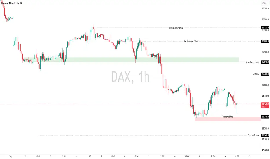
Potential bearish reversal?DAX40 (DE40) is rising towards the pivot, which has been identiifed as an overlap resistance and could reverse towards the 1st support, which acts as a pullback support.
Pivot: 25,823.46
1st Support: 24,639.56
1st Resistance: 26,586.19
Disclaimer:
The opinions given above constitute general market commentary and do not constitute the opinion or advice of IC Markets or any form of personal or investment advice.
Any opinions, news, research, analyses, prices, other information, or links to third-party sites contained on this website are provided on an "as-is" basis, are intended to be informative only, and are not advice, a recommendation, research, a record of our trading prices, an offer of, or solicitation for, a transaction in any financial instrument and thus should not be treated as such. The information provided does not involve any specific investment objectives, financial situation, or needs of any specific person who may receive it. Please be aware that past performance is not a reliable indicator of future performance and/or results. Past performance or forward-looking scenarios based upon the reasonable beliefs of the third-party provider are not a guarantee of future performance. Actual results may differ materially from those anticipated in forward-looking or past performance statements. IC Markets makes no representation or warranty and assumes no liability as to the accuracy or completeness of the information provided, nor any loss arising from any investment based on a recommendation, forecast, or any information supplied by any third party. Short 
Long 
SMC Masterclass Pt 8: Dealing Range Equilibrium & The 70.5% OTE 🏛️ INSTITUTIONAL MASTERCLASS • PART 8 OF 15 📌 SMC Masterclass Pt 8: Dealing Range Equilibrium & The 70.5% OTE Centroid
If you walked into a showroom to buy a vehicle, you would never offer to pay 20% above the manufacturer's suggested retail price. You look for a discount.
Yet every single day, millions of retail traders buy stocks, futures, and forex at the absolute top of the dealing range—paying premium prices—and wonder why they are instantly underwater.
Institutional trading desks operate strictly on the fundamental laws of Auction Theory: Premium Zone (>50%): Price is expensive. Smart money looks to distribute inventory (sell). Discount Zone (<50%): Price is cheap. Smart money looks to accumulate inventory (buy).
1. The 50% Equilibrium Baseline: To establish your dealing range, identify your protected Higher-Timeframe Swing Low and Swing High. The exact 50% midpoint of this range is your Equilibrium (EQ) line: Equilibrium = (Swing High + Swing Low) / 2
Golden Rule: In a Bullish Trend, you are ONLY permitted to buy when price retraces below the 50% Equilibrium into the Discount Zone. In a Bearish Trend, you are ONLY permitted to sell when price rallies above the 50% Equilibrium into the Premium Zone.
2. The 70.5% Optimal Trade Entry (OTE) Centroid: Inside the Discount Zone, where is the highest-probability institutional entry? It is the Optimal Trade Entry (OTE) centroid—the mathematical sweet spot anchored at the 70.5% Fibonacci retracement level, situated right between the classical 61.8% and 78.6% levels: OTE Level = High -
Why 70.5%? Because this level offers the maximum mathematical asymmetry: your stop-loss placed just below the swing low is minimal (risking only 29.5% of the range), while your target at the swing high or -0.272 expansion yields 3x to 5x your risk.
📊 Real-Time Tape Study (Look at the Attached S&P 500 ES 1H Chart): Let's examine this live ES hourly chart: Swing Low is anchored at 5,500.00; Swing High printed at 5,650.00 (a 150-point dealing range). 50% Equilibrium sits at exactly 5,575.00. Price initiated a healthy multi-day retracement. Notice that when price was trading at 5,600, retail was eagerly buying the 'breakout retest' in Premium. They got crushed. Price plunged through Equilibrium down into the Discount zone, bottoming right at the 70.5% OTE level (5,544.25) where it tapped a 1H bullish FVG. Institutional buyers stepped in with size, propelling price 135 points higher to new highs at 5,680.00. Risk on the OTE entry was 18 points (stop at 5,498.00); reward was 135 points—yielding a monster 1:7.5 R:R trade.
Never buy in Premium. Never sell in Discount. Wait for the market to come to your price.
A big shoutout to TradingView's Fibonacci tool customization: Being able to input custom levels (0.705, -0.272, -0.618) with custom color fills and label alignments makes executing the OTE framework effortless. Deep respect to the TradingView team for building the world's most versatile technical analysis canvas!
💡 Key Institutional Takeaway: Anchoring all entries strictly inside the 50% Discount zone mathematically tilts the risk-to-reward ratio in your favor before any trade is taken.
⚖️ Educational Disclaimer: This tutorial is published strictly for technical analysis and educational purposes. It does not constitute financial, investment, or trading advice. Always manage your risk responsibly. DXY Rebounds from Support — Can Buyers Extend the Recovery?Market Structure
The U.S. Dollar Index (DXY) remains in a broader bearish structure on the 4-hour chart, but recent price action shows a short-term recovery from the latest swing low. Buyers have regained some momentum, although the index is now approaching an important resistance zone where selling pressure may reappear.
Market Sentiment - Cautiously Bullish
Market sentiment has shifted to cautiously bullish. The recent rebound suggests buyers are attempting to regain control, but confirmation above key resistance is still required before the outlook can turn decisively bullish.
Bullish Scenario
If DXY breaks above 99.40, bullish momentum could accelerate and open the door toward the next resistance around 99.80. A sustained move above that level would indicate a stronger short-term trend reversal.
Bearish Scenario
If price fails to hold above 99.00 and falls back below this support, sellers could regain control and push the index toward the next support near 98.70. A break below that level would reinforce the broader bearish structure.
────────────────────
Market Outlook
DXY is attempting to recover after a prolonged decline. While the rebound has improved short-term sentiment, the index must clear nearby resistance before confirming a more meaningful recovery.
────────────────────
Key Levels
First Resistance: 99.40
Second Resistance: 99.80
First Support: 99.00
Second Support: 98.70
────────────────────
Future Scenarios
A break above the First Resistance would suggest buyers are gaining momentum and could extend the recovery toward the Second Resistance.
However, if price falls below the First Support, sellers may regain control and push the index toward the Second Support.
────────────────────
Event Risk
DXY may remain sensitive to upcoming U.S. inflation data, Federal Reserve comments, Treasury yield movements, and overall market risk sentiment.
However, price action remains the key indicator. If positive news cannot push the index above the First Resistance, upside momentum may remain limited. Conversely, if DXY breaks below the First Support despite supportive headlines, it would suggest sellers remain firmly in control.
────────────────────
Please share your view below:
Do you expect DXY to continue recovering, or will the broader downtrend resume?
More market structure and key level updates will be shared regularly. SMC Masterclass Pt 7: Imbalance Dynamics — Fair Value Gaps, BPR 🏛️ INSTITUTIONAL MASTERCLASS • PART 7 OF 15 📌 SMC Masterclass Pt 7: Imbalance Dynamics — Fair Value Gaps, BPR & Inversion IFVGs
Healthy markets operate on balanced two-way trade: for every buyer, there is a willing seller at that price.
However, when an institutional algorithmic program initiates an aggressive repricing drive, it delivers orders with such speed that liquidity is offered to only one side of the market. This creates a Fair Value Gap (FVG) or Market Imbalance.
1. Anatomy of a Fair Value Gap (FVG): An FVG is a 3-candle price pattern: Because the interbank algorithm is designed to seek fair value, price will frequently retrace back into that gap to re-offer liquidity to the bypassed counter-parties before resuming the dominant trend. Bullish FVG (BISI - Buy-Side Imbalance Sell-Side Inefficiency): Formed when Candle 2 explodes upward, leaving an empty gap between Candle 1 High and Candle 3 Low. Sell orders were completely bypassed. Bearish FVG (SIBI - Sell-Side Imbalance Buy-Side Inefficiency): Formed when Candle 2 dumps downward, leaving a void between Candle 1 Low and Candle 3 High.
2. Quantitative Formula: Consequent Encroachment (CE): Consequent Encroachment (CE) represents the exact 50% mathematical midpoint of the Fair Value Gap: CE = (High of Gap + Low of Gap) / 2 Algorithms love to rebalance price exactly to the 50% CE line. You do not need price to fill the entire gap (100% full fill); touching the CE is often sufficient for the algorithm to declare the auction balanced.
3. The Inversion Fair Value Gap (IFVG): What happens when a Fair Value Gap fails to hold? This is where many traders get caught, but on our desk, it provides some of the highest-conviction entries. When an existing Bullish FVG is violently sliced through and closed below by a strong candle body, that gap undergoes a Polarity Flip. It transforms into an Inversion Fair Value Gap (IFVG). On the next pullback, that failed support zone now acts as dynamic institutional resistance.
4. Balanced Price Range (BPR) - The Double Imbalance: A Balanced Price Range (BPR) is an elite institutional structure formed when an aggressive buying BISI is immediately engulfed by an aggressive selling SIBI within 1 to 2 candles (or vice-versa). This creates a double-sided imbalance over the exact same price coordinates. Because the algorithm delivered extreme buying and extreme selling back-to-back, the overlapping FVG zone acts as an iron-clad institutional support/resistance shelf on subsequent retests.
5. Liquidity Void (LV) vs Standard FVG: While a standard Fair Value Gap spans 3 candles with wicks on either side, a Liquidity Void (LV) is a violent, multi-candle vertical sprint or 'price vacuum' with little to no overlapping wick activity. Because liquidity was offered in only one direction over a wide price spectrum, the algorithm views a Liquidity Void as an unstable vacuum that ultimately demands 100% full rebalancing before sustainable trend expansion can continue.
📊 Real-Time Tape Study (Look at the Attached NQ 15M Chart): Look at this live Nasdaq chart: Price printed a 3-candle bearish imbalance (SIBI) between 19,860 (Candle 1 Low) and 19,820 (Candle 3 High). The 50% Consequent Encroachment (CE) sits at 19,840. During the New York morning session, price pushed up into the gap. Notice how price pierced into the gap, touched 19,842 (just 2 ticks into CE), and instantly printed long upper wicks. Price rejected the CE line with extreme velocity, collapsing 120 points down toward the daily sell-side liquidity pool.
Execution Tip: Always align your FVG entries with higher timeframe trend bias. Never trade an isolated 1-minute FVG that sits in the middle of nowhere. Look for FVGs that originate from a high-timeframe Order Block or liquidity sweep.
I want to take a moment to commend the TradingView platform team: The precision of TradingView's volume profile and measurement tools when charting Nasdaq and S&P futures is unmatched in modern technical analysis.
💡 Key Institutional Takeaway: Monitoring how price interacts with the 50% Consequent Encroachment (CE) provides immediate confirmation whether an imbalance is acting as dynamic support/resistance or transitioning into an Inversion FVG.
⚖️ Educational Disclaimer: This tutorial is published strictly for technical analysis and educational purposes. It does not constitute financial, investment, or trading advice. Always manage your risk responsibly. SMC Masterclass Pt 6: Order Block Anatomy, Mean Threshold (MT) 🏛️ INSTITUTIONAL MASTERCLASS • PART 6 OF 15 📌 SMC Masterclass Pt 6: Order Block Anatomy, Mean Threshold (MT) & Rejection Blocks
The term 'Order Block' has become one of the most abused buzzwords on social media. Many traders think that every single green or red candle before a move is an order block. That is completely false.
An authentic institutional Order Block (OB) represents the specific consolidation candle where smart money injected high-volume limit orders that caused a structural break with displacement.
1. The Anatomy of a Valid Order Block: If an alleged order block does not break market structure, and does not create an imbalance (FVG), it has ZERO institutional backing. Ignore it. Bullish Order Block (+OB): The lowest down-close (bearish) candle immediately prior to an aggressive impulse leg that produces a confirmed BOS and creates an unfilled Fair Value Gap. Bearish Order Block (-OB): The highest up-close (bullish) candle immediately prior to an aggressive downward expansion that breaks structure with displacement.
2. Dual-Zone Order Block Architecture: When trading order blocks on our desk, we split the zone into two distinct layers: Zone A: The Refined Body (Open to Close). This is where high-probability mitigation taps occur. Entering on the candle body open or 50% body gives an ultra-tight entry. Zone B: The Structural Wick Buffer. Smart money will frequently wick into the lower shadow of the OB to absorb final liquidity before launching.
3. Quantitative Rule: The 50% Mean Threshold (MT): The Mean Threshold (MT) is the exact mathematical midpoint of the order block's candle body: MT = (Open + Close) / 2
Institutional Invalidation Law: While liquidity-seeking wicks may pierce beyond the Mean Threshold during the mitigation tap, a CANDLE BODY CLOSE beyond MT structurally compromises the order block. If an hourly candle body closes past the Mean Threshold, smart money has abandoned the defense of that level. Cut the trade immediately.
4. Advanced Institutional Order Block Variants: Beyond classical Order Blocks, institutional algorithms utilize three specialized block variants: Rejection Block: Formed by the long wick of a swing high or low where institutional smart money aggressively absorbed resting orders and rejected price back inside the range. The institutional entry zone is measured from the wick extreme down to the candle body open/close. Propulsion Block: A high-momentum launchpad Order Block formed immediately when price mitigates an existing Order Block. When price dips into an established +OB and instantly prints a fresh bullish displacement candle that breaks internal structure, that new candle is a Propulsion Block—signaling aggressive institutional re-accumulation. Vacuum Block (VB): An open price gap created during high-impact macroeconomic news releases (CPI, NFP) or Sunday market opens where zero trading volume was transacted. The algorithm treats Vacuum Blocks as high-priority magnetic voids that must be retraced into and filled before structural trend continuation can resume.
📊 Real-Time Tape Study (Look at the Attached EURUSD 1H Chart): Let's study this live EURUSD hourly chart: Prior to a 100-pip rally, the origin down-close candle spanned from Open: 1.0740 to Close: 1.0760. The 50% Mean Threshold (MT) sits at exactly 1.0750. Days later, price retraced into the zone during the London session. Notice the candle wick: it dipped down to 1.0746, sweeping weak hands, but the 1H candle body refused to accept below 1.0750 and closed firmly at 1.0762. The Mean Threshold held with mathematical precision, sending price on an 80-pip continuation rally.
Huge thank you to the TradingView team: The ability to customize rectangle transparency, extend lines right, and save drawing templates in TradingView makes managing these dual-zone Order Blocks seamless. And to the TV moderation team—thank you for keeping this platform a sanctuary for genuine price action education!
💡 Key Institutional Takeaway: Respecting the 50% Mean Threshold (MT) as your invalidation threshold prevents holding losing positions when institutional order flow fails to defend an order block.
⚖️ Educational Disclaimer: This tutorial is published strictly for technical analysis and educational purposes. It does not constitute financial, investment, or trading advice. Always manage your risk responsibly.