Short
Short
KSE-100: Relief Bounce Possible, But Bottom Not ConfirmedTaking lead from our previous analysis, KSE-100 remained under bearish pressure during the week. The index continued to trade weakly and only showed some support on Friday, where a relief candle appeared on the daily chart.
This relief candle may continue into a few more green sessions next week. However, looking at the broader structure and higher-timeframe charts, we do not see enough evidence yet to call a sustainable rally from here.
## Trend Hierarchy
**Secular Trend:** Bullish
**Intermediate Trend:** Corrective / Bearish Pressure
**Short-Term Trend:** Relief Bounce Possible
## Market Structure
KSE-100 is still trading inside the broader range/accumulation box. The recent weakness confirms that the market has not yet gathered enough strength for a clean upside breakout.
The Friday bounce is positive for short-term sentiment, but it should be treated as a relief move unless price starts reclaiming important resistance levels with strength.
If the index fails to hold the current support area, deeper downside may remain open before a durable bottom forms.
## Fundamental Context
The macro backdrop is not strongly supportive for an aggressive index rally at this stage.
Pakistan’s current account has recently moved back into deficit, while inflation has also picked up again. At the same time, elevated oil prices remain a major risk for Pakistan because higher oil imports can pressure the trade balance, inflation, and currency stability.
This means fundamentals are currently **mixed to slightly negative** for equities.
The market may still produce stock-specific opportunities, but broad index-level aggression requires stronger macro comfort and better price confirmation.
## Outlook
In the coming week, KSE-100 may show some relief candles after Friday’s support reaction.
However, the broader view remains cautious. The market may still be away from a confirmed bottom and may require more time before a strong rally develops.
## Strategy
Maintain a wait-and-watch stance.
Keep cash ready and avoid chasing weak relief candles. Better opportunities may come when fear increases and quality stocks reach stronger support zones.
## Stance
➡️ Bearish Pressure Continued
➡️ Friday Relief Candle Seen
➡️ Few Green Sessions Possible
➡️ Higher Timeframes Still Not Strong
➡️ Bottom Not Confirmed Yet
➡️ Macro Backdrop Mixed To Slightly Negative
➡️ Strategy: Wait, Watch, Keep Cash Ready
Price tells the story.
For short updates: X @JustTechnicals_
 Short
Short
Dow Jones – Weekly-Potential Correction from Major ResistanceThe weekly Dow Jones chart shows a strong long-term uptrend, but price has now reached a potentially important resistance/reversal zone around 53,500–54,500. The recent candles near the highs show hesitation after a substantial rally, suggesting that a medium-term corrective phase could develop if the current high fails to extend. The first major support is around 45,000, which is particularly important because it coincides with the previous breakout/consolidation zone and could act as a strong demand area. Your projected path indicates an initial pullback, a possible rebound, followed by another decline toward 45,000; this is technically plausible, although the exact path cannot be predicted. A weekly close below the recent short-term support would strengthen the correction thesis, while a decisive breakout and sustained move above 54,500–55,000 would weaken it. Overall, I would treat this as a medium-term correction setup within a larger bullish trend, rather than immediately calling it a long-term bearish reversal.
Idea Rating: 7 to 8/10 ⭐
Strengths: major resistance, extended rally, clear historical support around 45,000, and a well-defined projected path.
Weakness: the chart does not yet provide definitive confirmation that the top is in.
Disclaimer: This analysis is based solely on the technical structure visible in the chart and is for educational/informational purposes only, not financial or investment advice. The projected path is a possible scenario, not a prediction or guarantee. Markets can invalidate technical setups without warning. Please wait for confirmation and use appropriate risk management before making any trading decision.
 Short
Short
US Index Check — Same 500 Stocks, Two Weights, Two LinesFirst, four rules.
1. The market is always right.
2. Every price is already set.
3. Every view is a quantum view — stay flexible, keep every state open.
4. All evolution comes through repetition.
Only two hard terms in this post. Cap-weighted means the biggest companies get the biggest share; equal-weighted means all 500 get the same share. The stocks are identical — only the weights differ. And effective number of bets counts not how many lines are on your list, but how many genuinely different decisions are on it.
Two indexes hold the same 500 stocks. Overlay the two lines on one screen and they have separated.
This post is about what that gap says — and how, once you know, the sentence "I'm diversified across US stocks" changes.
Every measurement here is weekly bars, 520 weeks, ten years.
What this post does
① — how the same 500 stocks separate when only the weights change: size and speed
② — the effective number of bets in four baskets, and where the names and the measurements disagree
③ — testing "in a crisis they all fall together" against a control — and what actually drives the index
④ — before you buy: which weighting your index ETF uses, and how many bets your list really holds
⑤ — after you buy: what to confirm, and what to measure to tell which weighting the regime favors — plus today's 5-minute check
④ and ⑤ are the point. ①–③ exist so you can do ④ and ⑤. And up front: ⑤ is not a table of which one to buy. It is a set of rulers. The answer comes out of your own measuring.
What to look for in this chart — the broad-market index. This one chart is the baseline; every number below comes from the same weekly window as this screen.
① Same stocks, two lines
In one sentence. Week to week they are almost one body; stacked over ten years they separate, and the gap is widening faster.
The weekly-return correlation between the two indexes is 0.935 . Nearly one body.
Stack ten years and the cumulative paths diverge.
Cumulative log difference over the same 519 weeks: +0.3176
A 0.935 correlation with a diverging cumulative path looks odd. It is not. If the two tilt slightly different ways every week, those small tilts accumulate over a decade. The standard deviation of the weekly difference is only 0.90%. That 0.90% is what piled up.
Now the part that matters more. Cut the gap into halves:
First half (about 5 years): +0.1104
Second half (about 5 years): +0.2072
The separation is accelerating. The second five years is nearly double the first.
And one more thing. The cap-weighted side has smaller weekly swings (2.39% vs 2.55%). More concentrated, yet quieter. The opposite of the "concentration equals volatility" intuition.
What to look for in this chart — the same 500 stocks at equal weights. Overlay it on the chart above and find where the two lines separate and where they converge. That single view is the most useful thing in this post.
② Length of the list vs number of bets
In one sentence. The names say four, ten, seven; the measurement says 1.12, 1.54, 1.81 — and the order of the names and the order of the measurements disagree.
Several baskets, one yardstick.
N_eff = N / ( 1 + (N − 1) × r )
N is the length of the list; r is the average pairwise correlation. Same 520 weeks, same method.
Basket · N · avg pair corr · min · max · N_eff
Major US indexes · 4 · 0.854 · 0.743 · 0.945 · 1.12
Sector funds · 10 · 0.609 · 0.312 · 0.877 · 1.54
Largest by market cap · 7 · 0.478 · 0.270 · 0.645 · 1.81
Next tier of large caps · 5 · 0.376 · 0.112 · 0.739 · 2.00
Top 7 + next 5 · 12 · 0.385 · 0.112 · 0.739 · 2.29
Read the first line first. Four major US indexes are 1.12 effective bets. Large cap, tech, blue chip, small cap — four names, one decision. The lowest pair is 0.743, so even the two least similar are quite similar.
Now the second and third lines. I did not expect this result.
Sector funds, 10 of them: N_eff 1.54
Largest by market cap, 7 of them: N_eff 1.81
Splitting into ten sectors gives you fewer effective bets than holding the seven biggest stocks.
That runs against intuition. Sector funds carry the label "diversified"; individual mega caps carry the label "concentrated." Measured, the labels are backwards.
A plausible reason: each sector fund holds dozens to hundreds of names, so company-specific movement is already averaged away. What remains is the market as a whole, and that is why ten of them resemble each other. Individual giants still carry their own business and circumstances.
That is my guess; the table above is the measurement. I am keeping the two separate.
And do not read this as "so individual stocks are better." 1.81 is still 1.81 out of seven. Nothing in this post says one thing is better than another. What it says is that what the names claim and what the measurement shows are different things.
What to look for in this chart — the tech-heavy index. Eyeball how often it moves the same direction as the broad index above at the same time. That overlap is why four major indexes came out as 1.12 bets in the table.
③ "In a crisis they all fall together" has never been tested
In one sentence. In the worst 52 weeks, 6.33 of the seven fell together — but in the best 52 weeks, 6.33 of the seven rose together , and a fake market with nothing happening produces 6.35.
Take the 52 weeks when the market fell the most and count how many of the top seven fell in the same week.
Worst 52 weeks: average 6.33 of 7 down
More than six of seven went down together. Stop here and you get "in a crisis even the giants become one block."
Now look at the other side.
Best 52 weeks: average 6.33 of 7 up
Identical to the decimal.
They do not cluster only on the way down. They cluster the same way on the way up. The crisis narrative has nowhere to stand.
To confirm, I attached a control. Build a fake market with the correlation structure fixed at its full-period value. No crises, no correlation spike in bad weeks. Run the identical procedure 600 times.
Metric · observed · null median · 5–95% band · p
Count down · 6.33 · 6.35 · 6.12 – 6.58 · 56.5%
Dead center of the band. The observed value is slightly below the null median.
So "in the worst weeks six of seven fell together" is true — and says nothing about crises. Gather things with a 0.478 correlation, select the worst weeks, and that is what you get by construction.
Last, what the index's weekly movement is actually attached to.
Index ↔ average of 10 sectors: correlation 0.942, explanatory power 0.888
Index ↔ equal-weighted version: correlation 0.935, explanatory power 0.875
Index ↔ average of top 7: correlation 0.827, explanatory power 0.684
All three are high. But the top seven alone explain only 0.684. The rest comes from outside them.
This connects back to ①. Cumulatively, cap-weighted and equal-weighted separate; week to week, they are 0.935, almost the same. The same two series read as "nearly identical" or "very different" depending on the time scale you look through. Both are true. What matters is knowing which one you are looking at.
④ Before you buy — which weighting, and how many
In one sentence. Check two things before picking an index product and half of this post is done — which weighting it uses , and how many effective bets your list holds.
1 Weighting method — page one of the product document. Cap-weighted or equal-weighted.
The same index name often exists in both versions.
2 Top-10 share — if cap-weighted, what percent of the index the ten largest names are. That is the concentration.
3 Effective bets — get your list's average pairwise correlation r and put it into N / (1 + (N − 1) × r).
4 The gap between the lines — plot cap-weighted ÷ equal-weighted once. Is it widening now, or converging?
All four are free to know before you buy. Learn them after, and you have already paid.
Number 3 in particular shows in numbers that adding names does not add bets. In the table in ②, adding the next five large caps to the top seven — twelve names — moved the effective count from 1.81 to 2.29. Five names bought 0.48 of a bet.
⑤ After you buy — what to confirm, and what decides which weighting is favored
In one sentence. The two weightings move in opposite directions in some regimes. Which one is favored is decided not by taste but by three axes.
Three things to confirm first.
1 Direction of the ratio — cap-weighted ÷ equal-weighted. Rising means a few names are carrying it; falling means the move is spreading.
2 Correlation holding — is the 0.935 weekly correlation intact? If it breaks, the two versions have become different markets.
3 Your effective count — if the list changed, count again. Adding names is not adding bets (see the twelve-name example in ④).
What to look for in this chart — the breadth line itself: cap-weighted ÷ equal-weighted, drawn by typing the ratio SPY/RSP straight into TradingView's symbol box. Rising means a few names are carrying the index; falling means the move is spreading. One line answers item 2 every week.
Then the axes for which weighting is favored. This is not a recommendation for either version. Put anything on these three axes and the favored and unfavored sides separate within the same regime.
Axis 1 Is concentration being rewarded in this regime?
When a handful of giant companies capture most of the profit, cap-weighted leads. The reverse favors equal-weighted.
The ratio in item 1 makes the call: rising means concentration, falling means dispersion.
Axis 2 Which way are rates going?
Giant growth companies with far-out cash flows swing more with rates. Cap-weighted holds more of them.
The sign flips between rising-rate and falling-rate regimes.
Axis 3 How much swing can you carry?
The concentrated side had smaller weekly swings (2.39% vs 2.55%). The opposite of the intuition.
"Diversified means safer" needs to be re-measured against that number.
Using it is simple. Write +, 0, or − on each axis for the current regime. If all three point the same way, that version is attached to this regime. If they conflict, the version is moving for a reason this post does not explain — and then it is not a weighting story.
Today's 5-minute check
All of it takes a few minutes on TradingView.
One — two lines. Overlay the cap-weighted index and its equal-weighted version, weekly. Mark where they separate and where they converge, and look at the first five years and the second five years separately. The numbers in ① become visible.
Two — effective bets. Write down what you hold, get the average pairwise correlation from weekly log returns, and put it into the one-line formula. Write the answer next to the length of the list. Compare with the table in ②.
Three — demand a control. When you meet the claim "in a crisis they all fall together," ask: what does the same calculation return on data where nothing happens? Including this post's ③ — which answers that question itself, and the answer is "rejected," so that is what it says.
Four — one ratio. Plot cap-weighted ÷ equal-weighted and watch whether it rises or falls when the index rises. Two rallies that look the same have different characters.
Closing
The names say diversified; the measurement sometimes says otherwise.
Four major indexes were 1.12 effective bets. Ten sector funds were 1.54, and the seven largest stocks were 1.81. The order of the names and the order of the measurements disagree.
And the same 500 stocks, with only the weights changed, separated over ten years. That gap is still widening.
An honest limit. These numbers are one window — 520 weekly bars. Cut a different decade and the sizes may change, and whether the disagreeing order holds is something to re-measure then. Read this as a fact about this window , not a law.
Which version to hold is not mine to decide. But before deciding, you can count how many you are actually holding. The formula is one line, and the charts are two.
Count it yourself, and judge it yourself.
So the last question is a single one. What was your list's effective number of bets?
You already know the length of the list. Write the two numbers side by side and you will know which one you have been counting.
For education and record only. Not a recommendation to buy or sell. Global Liquidity Check — Three Taps, Everyone Watches OneFirst, four rules.
1. The market is always right.
2. Every price is already set.
3. Every view is a quantum view — stay flexible, keep every state open.
4. All evolution comes through repetition.
Liquidity is not a hard word. It means one thing: is the amount of money moving through markets growing or shrinking.
Most people watch a single tap: the policy rate. They wait for it to move, and until it does they call everything "on hold." A whole quarter gets filed as "nothing happened" on the strength of one number that did not change.
The water that reaches asset prices comes out of three taps . And usually two of them are already open while everyone stares at the third.
① Fiscal — money the government borrows and spends. Slow.
② Words — the sentences a central bank says. Fast.
③ Currency — the arithmetic of a basket. Fastest.
What this post does
①②③ — one tap at a time: what it is, why it is liquidity, and where it leaves marks on a chart
④ — before the water arrives: which five screens to watch first, fastest first
⑤ — after it arrives: what to confirm, and what to measure to tell which sectors are favored — plus today's 5-minute check
④ and ⑤ are the point of this post. ①–③ exist so you can do ④ and ⑤. And to be clear up front: ⑤ is not a table of what to buy. It is a set of rulers. The answer comes out of your own measuring.
① The first tap · Money the government spends
In one sentence. When a government borrows and spends, the money stays in private hands. So a deficit is a risk number and a liquidity number at the same time. Most commentary uses the first meaning and never the second — and that is how an entire tap goes unwatched.
Government borrows, government spends, and that money does not vanish into an accounting line. It lands with companies and households and stays there. Someone's spending is always someone's income.
Now walk the circle. The interesting part is inside it.
Deficit → more Treasury issuance → supply piles onto a demand pool of fixed size
→ bond prices get pushed down and long yields harden
→ private issuers pay more to sell corporate bonds
→ the same money that loosened one side tightens the other
That is one tap seen from both ends. The spending side loosens; the funding side tightens. Which wins in a given week depends on how much was issued and how much demand showed up.
So long yields can rise during the exact phase when the most money is being pushed out. It looks like a contradiction. It is not. You are opening the tap wider while a contest starts over where the water is drawn from.
One step further: when several governments do this at the same time, they are reaching into the same pool of savings. No one coordinated, but the effect is the same as if they had. That is why this check cannot be done by looking at one country.
And there is a second-order move that almost nobody prices. If long yields are the problem, the seller can change the shape of what it sells — buy back long paper, issue short paper instead. Pressure at the long end eases. But the pressure moves to the short end, and the question changes: who buys all those bills.
Whenever you see that question being answered, in any form, you are watching a liquidity decision — with no rate announcement and no meeting.
Two more things about time live inside this tap.
A borrowing limit raised in advance is an overdraft opened in advance. Raising it is not the event. Using it is the event. Positions get built in the gap between the two, and that gap is usually long.
Rules move markets before they pass. When a framework is expected to become law, the businesses it will govern start preparing early. Preparation is real activity. So the expectation of passage gets priced before passage — and sometimes instead of it.
Here is what the short end looks like when pressure migrates there.
What to look for in this chart — short-term rates. Notice the flat stair-steps and the moments the step changes. A flat stretch is not a "nothing happened" stretch. Issuance kept running the whole time.
The moment long yields harden is right there on the chart.
What to look for in this chart — long-term rates. Find the stretches where this chart and the short-end chart above moved in different directions at the same time. Those are the "changing the shape" moments described above.
② The second tap · Words
In one sentence. A central bank can move markets without touching the rate. It moves them with sentences. And on a good day, the sentence replaces the action.
Central banks do not come to announce decisions. They come to state principles.
They speak firmly because what they are actually bending is expectations , and if expectations bend, they may not have to move at all. A speech is not a preview of action.
This gives you the most useful free reading habit there is. Listen for the reasoning, not the conclusion. The conclusion tells you what that person decided. The reasoning tells you what would make them decide differently — and that is the only part you can actually use.
A quick filter: someone who only ever praises, or only ever criticizes, is not conveying a principle. They are conveying a position they held before the data arrived.
And the two most expensive sentences in the business:
Prices are still rising.
The pace of the rise is falling.
Both can be true at once. They describe the same chart. And they lead to opposite conclusions about what comes next. Many arguments are two people each holding one sentence, each certain the other cannot read.
Underneath this tap sits something quieter and more important.
What you measure with changes the conclusion.
There is more than one ruler for prices. None of this is hard, so here it is line by line.
Headline — includes everything, fuel and food. Swings the most.
Core — removes the most volatile items. A trend ruler.
Trimmed mean — cuts the biggest risers and the biggest laggards from both ends, and shows what the broad middle is doing.
All three are honest. All three are public. And they disagree about which phase we are in — not slightly, but enough that one says "not yet" while another says "already over."
So before arguing about the answer, check which ruler each person is holding. Otherwise it is one person quoting height and another quoting weight, arguing about whether someone is big.
When the ruler was read matters the same way. A decision made on two-month-old data is a decision about a world that has already passed. The more recent the estimate, the more the conclusion moves — and if the pace of price increases is falling, the direction of that movement is consistent.
One honest limit. These institutions decide by committee, and committees vote. When considerations from outside economics enter the room, economic reasoning loses its predictive power — not because the reasoning got worse, but because reasoning is no longer what decides. That case is not a forecasting target, and saying so is more useful than pretending otherwise.
What to look for in this chart — find the stretch where the policy rate did not move at all for a long time, yet the broad index moved a lot. Nothing changed at the companies on those days. Expectations changed. That is this tap working alone, with the other two held still.
③ The third tap · Currency
In one sentence. A currency index is a basket of other currencies. So when the others go up, yours goes down. Not psychology — arithmetic.
That one sentence is the entire mechanism, and it produces the result commentary tends to treat as a mystery. An index is a ratio, and a ratio can move from either side.
Which means the index can be moved by coordinated pressure on other countries — asking them to tighten, to let their currency appreciate, to intervene alongside — with no domestic decision at all. If you look for the cause only in domestic announcements, you will not find it, and you will conclude the move was irrational.
Behind that pressure sits a frame. You do not have to agree with it to be better off understanding it.
A chronic trade deficit sends production and jobs abroad
→ support for the displaced comes out of the fiscal budget
→ the fiscal deficit grows alongside the trade deficit
→ the two deficits are treated as one problem
→ the proposed fix points toward a cheaper domestic currency
However you judge that chain, notice what it does: it turns the exchange rate from a result of policy into a tool of policy. Tools are used on purpose. Results are explained afterward. You respond to them differently.
And there is an amplifier nobody controls. Exporters hold foreign currency. While direction is unclear, they wait. When they judge the direction has turned, they convert — not because anyone told them to, but because it is in their interest. That flow accelerates a move that has already begun. It does not create the turn; it makes the move faster than the reasons alone would explain. That is why these moves look excessive halfway through and get partially retraced later.
One confusion to settle permanently. Reserve-currency status and exchange-rate level are different axes.
How many people use it ≠ what it costs today
A currency can lose value while its share of use holds, or hold value while its share erodes slowly. Use one as evidence of the other and you get confident forecasts that keep missing.
One note on sequence. Expectations about the growth rate of the money supply tend to move the exchange rate before the growth rate itself changes. Markets price the change in speed , not the level. So a currency that has already moved may not be running ahead of an event — it may be pricing a change in speed that is underway.
What to look for in this chart — the basket itself. Mark two or three major turning points , and later look up what was announced at each. If even one turn cannot be explained by a domestic announcement, you have confirmed this section with your own eyes.
④ Before the water arrives — where to look first
In one sentence. The three taps run at different speeds, so the fastest one gets priced first. "Where to look before the water arrives" means the fast screens that move before the slow tap opens.
Direction tells you what happened. Sequence tells you what is being expected, by whom, and how far along the process is.
Fiscal — slow, pre-announced, visible in the issuance calendar
Words — fast, priced the moment they are spoken, sometimes before
Currency — fastest, and moved by other people's decisions
Because the speeds differ, the three are almost always out of step. That misalignment is not noise. It is the most readable thing on your screen , and the reason to watch all three instead of picking a favorite.
One common mistake to cut off here. Which of the three turns first is not fixed. It changes by regime. It is something to observe each time, not memorize. Bring a memorized order and you will be wrong precisely in the regime where the order changed.
So fix a set of screens where "which turns first" can be seen. All of them can be found on TradingView by name; none require a data subscription.
Fastest first —
1 Dollar index — moves on other countries' decisions. Turns first even with no domestic news.
2 2-year yield — where policy expectations land first. Moves before the meeting.
3 10-year yield — where funding cost hardens. When issuance piles up, this is what holds.
4 10-year minus 2-year — the shape of loosening vs tightening. Direction matters more than level.
5 High yield ÷ Treasuries — whether money is taking risk. Plot it as a ratio and it reads as one line.
Those five lines do one job: show what the fast taps are saying before the slow tap opens.
What to look for in this chart — the dollar index and the 10-year yield on one screen, overlaid with TradingView's Compare on a percent scale. Ignore the levels; watch which line turns first at each big turn. That is all of ④ in one picture, and you can rebuild it in ten seconds: the ⊕ next to the symbol, then type US10Y.
Reopen the basket chart from ③. Mark two or three big turns, then set the 2-year and 10-year alongside for the same dates. If even one stretch shows the currency turning first , you have seen this section's point with your own eyes.
Honest note. Moving first does not mean being the cause. It means being priced first. Those are different things — which is why this section is an observation order, not a forecast.
⑤ After the water arrives — what to confirm, and what to measure with
In one sentence. More water does not lift everything. Where it pools is a separate question, and what decides it is not taste but four axes.
Four things to confirm first.
1 Used, not just raised — a raised limit is not the event; using it is.
2 Breadth — is everything rising, or only a few names?
Read it in one line: cap-weighted index ÷ equal-weighted index.
3 Risk appetite — is high yield outrunning Treasuries?
4 Sequence intact — if the usual order broke, the regime is changing.
Number 2 is especially useful. If the index rises and that ratio rises with it, a few names are carrying it. If the ratio falls, the rise is spreading wide. Same rally, different character.
Look again at the index chart in ②. The breadth habit starts on that screen — do not watch the index alone; watch what rose with it.
Now the axes for which sectors are favored. This is not a list of names. Put anything on these four axes and, in the same regime, the favored side and the unfavored side separate.
Axis 1 How sensitive is it to funding cost?
A business that runs on borrowed money breathes easier when long yields fall and tightens when they rise.
Axis 2 Does the cash arrive now or later?
The further out the cash flow, the bigger the discounting effect — so the more it swings with rates.
Axis 3 How does it react to real rates?
Real rate = nominal rate − expected inflation. Assets that pay no interest attach to this with the opposite sign.
Axis 4 Which way does it lean on the currency?
When the home currency weakens, businesses that earn abroad are favored and those that import are not.
Using it is simple. Take a sector you care about and write +, 0, or − on each of the four axes. Then set it against the current regime — rates falling or rising, currency weak or strong. Where the signs agree, that is a favored spot; where they conflict, that is a risky one.
Example — a regime where long yields are falling and the home currency is weakening:
Axis 1 funding sensitivity + (falling rates help)
Axis 2 cash timing + (far-out cash flows benefit)
Axis 3 real rates ? (if expected inflation moves too, it offsets — check separately)
Axis 4 currency lean + (foreign-revenue heavy)
Three or more signs pointing the same way: that sector is attached to this regime.
Signs conflicting: this regime does not explain that sector — it is moving for another reason.
The value of this table is not that it gives an answer. It tells you whether a sector's move can be explained by the regime or not. If it cannot, it is not a liquidity story, and forcing a liquidity explanation onto it is how you get it wrong.
Today's 5-minute check
No tools, no data feed, no subscription. A chart and a habit.
One — write down the order. Put the dollar index and the 10-year yield on one screen, weekly. Do not look at direction first. At every turn, note which one turned first. Three turns are enough to build a sense of the usual order — and to notice when it breaks.
Two — mark what moved first. Shade the stretches where the currency moved before the rate differential. Expectations are usually priced first. Do not take my word for it; look at those stretches.
Three — find the disagreement. Look for stretches where the 10-year and the currency are saying different things. One of them is holding something the other has not accepted yet. That gap always closes; what you cannot know in advance is which side closes toward which. So it is something to observe, not predict.
Four — distrust the flat stretch. Pick a period where the policy rate did not move, and check what the index and the currency did. If either moved a lot, that period was not "nothing happened."
Five — check breadth. Plot cap-weighted ÷ equal-weighted once, and watch whether it rises or falls when the index rises. It separates the character of two rallies that look the same.
You do not need all five at once. Pick one and log three turns ; the rest will show up on their own.
Closing
This post is not a recommendation of any kind. It is a way of reading.
The three taps determine how much water there is. Where that water pools is what makes prices, and that second half is genuinely a separate story. No amount of macro reading answers it alone.
One more thing, and if nothing else survives, let it be this.
An economy is a living thing. When someone points at a pothole ahead, the cars do not drive into it. They go around. Which means a warning that is widely enough believed changes the very thing it warned about , and the forecast that came from the warning stops being a forecast of anything.
So read the taps to understand the terrain , not to learn the destination. The terrain can be known. The destination keeps moving — and one of the things moving it is the people reading the terrain.
One question to leave you with. At the most recent turn, which of the three moved first?
If the answer does not come immediately, that is the most honest thing this post can offer. Mark it once, and next time you will see it.
For education and record only. Not a recommendation to buy or sell. AI Bubble: Potential SPX Retracement Scenarios From a 2026 PeakThis chart explores a hypothetical downside framework for the S&P 500 if the current AI-driven expansion ultimately develops into a speculative bubble and experiences a major unwind. It is not a prediction that these levels must be reached. The purpose is to identify the magnitude of downside that becomes mathematically possible when a secular market moves significantly above its long-term trend.
My working peak zone is approximately 7,650–7,800 on SPX, where price would be approaching the upper boundary of the long-term secular channel shown on the chart.
From that area, I am watching several progressively more severe scenarios.
Scenario 1 — Normal bear-market reset: ~6,080
A decline from approximately 7,656 to the 6,080 area would represent roughly a 20.6% correction. This would technically qualify as a bear market, but in the context of this chart it would still be a relatively conventional reset rather than evidence of a complete AI-bubble collapse.
The first question would therefore be whether buyers can stabilize the market in the 6,000 area or whether the decline begins developing into something structurally larger.
Scenario 2 — Major valuation compression
Below that, the 4,700–4,800 region becomes an important longer-term area on my chart.
A move into this zone would suggest that the market is no longer experiencing a normal correction. It would indicate significant multiple compression and a much broader unwinding of the valuation expansion that carried the index into the projected peak.
For historical perspective, the chart also highlights the approximately 50% decline associated with the Dot-Com collapse and the roughly 57.7% decline during the Global Financial Crisis. Those periods demonstrate that major secular disruptions can remove more than half of the index's value without requiring a repeat of the Great Depression.
Scenario 3 — Long-term mean reversion: ~2,000–2,067
The most important downside level in this study is approximately 2,000–2,067.
This area intersects the long-term anchored VWAP originating near the Great Depression low and would represent approximately a 72.7% decline from a projected 7,656 peak.
That sounds extreme when viewed from present prices, but that is precisely the purpose of this long-term chart: to visualize how far price can separate from its historical mean during a speculative expansion and what a full mean-reversion event could theoretically look like.
A decline of this magnitude would likely require much more than disappointing AI earnings. It would probably involve a combination of collapsing valuations, declining corporate investment, recessionary conditions, credit stress, and a broader reassessment of the expected economic returns from the AI investment cycle.
Scenario 4 — Depression-scale tail risk: ~1,057
The lowest level on the chart, approximately 1,057, represents the extreme tail-risk scenario.
From a peak around 7,656, this would equal approximately an 86.2% decline, remarkably close to the magnitude of the S&P's Great Depression-era collapse represented earlier on the chart.
This level also approaches the lower boundary of the very long-term secular trend structure.
I do not consider this the base case. It represents the outer boundary of the analysis: what the chart could theoretically permit if an AI bubble were followed by a once-in-a-generation financial and economic dislocation.
The larger point of this study is that bubble risk should be evaluated in ranges, not with a single price target.
A break from a projected 7,650–7,800 peak toward 6,080 could simply represent a conventional bear market. Failure there could open a much larger valuation reset. A move toward the 2,000 area would represent genuine secular mean reversion, while approximately 1,057 should be viewed as an extreme systemic tail-risk outcome.
The Dot-Com Bubble, the Global Financial Crisis, and the Great Depression are included as historical stress analogues—not as claims that history will repeat exactly.
What I would ultimately be watching is not simply whether SPX falls, but how price behaves as each structural level is reached. A bubble does not become a generational collapse simply because the market corrects 20%. The thesis becomes progressively more relevant only if major long-term support structures begin failing one after another.  Short
Short
S&P 500 Holds Above 7,600. Can the Fed Trigger the Next Move?The S&P 500 remains stuck in a tight range as investors wait for the Federal Reserve's interest rate decision this week.
The index closed Friday at 7,656.98, recovering 0.86% on the day, but still ended the week lower by around 0.8%.
More importantly, the broader uptrend remains intact, but the index continues to struggle near the 7,800 resistance zone.
With the Fed decision coming on Wednesday, the market could finally be heading toward a breakout or breakdown.
The bigger trend is still bullish
From a technical perspective, the overall trend remains positive.
However, the short-term picture is more mixed.
The index has spent the past several weeks moving sideways between roughly 7,600 and 7,800, showing that buyers have not been able to push through the record-high zone.
This consolidation could continue, but a major catalyst is coming this week.
Key levels to watch
On the upside:
🔹 7,800 → Major resistance
This remains the key level for the bulls.
A decisive breakout and close above 7,800 could signal that the index is ready to move into fresh territory and resume the broader uptrend.
On the downside:
🔹 7,600 → Immediate support
The index is currently trading only slightly above this level. Holding 7,600 is important for maintaining the current range.
🔹 7,300 → Major support
A break below 7,600 could bring this level into focus. A move toward 7,300 would indicate that the current consolidation has turned into a deeper correction.
The Fed is the big trigger
The biggest event this week is the Federal Reserve's rate decision on September 16.
Markets are increasingly expecting a rate hike, but the bigger question will be what the Fed signals about future policy.
A more hawkish Fed could push Treasury yields higher and put pressure on equity valuations, particularly high-growth technology stocks.
On the other hand, if the Fed signals that further tightening may be limited, markets could take it as a relief signal and give the S&P another chance to challenge 7,800.
Oil prices are another factor to watch, especially with ongoing geopolitical tensions. Higher crude prices could keep inflation elevated and make the Fed's policy path more difficult.
Outlook
The broader trend is still positive, but the index is approaching a key decision point.
With the Fed meeting this week, traders should avoid assuming that the current range will continue.
A breakout above 7,800 would strengthen the bullish setup, while a break below 7,600 would increase the risk of a deeper pullback.
For now, patience may be more important than chasing the next move. The Fed could provide the catalyst the market has been waiting for.  Long
Long
 Short
Short

DAX Breakdown Setup: Short Below 25,400The DAX is trading in a clear sequence of lower highs and lower lows on the 4-hour chart. After rejecting the 26,600 area, price sold off sharply and is now consolidating just above the key support at 25,400.
My preferred setup is not an anticipatory short, but a confirmed breakdown.
SHORT CONFIRMATION
A 4H candle close below 25,400
ENTRY ZONE
25,400–25,450 on a failed retest from below
STOP-LOSS
25,650
TARGETS
TP1: 25,150
TP2: 24,875
Extended target: 24,600
A brief wick below 25,400 is not enough. The setup requires a confirmed 4H close below support, ideally followed by a failed retest of the breakdown zone.
The broader short-term structure remains bearish: lower highs have formed below 26,600, while the latest recovery attempts around 25,900–26,000 were rejected. Elevated energy prices and bond yields may continue to pressure European equities.
INVALIDATION
A 4H close above 25,650 weakens the setup. A sustained move above 25,900 invalidates the bearish scenario.
This analysis is for educational purposes only and does not constitute financial advice.
BotTradeLab — Human judgment, AI-assisted analysis.  Short
Short
NDX Ahead of the Fed: Long Opportunity Above 29,650The Nasdaq 100 is consolidating below an important resistance zone on the 4-hour chart. The area between 29,150 and 29,200 has been defended several times, while 29,600–29,700 remains the short-term upper boundary.
My preferred setup is not an anticipatory entry, but a confirmed breakout.
LONG CONFIRMATION
A 4H candle close above 29,650
ENTRY ZONE
29,600–29,680 on a successful retest
STOP-LOSS
29,150
TARGETS
TP1: 30,050
TP2: 30,400–30,500
Extended target: 30,800
A brief wick above 29,650 is not sufficient. The decisive signal would be a confirmed 4H close above resistance, ideally followed by a successful retest of the breakout zone.
The EVT Tails indicator currently shows a stronger positive tail. This supports the bullish scenario, but it does not replace confirmation from price action.
Special caution is required around Wednesday’s Federal Reserve interest-rate decision. The first move could be a false breakout, so I would avoid entering immediately after the announcement.
INVALIDATION
A 4H close below 29,150 invalidates the long setup. Below 28,800, the market structure would become considerably more bearish, with potential downside targets at 28,400 and 27,800.
This analysis is for educational purposes only and does not constitute financial advice. Long 
Leadership Has Narrowed Again — Volatility Is Starting to NoticeSPY is still above its longer-term trend structure.
But the sector table underneath it is getting weaker.
Where is capital actually flowing?
The clearest leadership remains:
Energy + Technology + Software
Energy is still the strongest absolute and relative sector.
Broad Technology continues beating SPY.
Software remains structurally strong despite its short-term pause.
Financials remain constructive, but short-term relative momentum has weakened.
Healthcare has cooled substantially.
One line on breadth
Equal-weight, small caps and equal-weight Nasdaq are all losing relative ground.
RSP/SPY is weak.
IWM/SPY is weak.
QQQE is weaker than QQQ.
That is concentration, not broad participation.
What matters
There is now another signal to add:
VIX/SPY and VVIX/SPY are turning higher.
For weeks, breadth deteriorated while volatility stayed quiet.
Now volatility itself is beginning to outperform.
What is mostly noise
A one-day bounce in the weaker sectors.
The structural question is whether their 20/50-day relative trends actually repair.
TradeSentinel Takeaway
The market has moved from broad participation to increasingly concentrated leadership.
Energy and selective Technology still work — but fewer sectors are supporting the index, small caps are weak, equal-weight is weak, and volatility is beginning to strengthen.
Lean into: XLE, selective XLK/IGV
Watch for repair: XLF, XLV, SOXX
Breadth confirmation needed: RSP, QQQE, IWM
Avoid: XLI, XLRE, XLU, XLP, XLY
The most important new development is not another weak sector. It's this:
Volatility is beginning to join the deterioration story.
That makes the coming breadth/price response considerably more important.  Short
Short
 Short
Short
Nifty September 3rd Week Analysis.Nifty remained bearish throughout last week. The close at 23,398 is crucial. In the upcoming week, we can expect high volatility, but the chances of further retracement look bleak. Due to this volatility, we can expect big swings.
Analyzing the bull and bear case scenarios:
Bulls – If Nifty is able to cross and sustain above 23,490 and 23,600, we can expect further upward movement until it faces strong resistance at 24,000.
Bears – If Nifty slips below the important support range of 23,255–23,148, we can expect further retracement and a swing down to 22,810.
All levels are marked in the chart posted.
 Long
Long
Banknifty September 3rd Week AnalysisBank Nifty remained highly volatile and negative last week. Closing at 56,606 indicates further volatility, but the chances of further retracement look grim.
Analyzing both the bull and bear case scenarios:
Bulls – If Bank Nifty is able to cross and sustain above 56,937 and 57,182, we can expect the trend to continue until the next resistance zone of 57,950–58,162.
Bears – Only if Bank Nifty slips below the support range of 56,400–56,140 can we expect further retracement up to 55,400.
All levels are marked in the chart posted.
 Long
Long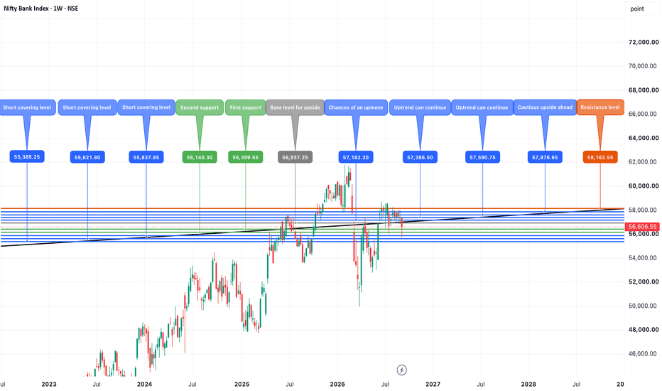
Long