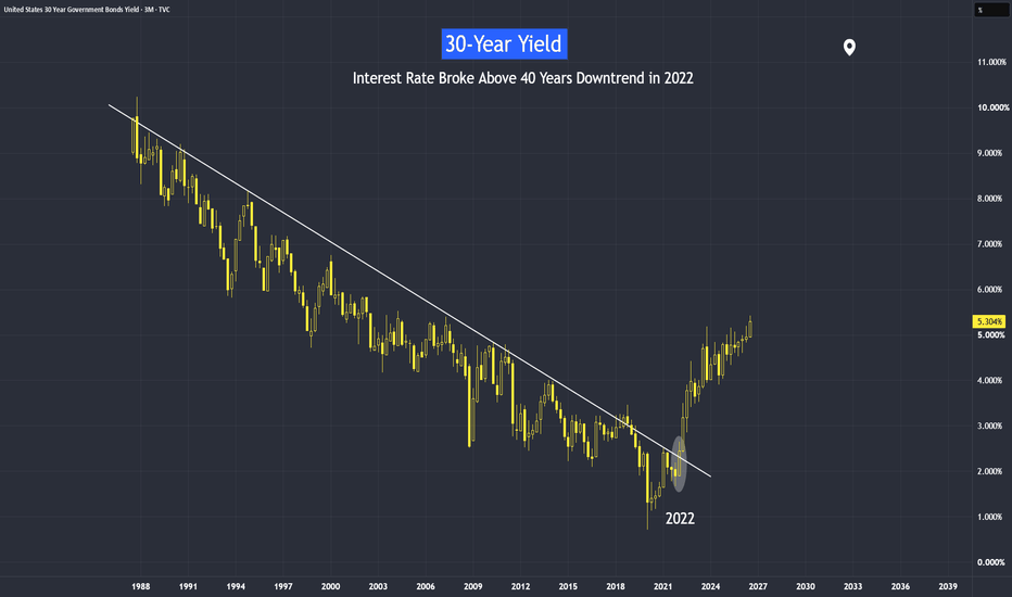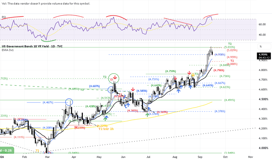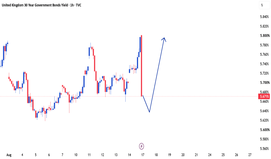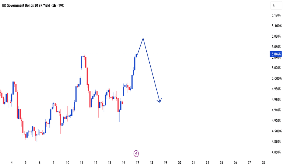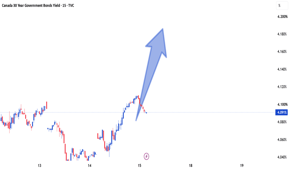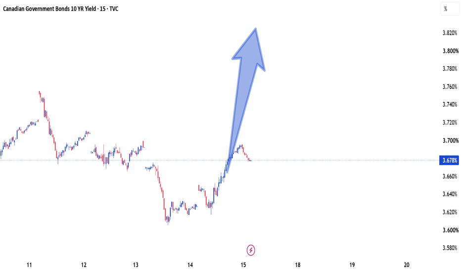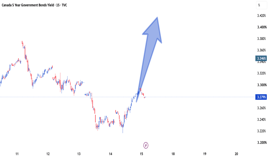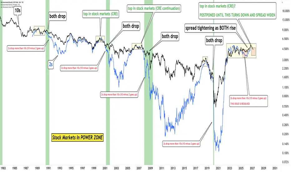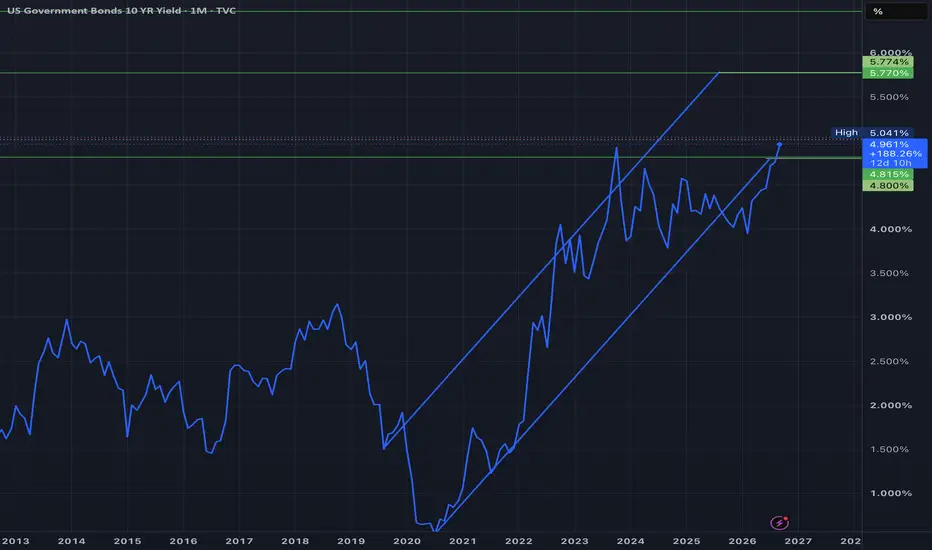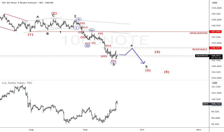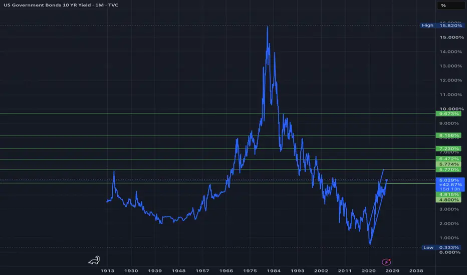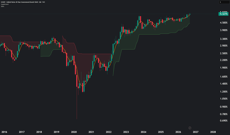
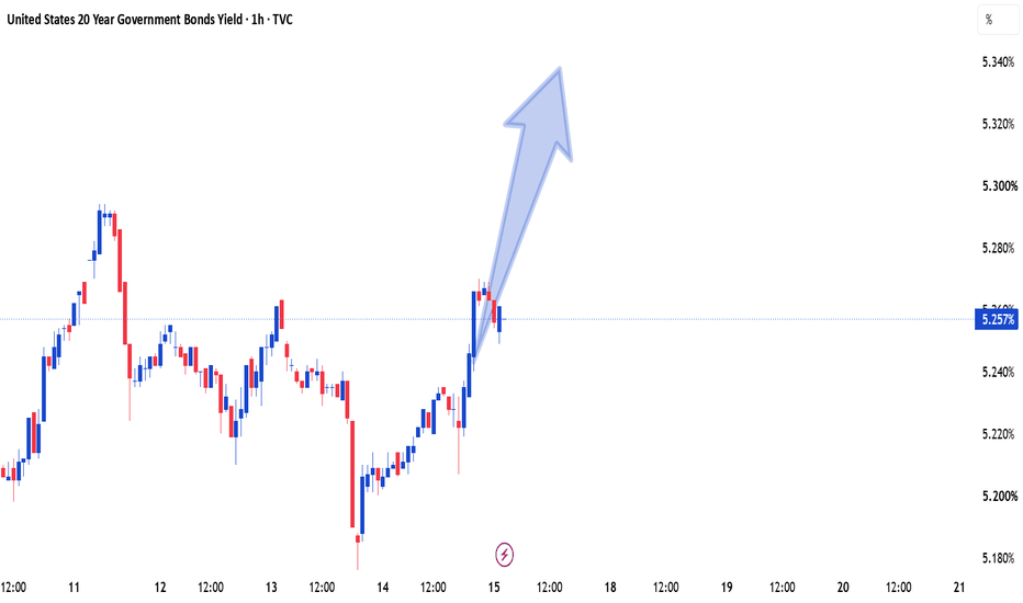
US 10Y Treasury Yield Faces Bearish PressureThe US 10-Year Treasury yield is showing signs of weakening as expectations around future monetary policy and easing inflation pressures continue to shape market sentiment. If sellers remain in control, yields could extend lower in the coming sessions. A sustained move to the downside would reinforce the sell-side outlook while markets continue to monitor upcoming economic data and Federal Reserve commentary.
Government bonds
Canadian 10Y Yield Signals More DownsideThe Canadian Government 10-Year Bond Yield is struggling to extend its recent recovery. Softer rate expectations and improving demand for bonds could keep yields under pressure. The bearish outlook remains valid while price stays below key resistance, with further downside in focus.
US 10Y TREASURY: Gains on safety demandsU.S. 10-year Treasury yields declined toward the end of the week as investors balanced encouraging domestic economic data against renewed geopolitical tensions in the Middle East. The highest weekly yields at 4,63% were reached at the start of the week, while the close is at 4,54%. Softer-than-expected U.S. inflation figures reinforced expectations that underlying price pressures continue to moderate, while weaker producer prices added to the view that inflation is gradually easing. Despite escalating tensions in the Middle East and higher oil prices, demand for U.S. government bonds increased as investors sought safety, pushing long-term yields lower. Market participants remain cautious that sustained increases in energy prices could slow the disinflation process and influence the Federal Reserve's policy outlook in the months ahead.
Looking ahead, attention will remain on upcoming U.S. macroeconomic releases and the July FOMC meeting. Investors will be looking for further evidence that inflation continues to move toward the Federal Reserve's target, as expectations regarding the timing of future monetary policy decisions are likely to remain the primary driver of Treasury yields.
2Y and 10Y Bond Yield Spread: Week of July 20thSee levels and key areas for this week:
After you click the link, click “Grab this Chart” at the bottom/right of the chart or Load Live Bars on far middle-right.
“Grab this Chart” opens a copy of the chart environment, but it doesn’t automatically save as a permanent layout in your dashboard. Once the chart opens, you need to manually save it as your own layout by clicking the cloud/save icon at the top of TradingView , “Save As”, name the layout. After that it will show up in your saved layouts/dashboard going forward.
30Y Yields Are a Headwind30Y yields vs S&P (overlay)
The simple version is yields up, stocks down. Higher long rates tighten conditions and compete with risk assets. That works until it doesn't. Regime matters more than the textbook line.
On this chart, yields have been grinding higher off the ~4.55% lows, tagged 5% more than once, and are sitting above that line now around 5.13%. Equities still ran hard over the same window, from the ~6,400 area in April toward ~7,570+. So for a stretch, yields and stocks moved up together. That usually means the market is working through higher rates without pricing a hard landing, not that rates stopped mattering.
The 5% line is the threshold. The question is whether 5% holds as support for yields while the index chops near highs, and whether stocks start reacting if yields push again.
How I use this: I'm not trading the overlay as a signal. I watch whether yields are breaking and holding above or below key levels, and whether stocks start reacting again or keep shrugging it off. When yields sit on a threshold like 5% and ES is in multiday overlap/chop, the auction tends to get messier. Two-way chop, less clean trend, fewer setups that run, and more stops.
Bottom line: rising yields didn't kill this rally leg. The live question is whether 5%+ holds while the index consolidates near highs. Watch yield acceptance at the threshold, and whether equities start caring again.
the 5% treasury yield problem5% Changes The Cost Of Money
For years, one of the biggest forces supporting financial markets was cheap money.
Low interest rates reduced borrowing costs, supported asset valuations, and allowed governments, companies, and households to finance themselves at historically favorable levels.
That environment has changed.
The U.S. 30-year Treasury yield moving back above 5% brings a simple but important question back into focus:
A 5% yield does not automatically signal a crisis.
The importance is that long-term borrowing costs are moving into a range where they begin influencing decisions across the economy. Treasury yields are the foundation used to price many other assets, from mortgages to corporate debt and equity valuations. When the world's largest bond market reprices, the effects eventually spread.
U.S. 30-Year Treasury Yield — 2021 to 2023
TVC:US30Y
Inflation shock + Fed tightening
A rapid rise in inflation and interest rates pushed long-term yields from historic lows to levels not seen in years. The important point is that higher yields do not immediately change everything overnight.
The U.S. government does not suddenly pay higher interest on its entire debt when Treasury yields rise. Most debt is locked in at existing rates and matures over time. However, as old debt is refinanced and new borrowing takes place, higher rates gradually increase the cost of financing.
The same applies to businesses and households.
A company refinancing at a higher rate faces different choices.
A homeowner taking a new mortgage faces a different financial reality.
The price of money changes behaviour.
U.S. 30-Year Treasury Yield — 2003 to 2006
TVC:US30Y
Economic expansion + Fed tightening
Higher yields are not always bearish. This period shows that rising yields can happen during economic strength, not only during market stress.
This distinction matters because rising yields are often treated as automatically negative.
History shows the opposite.
The reason behind the move is what matters.
Yields rising because of stronger growth tell a different story from yields rising because investors demand compensation for inflation or fiscal concerns.
The bond market is constantly pricing expectations for the future.
U.S. 30-Year Treasury Yield — 2016 to 2018
Fed normalization
TVC:US30Y
Long-term yields moved higher as investors adjusted to stronger growth and a gradual shift away from emergency monetary policy. One of the clearest areas where higher yields appear is housing.
Mortgage rates are closely connected to long-term Treasury yields because lenders demand higher returns when the cost of funding rises.
Higher borrowing costs can reduce affordability, slow demand, and influence how buyers and sellers behave.
The housing market is not only about prices. It is also about the cost of financing those prices.
Higher yields also affect financial markets through valuation.
Stocks are valued based on expectations of future earnings.
When interest rates rise, the discount rate used to value those future earnings increases.
This can create pressure, especially on companies whose valuations depend heavily on future growth.
30-Year Treasury Yield vs S&P 500 — 2022
TVC:US30Y / TVC:SPX
Rising yields pressure valuations
When rates rise quickly, valuations adjust
The 2022 selloff showed how rapidly higher yields can tighten financial conditions and pressure equity valuations. However, rising yields do not always create the same market reaction.
The economy, earnings growth, and investor expectations all determine whether markets can absorb higher rates.
30-Year Treasury Yield vs S&P 500 — 2020 to 2021
TVC:US30Y / TVC:SPX
Recovery + growth expectations
Rising yields can coexist with rising stocks
During the recovery period, stronger growth expectations helped equities absorb higher Treasury yields. The bond market is often slower than equities, but it plays one of the most important roles in global finance.
A 5% 30-year Treasury yield is not a prediction of a crisis.
It is a reminder that the era of near-zero borrowing costs is no longer the normal environment.
For traders, the focus should not be the yield level alone.
The opportunity comes from understanding the reason behind the move and how different markets respond.
One Thing to Remember
Interest rates are the price of money.
When that price changes, every major asset eventually has to adjust.
put together by : Pako Phutietsile as @currencynerd
10Y Yield: Breaking Out of the Range?
The 10-year Treasury yield is pushing higher again, currently trading near 4.62% and testing the descending trendline that's capped every major rally since the 2023 high of 5.02%. Yields are rising as Fed rate-hike expectations grow, with Treasury markets bracing for Fed Chair Kevin Warsh's debut testimony before Congress and June's CPI and PPI data — both landing this week.
The yield is holding firmly above its long-term ascending trendline (support since the 2023 lows), and a clean break above the 2025 high near 4.80% would open the path toward retesting that 5.02% 2023 high. CME's FedWatch tool now prices a 43.3% probability of a hike at the July 29 Fed meeting, up sharply from just 8.3% a month ago, showing how fast rate expectations are repricing hawkish.
A hold above the trendline and a push through 4.80% would confirm the market is leaning into "higher for longer" , a headwind for gold and risk assets. A rejection back below 4.40-4.45%, on the other hand, would suggest this move is a hawkish overreaction ahead of the data, not a new structural leg higher.
Hope you liked this analysis, make sure to follow us on our pages to stay informed.
Yields Squeezing, Dollar Running, and What It Means for GoldIf you look at the charts right now, a major technical and macroeconomic setup is unfolding across Treasury Yields, the US Dollar Index TVC:DXY , and Gold.
1. Weekly Squeeze on 10 Year Yields
The weekly chart for TVC:TNX shows price action is coiling tightly into the apex of a multi year pennant pattern. The moving averages (red and green lines) are stacked underneath price, curling upward, and providing dynamic support. At the same time, weekly momentum indicators like the TTM Squeeze are turning green. Everything points toward a potential upside breakout sooner rather than later.
2. Monthly Structural Floor
Zooming out to the monthly 10 Year Yield chart, we see that yields are respecting a long term upward trendline that started in 202 after the 2020 lows. Every time yields pull back to key support levels, buyers step in aggressively. Long term interest rates have established a clear higher floor.
3. Triple Threat: Yields, Dollar, and Paper Gold
When 10 Year Yields and the 2 Year Yield rise together, they pull the US Dollar Index up with them. This creates a short term liquidity crunch for precious metals.
Opportunity Cost: Treasury yields offer a guaranteed return. When nominal rates rise, traders dump non yielding paper Gold futures to grab paper yield.
Technical Pressure: On daily charts, this dollar and yield push keeps Gold trapped inside a downward sloping channel heading toward key support near $4k.
4. Macro Picture: Running Dollar vs Real Inflation
Why are yields staying high? Because real world inflation is sticky. Official government numbers use formulas like substitution and quality adjustments that smooth out true cost of living increases. But everyday essentials like food, insurance, utilities, and housing have increased significantly over the last few years.
While a surging Dollar and rising yields push paper Gold down in the short term, they also signal growing national debt burdens and loss of cash purchasing power. Over a longer horizon, short term paper pressure gives way to physical demand, and hard assets eventually decouple from dollar strength.
Conclusion:
Respect the short term daily trend while DXY and yields push higher, but keep your eye on the bigger macro picture as structural inflation remains real.
2Y and 10Y Bond Yield Spread: Week of July 13thSee levels and key areas for this week:
After you click the link, click “Grab this Chart” at the bottom/right of the chart or Load Live Bars on far middle-right.
“Grab this Chart” opens a copy of the chart environment, but it doesn’t automatically save as a permanent layout in your dashboard. Once the chart opens, you need to manually save it as your own layout by clicking the cloud/save icon at the top of TradingView , “Save As”, name the layout. After that it will show up in your saved layouts/dashboard going forward.
US 30-Year Yield to 6.5% - Three resistance tests - July 2026SYMBOL: TVC:US30Y | DIRECTION: YIELD HIGHER | TIMEFRAME: 1-Month
Published: July 2026
Three times the 30-year yield approached the 5.0-5.2% resistance band. Three times it was turned back. Three times the subsequent pullback was shallower than the one before it. A market that keeps returning to a level with less and less willingness to retreat from it is not a market that wants to go lower. It is a market building pressure for a move through.
Note: this idea is long the yield. Higher yield = lower bond price. Position accordingly.
On the above monthly chart the 30-year US Treasury yield is about to break out of a multi-year ascending triangle. Several reasons now exist to expect further upside in yield. They include:
1) Ascending triangle: textbook geometry. Horizontal resistance at 5.0–5.2% tested in 2023, early 2025, and mid-2026, each marked by a downward arrow on the chart. Each rejection produced a higher low than the last, creating the rising diagonal support line that defines the pattern. The measured move from the breakout projects a further +1.489 percentage points, or 29.57%, targeting a yield of approximately 6.5%. That is the mathematics of the pattern. The chart is doing the work.
2) The trend channel confirms the structure. The Gaussian channel has tracked this entire advance from the 2020 lows without interruption. Price is above it. The channel is rising beneath it. This is not a structure that is turning down. It is one that has absorbed three tests of resistance and remains pointed upward.
3) The macro case has not gone away. US debt issuance is at a structural high. The term premium is the extra yield investors demand for lending long. It has been repricing upward for three years. When a government needs to borrow more and buyers demand more to lend, the direction of long yields is not a mystery. The chart and the macro are saying the same thing.
One caveat worth acknowledging
RSI has been operating within a descending channel since the 2022 yield peak, making lower highs each time yield retests 5.0%+. That is bearish divergence and it deserves respect. It has not prevented the ascending triangle from forming, and it has not prevented the resistance breakout. But if RSI continues to decline as yield pushes toward 6.5%, that divergence will eventually have something to say about it. Watch the RSI channel. A breakout above it removes the concern. A continued decline raises it. A break above 64 will result in a melt up for markets and a melt down for precious metals.
Forecasts (yield)
1st target: 5.5%. Prior reaction zone within the advance.
2nd target: 6.489%. The ascending triangle measured move. A monthly close back below the ascending support line, currently near 4.6% and rising, cancels the thesis.
The crowd
The consensus has been calling for lower long yields, and therefore a bond rally, for the better part of three years. The Fed will cut. Inflation will moderate. The long end will recover. Three tests of resistance and three higher lows later, the yield has not cooperated. The bond market is considerably larger and considerably less sentimental than anyone forecasting it. It is not interested in what the consensus thinks should happen. The ascending triangle is what is happening as most publishers on tradingview go short. Bless.
Is it possible the breakout fails, yield retreats and the long bond finally gets its recovery? Of course. The RSI divergence exists for a reason.
Is it probable, with an ascending triangle, three years of higher lows, a rising trend channel, and a macro backdrop that has not solved the debt question? Look left. Look at the diagonal. Is this time different?
What should I do with this information? Boring Bond markets don't apply to me!
Got debt? In 10-12 month you'll wish you hadn't. Pay it off as quickly as possible.
Ww
Type: Macro / yield direction | Timeframe: 12–24 months
======================================================
Disclaimer : This idea is for educational and informational purposes only. It is not financial advice. Government bond yields and fixed income markets involve significant risk. Higher yields imply lower bond prices and potential capital loss for existing holders. Always do your own research and consult a qualified financial adviser before making any investment decisions. Past performance is not indicative of future results.
Markets Stay Sideways As Rising Treasury Yields, FOMC Minutes, aAfter a strong recovery over recent weeks, markets are taking a breather today as investors digest a combination of geopolitical developments, rising Treasury yields, and the upcoming release of the FOMC meeting minutes.
The first catalyst today comes from the Middle East. The U.S. military confirmed another round of strikes against Iran following attacks on vessels in the Strait of Hormuz. The renewed tensions have pushed crude oil prices higher, bringing energy markets back into focus and raising concerns that inflation risks may not disappear as quickly as many had hoped.
At the same time, traders are preparing for today’s release of the FOMC meeting minutes. While the Fed left policy unchanged, investors will be looking for additional insight into the committee’s thinking regarding inflation, the labor market, and the timing of future interest rate cuts. After a somewhat hawkish tone from Kevin Warsh two weeks ago, many market participants are choosing to reduce risk rather than aggressively add new positions ahead of the release.
Perhaps the most interesting development, however, is taking place in the bond market.
The U.S. 10-year Treasury yield is attempting to break above both its short-term channel and the major trendline that has capped yields since 2023. As shown in the chart below, today’s move represents an important technical test. A confirmed breakout would suggest that the recent decline in yields was merely corrective and that another leg higher may be underway.
Historically, higher Treasury yields tend to create headwinds for equities by increasing borrowing costs and making fixed-income investments relatively more attractive.
10 year US yields
For now, I continue to view the current environment as a broad summer trading range rather than the beginning of a major trend. Risk sentiment remains supported, but several cross-market signals—suggest that volatility is likely to remain elevated in the weeks ahead.
Grega
10Y Update: Daily Channel Breakout Threatens Pennant ResistanceRevisiting the 10-Year U.S. Government Bond Yield ( TVC:TNX ) via a dual time frame view.
The Macro Frame (Left):
Yields are pushing right back up against the upper resistance line of the multi year symmetrical pennant/bull pennant. Crucially, the key Exponential Moving Averages held the recent pullbacks, while weekly RSI remains firmly above 50.
The Tactical Frame (Right):
Instead of continuing down toward the bottom of the macro wedge, the daily action broke out to the upside from its descending channel. We have a fresh bullish EMA crossover, and daily RSI has surged to 63 with solid momentum behind it.
The Takeaway:
Consolidation directly beneath major macro resistance shows strong underlying demand for yield. Rather than a deeper pullback first, TVC:TNX is attempting an upside expansion phase. A confirmed weekly close above this upper wedge boundary would signal a major structural breakout. One that could reverse the recent tailwind for broader equities.
Waiting for confirmation on the candle close is key.
US10Y Fake Break:Is a New Bond Yield Rally About to Shake MarketToday, I want to analyze the U.S. 10-Year Government Bond Yield ( TVC:US10 ), as it is one of the key financial market indices that can show us the broader market direction for various assets like Gold ( OANDA:XAUUSD ), Silver ( OANDA:XAGUSD ), U.S. stock indices (including the S&P 500 ( FOREXCOM:SPX500 )), and especially Bitcoin ( BINANCE:BTCUSDT ) in the crypto market. Stay with me.
On the daily timeframe, the U.S. 10-Year Government Bond Yield is currently moving near a support zone (4.24%-4.10%) and has formed a fake break. Typically, after fake break patterns, the market tends to move in the opposite direction, with upward momentum (educational note).
From a classical technical analysis standpoint, the U.S. 10-Year Government Bond Yield seems to have formed a falling wedge pattern, which could signal a potential upward breakout.
From an Elliott Wave perspective, after breaking the upper line of the falling wedge pattern, we could anticipate the start of the next impulsive wave upward.
I expect the U.S. 10-Year Government Bond Yield to continue its upward trend in the coming days and at least reach the next resistance zone(4.64%-4.50%). This rise could lead to a decline in risk assets such as U.S. equities, gold, silver, and even the crypto market, including Bitcoin.
Target: Resistance zone(4.64%-4.50%)
Stop Loss(SL): 4.35%
Note: The U.S. 10-Year Government Bond Yield could potentially maintain its upward trend ahead of the FOMC meeting on July 29. After the release of new economic data and once we hear Warsh’s latest remarks, we may get a clearer signal about the next major move or a possible trend reversal.
------------
How Rising 10-Year Bond Yields Influence Major Assets
When 10-year government bond yields move higher, they tend to reshape investor behavior across markets:
Bitcoin & Cryptocurrencies
As yields climb, capital often rotates toward safer, income-generating assets like bonds. This shift can reduce demand for high-risk assets such as Bitcoin, potentially leading to price pressure.
Gold
Gold typically struggles in a rising yield environment. Since it doesn’t generate income, higher bond yields increase the opportunity cost of holding gold, which can weigh on its price.
U.S. Equities
Stocks, especially growth and tech sectors, may face headwinds. Higher yields usually mean higher borrowing costs, which can compress margins and slow down expansion for companies reliant on financing.
------------
What’s your view on US10Y? If US10Yr rises, could we see declines in gold, U.S. stock indices, and the cryptocurrency market?
💡 Please respect each other's opinions and express agreement or disagreement politely.
📌 US 10-Year Government Bond Yield Analyze (US10Y%), Daily time frame.
🛑 Always set a Stop Loss(SL) for every position you open.
✅ This is just my idea; I’d love to see your thoughts too!
🔥 If you find it helpful, please BOOST this post and share it with your friends.
All Eyes 2 Year Yield For Correction Crash Or New Highs2 year 10 year looks at all areas of our living cars loan mortgages credit card etc.
The higher the 2 year goes that means higher rates for Tech to borrow remember tech borrowed money. It need to get back 3.50. The higher it goes tech will drop all eyes on 2 year. Daily says wants drop needs break like on the left. Lots lots support 4.10 25 day and 3.98 50 day ma and we are above all. Trend is up.
2Y and 10Y Bond Yield Spread: Week of July 6thSee levels and key areas for this week:
After you click the link, click “Grab this Chart” at the bottom/right of the chart or Load Live Bars on far middle-right.
“Grab this Chart” opens a copy of the chart environment, but it doesn’t automatically save as a permanent layout in your dashboard. Once the chart opens, you need to manually save it as your own layout by clicking the cloud/save icon at the top of TradingView , “Save As”, name the layout. After that it will show up in your saved layouts/dashboard going forward.
US 2-Year Yield: How to Read Fibonacci Extension After Reversal Market: TVC:US02Y US Government 2-Year Yield
Main lesson: Fibonacci extension is a projection tool, not a prediction tool.
Let’s dive into a chart that’s quietly telling a powerful story.
The US 2-year yield is giving us a textbook example of how traders can use the Fibonacci extension tool after a clean A-B-C structure forms. But this isn’t just about drawing lines and hoping for the best - it’s about understanding how trends evolve and where momentum might take us next.
Before we get into the fun stuff, one quick reminder; this chart shows yields, not bond prices. When yields rise, it usually reflects tighter rate expectations or stronger policy repricing. When they fall, it often signals easing expectations. Keep that in mind - it adds context to everything we’re about to explore.
What Is Fibonacci Extension?
Fibonacci tools can feel a bit mystical at first, but they’re actually pretty straightforward.
A retracement tells you how far price pulls back within a move, while the Fibonacci extension tool helps project where price might go next after a move and a correction.
Think of it like a three-step sequence:
A to B is the first push,
B to C is the pullback,
and from C onward, we project the next potential move.
The extension tool takes the size of that first push (A to B) and projects it forward from point C using Fibonacci ratios. It’s a simple concept, but when applied correctly, it becomes a powerful way to map potential future price zones.
Rules for Drawing Fibonacci Extension Correctly
To get meaningful levels, you need to draw the tool properly. While the process is straightforward, the quality of your inputs matters a lot.
First, you need to identify a clear trend shift or impulse. Point A should represent a meaningful swing low (in an uptrend) or swing high (in a downtrend), not just minor noise. From there, the move to point B should be a strong, directional impulse with visible momentum.
After that, you wait for a corrective pullback to form point C. Ideally, in an uptrend, this pullback holds above point A, confirming that the market structure is improving. Clean structure is key here - if price action is choppy or overlapping, extension levels tend to lose reliability.
Finally, it’s important to remember that Fibonacci works best when combined with other tools. Higher timeframes generally provide stronger signals, and confirmation from trend, momentum, and volatility indicators helps validate the levels.
The A-B-C Structure on This Chart
Here’s how the structure plays out on the chart.
Point A marks the four-month low near 3.376% in early March. This is where the previous decline in the 2-year yield stopped, and the market began to reverse higher.
From there, yields rallied sharply into Point B, around late March. This was the first strong upside impulse. The move was important because price broke away from the low, pushed above the 100-WMA, and showed that short-term rate expectations were being repriced higher.
After Point B, the market did not continue straight up. It corrected into Point C, near the 3.679% area in mid-April. This pullback is the key part of the structure. It held well above Point A, creating a higher low. That tells us sellers failed to return yields to the previous low, which is often an early sign that the market structure has shifted from decline to recovery.
Once yields bounced from Point C, the Fibonacci extension tool became useful. The tool takes the size of the first impulse from A to B and projects it upward from C. That gives traders a structured map of potential resistance levels.
The price action after Point C has respected this map well. Yields moved through the 38.2% and 50% zones, then held above the 61.8% extension near 4.088%, which is now acting as immediate support. The market is currently trading around 4.17%, just below the 78.6% extension near 4.199%, which is the next critical resistance.
How to Read the Extension Levels
Right now, the yield is hovering around 4.17%, sitting between two key Fibonacci levels:
• 61.8% extension at 4.088% (support)
• 78.6% extension at 4.199% (resistance)
This area acts as a decision zone. Holding above 4.088% keeps the recovery structure intact and suggests buyers are still in control. On the other hand, a break above 4.199% would signal stronger momentum and open the door for further upside.
The next major level above is the 100% extension near 4.341%, where the second move would match the size of the initial rally. Beyond that, the chart highlights additional resistance zones:
• January peak: 4.424%
• 127.2% extension: 4.521%
These levels help frame the potential path forward if momentum continues to build.
Why the 100% Level Matters
The 100% extension level represents symmetry in the market. It reflects a scenario where the move from point C matches the strength of the original A-to-B impulse.
In strong trends, price often reaches or exceeds this level. In weaker conditions, the move tends to stall earlier, typically around the 61.8% or 78.6% zones.
At the moment, the yield is approaching resistance but hasn’t fully broken through. That hesitation is important - it suggests the market is still deciding whether it has enough strength to continue higher.
Trend Context: The Recovery Is Still Constructive
Looking at the broader picture, the trend remains constructive, but it’s not accelerating aggressively.
The yield is holding above the 100-period weighted moving average, which indicates that the overall structure has improved since the March low. However, instead of trending sharply higher, price is beginning to move sideways near resistance.
This kind of behavior often reflects a pause - a period where the market consolidates before making its next directional move.
Bollinger Bands: Calm Before the Move?
The Bollinger Bands are tightening, signaling volatility compression. This typically means the market is entering a quieter phase, often followed by a larger move.
In general, narrow bands suggest low volatility and the potential for a breakout, while wider bands indicate that a trend is already in motion. Price positioning within the bands can also provide context, but it should always be interpreted alongside other tools.
In this case, the combination of compressed Bollinger Bands and nearby Fibonacci extension levels creates a clear setup. If the yield breaks above 4.199% and the bands begin to expand, it would support a move toward 4.341%. Conversely, rejection at resistance followed by a drop below 4.088% would weaken the structure.
PPO: Momentum Is Waiting
The PPO indicator is currently showing a lack of strong directional momentum. The lines are close together, and the histogram is hovering near zero, which is typical of a range-bound environment.
In general, the PPO helps identify shifts in momentum. Moves above the zero line suggest bullish conditions, while moves below indicate bearish pressure. Crossovers and changes in the histogram can signal strengthening or weakening momentum.
Right now, the key takeaway is that momentum hasn’t fully aligned with a breakout yet. For a stronger bullish signal, traders would typically look for a combination of factors:
• A clean close above resistance
• PPO turning higher
• Expanding histogram
• Bollinger Bands widening
• A successful retest of the breakout level
Until then, the structure remains constructive, but not fully confirmed.
Implied Volatility: Something’s Brewing
Implied volatility is starting to rise, which suggests the market may be preparing for a larger move.
Rising volatility often reflects expectations of increased price movement, while falling volatility points to stability or consolidation. When volatility increases near key support or resistance levels, it can signal that a breakout or rejection may be approaching.
In this case, the rise in implied volatility could be tied to upcoming macro catalysts such as inflation data, employment reports, or central bank communication. These factors can have a significant impact on short-term yield expectations.
Key Levels to Watch
The most important levels on the chart can be grouped into support and resistance zones.
Support levels:
• Immediate: 4.088%
• Secondary: 4.010%
• Deeper: 3.932%, 3.835%, 3.679%
Resistance levels:
• Critical: 4.199%
• Major extension target: 4.341%
• January peak: 4.424%
• Extended projection: 4.521%
At the moment, the key battleground lies between 4.088% and 4.199%. A breakout above this range could drive momentum toward 4.341%, while a breakdown below it may signal that the recovery is losing strength.
Educational Takeaway
The Fibonacci extension tool isn’t a crystal ball - it’s a roadmap. It highlights areas where price might react, not where it must go.
The real value comes from combining it with other elements of analysis, including trend structure, moving averages, momentum indicators, volatility signals, and, most importantly, price confirmation.
On this chart, the setup is clear. The structure is constructive, but the market is still in a decision phase. We’re sitting near a key inflection point, where the next move could define the direction of the trend.
Bottom line: Fibonacci gives you the map - but price action tells you when to move.
2Y and 10Y Bond Yield Spread - June 29th weekSee levels and key areas for this week:
After you click the link, click “Grab this Chart” at the bottom/right of the chart or Load Live Bars on far middle-right.
“Grab this Chart” opens a copy of the chart environment, but it doesn’t automatically save as a permanent layout in your dashboard. Once the chart opens, you need to manually save it as your own layout by clicking the cloud/save icon at the top of TradingView , “Save As”, name the layout. After that it will show up in your saved layouts/dashboard going forward.
US 10Y TREASURY: Potential for extended declinesThe yield on the U.S. 10Y Treasury bonds moved lower during the week as investors digested the latest inflation data and continued to reassess the outlook for Federal Reserve monetary policy. Although yields started the week around 4,5% level, the strong move toward the downside, brought them down to 4,37% where they are closing the week. Softer Treasury yields reflected growing expectations that while inflation remains above the Fed's target, policymakers may be approaching the end of their tightening cycle, encouraging demand for government bonds.
This week's PCE data matched market expectations, but confirmed that inflationary pressures remain persistent, reinforcing expectations that interest rates could stay elevated for an extended period. Despite the inflation report, Treasury yields drifted lower toward the end of the week as investors focused on signs of moderating economic momentum and positioned ahead of next week's key labor market releases. Attention now shifts to the JOLTs job openings report, Nonfarm Payrolls (NFP), and the June unemployment rate, which are expected to play a crucial role in shaping expectations for future Federal Reserve policy. Stronger-than-expected employment data could renew upward pressure on Treasury yields, while weaker figures would likely support further declines in yields as markets increase expectations for future policy easing. As per current charts, the next level of 10Y yields could easily become the 4,3% level.
US10Y - Technicals Over Sentiment, Bearish Leg Starting?US10Y respected the technical structure despite the recent hawkish sentiment.
Price rejected the resistance area and the upper boundary of the weekly symmetrical red triangle, then broke below both the EMA50 and the green trigger area, which provided an early indication that a bearish leg may have started.
This move increases the probability that the recent reaction was driven more by technical factors than by the hawkish tone.
Price is now testing the EMA100, where a short-term reaction may develop and lead to a retest of the green area before continuation lower.
If the bearish scenario remains valid, the next area of interest becomes the lower boundary of the symmetrical triangle aligned with the support zone.
📌From a broader market perspective, US Treasury bonds are often considered lower-risk assets. Continued downside in US10Y yields may serve as an early signal that investors are gradually becoming more comfortable increasing exposure to higher-risk assets such as equities, cryptocurrencies, and other asset classes. However, confirmation across broader market conditions remains important.
The reaction around EMA100 may provide more clarity on whether the market is preparing for continuation lower, or if buyers still have room to challenge the breakdown.
⚠️ Disclaimer: This analysis reflects my personal market view and is not financial advice.
Rayan Nasser
#US10Y #Bonds #TechnicalAnalysis #PriceAction #EMA #MarketStructure #MacroAnalysis #Trading