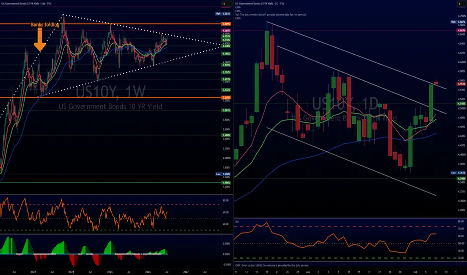
Why I'm Watching the US 10-Year Yield So Closely Right NowBack in January and February, I described the US 10-year Treasury yield as being in a constructive—but admittedly rather boring—sideways pattern.
While price action lacked excitement, the technical structure suggested that pressure was quietly building beneath the surface.
Today, that upside pressure is becoming much more apparent.
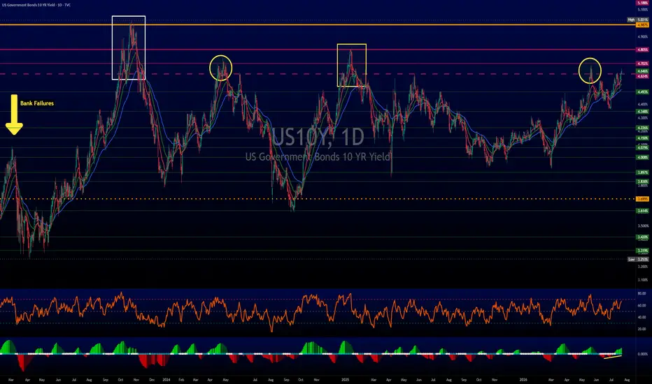
Although yields remain within the broader range, buyers continue to emerge on pullbacks, and the focus is now firmly on this year's high at 4.69%. A sustained break above that level would expose the January 2025 high at 4.81%, followed by the October 2023 peak at 5.02%.
From a longer-term perspective, the chart remains constructive. The breakout from a large symmetrical triangle suggests the market may eventually challenge—and potentially exceed—the 5.02% high.
Of course, technical analysis doesn't exist in isolation.
Recent strength in crude oil, combined with continuing geopolitical tensions in the Middle East, has added to concerns that inflation could prove more persistent than expected. Higher energy prices can feed into inflation expectations, helping to keep upward pressure on Treasury yields.
From a technical standpoint, the immediate trend remains positive while yields hold above the 55-day moving average at 4.50%. More importantly, the broader bullish structure remains intact while the market stays above the June low at 4.36%.
The coming weeks could prove pivotal. If 4.69% gives way, the next major upside targets are already visible on the charts.
Disclaimer:
The information posted on Trading View is for informative purposes and is not intended to constitute advice in any form, including but not limited to investment, accounting, tax, legal or regulatory advice. The information therefore has no regard to the specific investment objectives, financial situation or particular needs of any specific recipient. Opinions expressed are our current opinions as of the date appearing on Trading View only. All illustrations, forecasts or hypothetical data are for illustrative purposes only. The Society of Technical Analysts Ltd does not make representation that the information provided is appropriate for use in all jurisdictions or by all Investors or other potential Investors. Parties are therefore responsible for compliance with applicable local laws and regulations. The Society of Technical Analysts will not be held liable for any loss or damage resulting directly or indirectly from the use of any information on this site.
 Long
Long

US10Y Fake Break:Is a New Bond Yield Rally About to Shake MarketToday, I want to analyze the U.S. 10-Year Government Bond Yield ( TVC:US10 ), as it is one of the key financial market indices that can show us the broader market direction for various assets like Gold ( OANDA:XAUUSD ), Silver ( OANDA:XAGUSD ), U.S. stock indices (including the S&P 500 ( FOREXCOM:SPX500 )), and especially Bitcoin ( BINANCE:BTCUSDT ) in the crypto market. Stay with me.
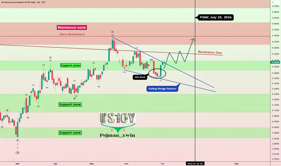
On the daily timeframe, the U.S. 10-Year Government Bond Yield is currently moving near a support zone (4.24%-4.10%) and has formed a fake break. Typically, after fake break patterns, the market tends to move in the opposite direction, with upward momentum (educational note).
From a classical technical analysis standpoint, the U.S. 10-Year Government Bond Yield seems to have formed a falling wedge pattern, which could signal a potential upward breakout.
From an Elliott Wave perspective, after breaking the upper line of the falling wedge pattern, we could anticipate the start of the next impulsive wave upward.
I expect the U.S. 10-Year Government Bond Yield to continue its upward trend in the coming days and at least reach the next resistance zone(4.64%-4.50%). This rise could lead to a decline in risk assets such as U.S. equities, gold, silver, and even the crypto market, including Bitcoin.
Target: Resistance zone(4.64%-4.50%)
Stop Loss(SL): 4.35%
Note: The U.S. 10-Year Government Bond Yield could potentially maintain its upward trend ahead of the FOMC meeting on July 29. After the release of new economic data and once we hear Warsh’s latest remarks, we may get a clearer signal about the next major move or a possible trend reversal.
------------
How Rising 10-Year Bond Yields Influence Major Assets
When 10-year government bond yields move higher, they tend to reshape investor behavior across markets:
Bitcoin & Cryptocurrencies
As yields climb, capital often rotates toward safer, income-generating assets like bonds. This shift can reduce demand for high-risk assets such as Bitcoin, potentially leading to price pressure.
Gold
Gold typically struggles in a rising yield environment. Since it doesn’t generate income, higher bond yields increase the opportunity cost of holding gold, which can weigh on its price.
U.S. Equities
Stocks, especially growth and tech sectors, may face headwinds. Higher yields usually mean higher borrowing costs, which can compress margins and slow down expansion for companies reliant on financing.
------------
What’s your view on US10Y? If US10Yr rises, could we see declines in gold, U.S. stock indices, and the cryptocurrency market?
💡 Please respect each other's opinions and express agreement or disagreement politely.
📌 US 10-Year Government Bond Yield Analyze (US10Y%), Daily time frame.
🛑 Always set a Stop Loss(SL) for every position you open.
✅ This is just my idea; I’d love to see your thoughts too!
🔥 If you find it helpful, please BOOST this post and share it with your friends. Long 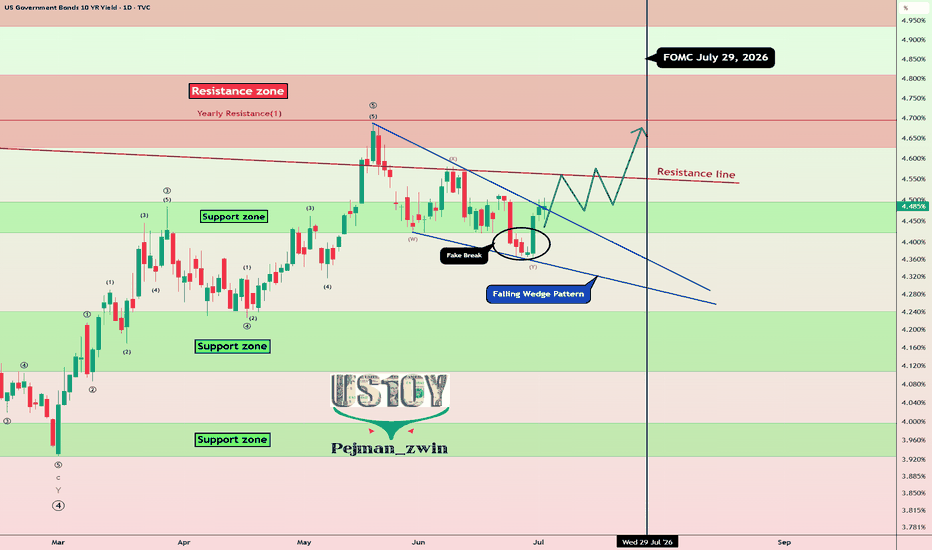
Long 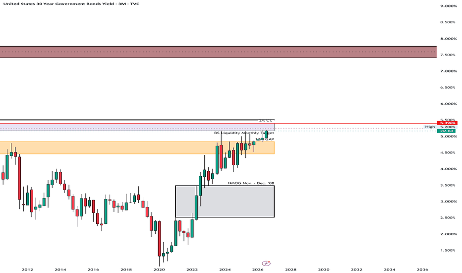
Education 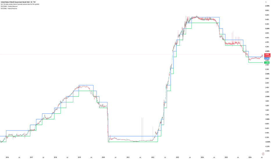
10Y Weekly Mega Symmetrical Triangle Pt2I prefer charts, they can’t lie. Unless of course they start fudging data, but that is another topic for another day, maybe…
Here’s a breakdown of the macro thesis outside of technical jargon. Like Nacho Libre would say, “the nitty gritty”, where the logic holds firm, where the trade offs lie, and the counter forces at play.
Supply/Demand Imbalance in Treasuries
Issuance Problem
U.S. Treasury continues to issue MASSIVE volumes of debt to fund federal deficits. When foreign central banks and traditional institutional buyers reduce their net purchases, the primary dealers must absorb the excess supply.
Price Discovery
To entice domestic private capital (pension funds, money market funds, insurance firms) to step in and absorb that supply, yields must rise to offer a sufficient risk/term premium.
Fed’s Dilemma: Print or Suffer Tightening
If long term yields surge high enough to threaten market functioning or make government debt service unsustainable, the Fed faces two stark options:
Option A: Yield Curve Control / QE
Mechanism
Fed steps in as the buyer of last resort to peg yields or buy Treasuries via balance sheet expansion.
Outcome
Expanding the balance sheet (monetizing the debt) increases money supply velocity. If done while inflation is still elevated, real yields turn negative, degrading the purchasing power of the USD and driving capital into tangible assets, commodities, and hard currencies.
Option B: Let Rates Float High
Mechanism
Fed refrains from quantitative easing, allows market supply and demand to dictate yields.
Outcome
Borrowing costs jump across mortgages, corporate credit, and municipal debt. This aggressively tightens financial conditions, slowing economic activity and squeezing regional banking balance sheets holding lower yielding duration risk.
Counter Perspective
The Flypaper Effect of High Yields:
At 5%+, U.S. Treasuries begin to aggressively compete with equities and corporate bonds for yield. Risk averse institutional capital often rotates heavily into risk free Treasuries at those levels, naturally capping the yield spike without requiring immediate Fed intervention.
Economic Slowdown
Higher long term yields act as a self correcting brake on economic growth. As mortgage rates and corporate debt costs rise, demand cools, eventually lowering inflation expectations and pulling yields back down.
Key Takeaway
Healthier technical footprint on the 10 Yr vs the 2 Yr confirms that long term fiscal deficits, debt supply, and inflation risks are currently pushing yields up far more aggressively than short term Fed policy expectations alone.
 Short
Short
Short 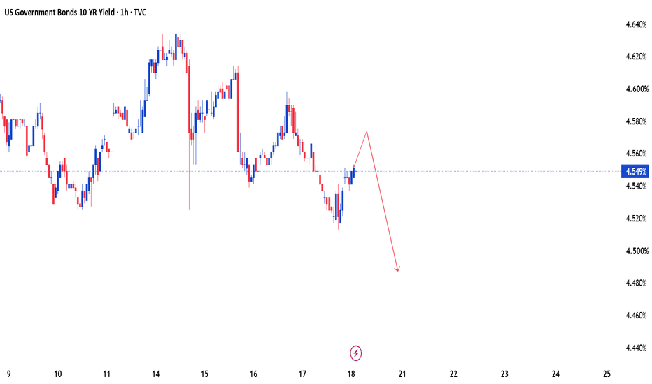
30Y Yields Are a Headwind30Y yields vs S&P (overlay)
The simple version is yields up, stocks down. Higher long rates tighten conditions and compete with risk assets. That works until it doesn't. Regime matters more than the textbook line.
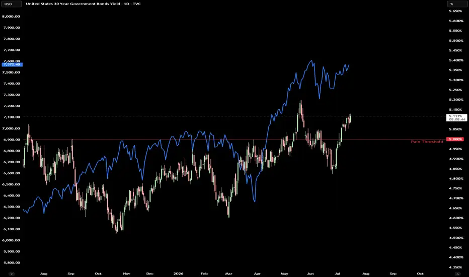
On this chart, yields have been grinding higher off the ~4.55% lows, tagged 5% more than once, and are sitting above that line now around 5.13%. Equities still ran hard over the same window, from the ~6,400 area in April toward ~7,570+. So for a stretch, yields and stocks moved up together. That usually means the market is working through higher rates without pricing a hard landing, not that rates stopped mattering.
The 5% line is the threshold. The question is whether 5% holds as support for yields while the index chops near highs, and whether stocks start reacting if yields push again.
How I use this: I'm not trading the overlay as a signal. I watch whether yields are breaking and holding above or below key levels, and whether stocks start reacting again or keep shrugging it off. When yields sit on a threshold like 5% and ES is in multiday overlap/chop, the auction tends to get messier. Two-way chop, less clean trend, fewer setups that run, and more stops.
Bottom line: rising yields didn't kill this rally leg. The live question is whether 5%+ holds while the index consolidates near highs. Watch yield acceptance at the threshold, and whether equities start caring again. the 5% treasury yield problem5% Changes The Cost Of Money
For years, one of the biggest forces supporting financial markets was cheap money.
Low interest rates reduced borrowing costs, supported asset valuations, and allowed governments, companies, and households to finance themselves at historically favorable levels.
That environment has changed.
The U.S. 30-year Treasury yield moving back above 5% brings a simple but important question back into focus:
A 5% yield does not automatically signal a crisis.
The importance is that long-term borrowing costs are moving into a range where they begin influencing decisions across the economy. Treasury yields are the foundation used to price many other assets, from mortgages to corporate debt and equity valuations. When the world's largest bond market reprices, the effects eventually spread.
U.S. 30-Year Treasury Yield — 2021 to 2023
TVC:US30Y
Inflation shock + Fed tightening
A rapid rise in inflation and interest rates pushed long-term yields from historic lows to levels not seen in years. The important point is that higher yields do not immediately change everything overnight.
The U.S. government does not suddenly pay higher interest on its entire debt when Treasury yields rise. Most debt is locked in at existing rates and matures over time. However, as old debt is refinanced and new borrowing takes place, higher rates gradually increase the cost of financing.
The same applies to businesses and households.
A company refinancing at a higher rate faces different choices.
A homeowner taking a new mortgage faces a different financial reality.
The price of money changes behaviour.
U.S. 30-Year Treasury Yield — 2003 to 2006
TVC:US30Y
Economic expansion + Fed tightening
Higher yields are not always bearish. This period shows that rising yields can happen during economic strength, not only during market stress.
This distinction matters because rising yields are often treated as automatically negative.
History shows the opposite.
The reason behind the move is what matters.
Yields rising because of stronger growth tell a different story from yields rising because investors demand compensation for inflation or fiscal concerns.
The bond market is constantly pricing expectations for the future.
U.S. 30-Year Treasury Yield — 2016 to 2018
Fed normalization
TVC:US30Y
Long-term yields moved higher as investors adjusted to stronger growth and a gradual shift away from emergency monetary policy. One of the clearest areas where higher yields appear is housing.
Mortgage rates are closely connected to long-term Treasury yields because lenders demand higher returns when the cost of funding rises.
Higher borrowing costs can reduce affordability, slow demand, and influence how buyers and sellers behave.
The housing market is not only about prices. It is also about the cost of financing those prices.
Higher yields also affect financial markets through valuation.
Stocks are valued based on expectations of future earnings.
When interest rates rise, the discount rate used to value those future earnings increases.
This can create pressure, especially on companies whose valuations depend heavily on future growth.
30-Year Treasury Yield vs S&P 500 — 2022
TVC:US30Y / TVC:SPX
Rising yields pressure valuations
When rates rise quickly, valuations adjust
The 2022 selloff showed how rapidly higher yields can tighten financial conditions and pressure equity valuations. However, rising yields do not always create the same market reaction.
The economy, earnings growth, and investor expectations all determine whether markets can absorb higher rates.
30-Year Treasury Yield vs S&P 500 — 2020 to 2021
TVC:US30Y / TVC:SPX
Recovery + growth expectations
Rising yields can coexist with rising stocks
During the recovery period, stronger growth expectations helped equities absorb higher Treasury yields. The bond market is often slower than equities, but it plays one of the most important roles in global finance.
A 5% 30-year Treasury yield is not a prediction of a crisis.
It is a reminder that the era of near-zero borrowing costs is no longer the normal environment.
For traders, the focus should not be the yield level alone.
The opportunity comes from understanding the reason behind the move and how different markets respond.
One Thing to Remember
Interest rates are the price of money.
When that price changes, every major asset eventually has to adjust.
put together by : Pako Phutietsile as @currencynerd Education 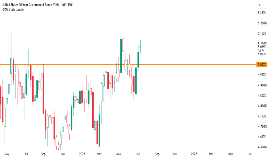
10Y Yield: Breaking Out of the Range?
The 10-year Treasury yield is pushing higher again, currently trading near 4.62% and testing the descending trendline that's capped every major rally since the 2023 high of 5.02%. Yields are rising as Fed rate-hike expectations grow, with Treasury markets bracing for Fed Chair Kevin Warsh's debut testimony before Congress and June's CPI and PPI data — both landing this week.
The yield is holding firmly above its long-term ascending trendline (support since the 2023 lows), and a clean break above the 2025 high near 4.80% would open the path toward retesting that 5.02% 2023 high. CME's FedWatch tool now prices a 43.3% probability of a hike at the July 29 Fed meeting, up sharply from just 8.3% a month ago, showing how fast rate expectations are repricing hawkish.
A hold above the trendline and a push through 4.80% would confirm the market is leaning into "higher for longer" , a headwind for gold and risk assets. A rejection back below 4.40-4.45%, on the other hand, would suggest this move is a hawkish overreaction ahead of the data, not a new structural leg higher.
Hope you liked this analysis, make sure to follow us on our pages to stay informed. Long 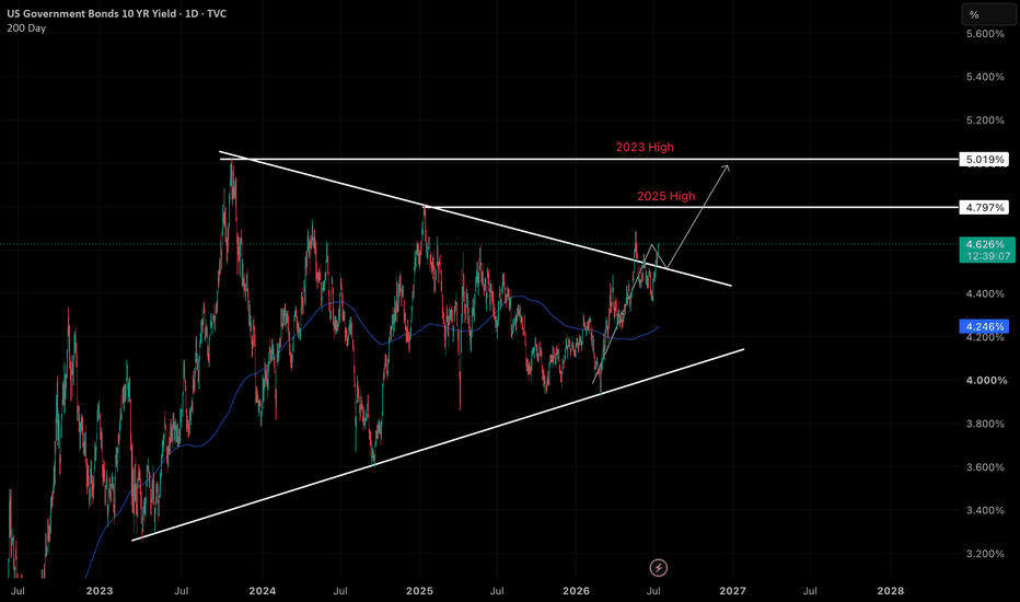
Yields Squeezing, Dollar Running, and What It Means for GoldIf you look at the charts right now, a major technical and macroeconomic setup is unfolding across Treasury Yields, the US Dollar Index TVC:DXY , and Gold.
1. Weekly Squeeze on 10 Year Yields
The weekly chart for TVC:TNX shows price action is coiling tightly into the apex of a multi year pennant pattern. The moving averages (red and green lines) are stacked underneath price, curling upward, and providing dynamic support. At the same time, weekly momentum indicators like the TTM Squeeze are turning green. Everything points toward a potential upside breakout sooner rather than later.
2. Monthly Structural Floor
Zooming out to the monthly 10 Year Yield chart, we see that yields are respecting a long term upward trendline that started in 202 after the 2020 lows. Every time yields pull back to key support levels, buyers step in aggressively. Long term interest rates have established a clear higher floor.
3. Triple Threat: Yields, Dollar, and Paper Gold
When 10 Year Yields and the 2 Year Yield rise together, they pull the US Dollar Index up with them. This creates a short term liquidity crunch for precious metals.
Opportunity Cost: Treasury yields offer a guaranteed return. When nominal rates rise, traders dump non yielding paper Gold futures to grab paper yield.
Technical Pressure: On daily charts, this dollar and yield push keeps Gold trapped inside a downward sloping channel heading toward key support near $4k.
4. Macro Picture: Running Dollar vs Real Inflation
Why are yields staying high? Because real world inflation is sticky. Official government numbers use formulas like substitution and quality adjustments that smooth out true cost of living increases. But everyday essentials like food, insurance, utilities, and housing have increased significantly over the last few years.
While a surging Dollar and rising yields push paper Gold down in the short term, they also signal growing national debt burdens and loss of cash purchasing power. Over a longer horizon, short term paper pressure gives way to physical demand, and hard assets eventually decouple from dollar strength.
Conclusion:
Respect the short term daily trend while DXY and yields push higher, but keep your eye on the bigger macro picture as structural inflation remains real.
US 30-Year Yield to 6.5% - Three resistance tests - July 2026SYMBOL: TVC:US30Y | DIRECTION: YIELD HIGHER | TIMEFRAME: 1-Month
Published: July 2026
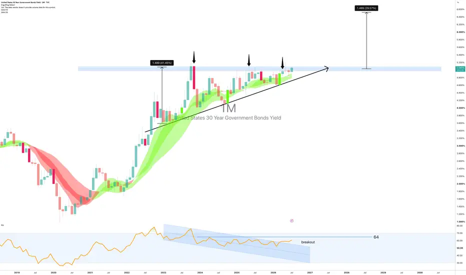
Three times the 30-year yield approached the 5.0-5.2% resistance band. Three times it was turned back. Three times the subsequent pullback was shallower than the one before it. A market that keeps returning to a level with less and less willingness to retreat from it is not a market that wants to go lower. It is a market building pressure for a move through.
Note: this idea is long the yield. Higher yield = lower bond price. Position accordingly.
On the above monthly chart the 30-year US Treasury yield is about to break out of a multi-year ascending triangle. Several reasons now exist to expect further upside in yield. They include:
1) Ascending triangle: textbook geometry. Horizontal resistance at 5.0–5.2% tested in 2023, early 2025, and mid-2026, each marked by a downward arrow on the chart. Each rejection produced a higher low than the last, creating the rising diagonal support line that defines the pattern. The measured move from the breakout projects a further +1.489 percentage points, or 29.57%, targeting a yield of approximately 6.5%. That is the mathematics of the pattern. The chart is doing the work.
2) The trend channel confirms the structure. The Gaussian channel has tracked this entire advance from the 2020 lows without interruption. Price is above it. The channel is rising beneath it. This is not a structure that is turning down. It is one that has absorbed three tests of resistance and remains pointed upward.
3) The macro case has not gone away. US debt issuance is at a structural high. The term premium is the extra yield investors demand for lending long. It has been repricing upward for three years. When a government needs to borrow more and buyers demand more to lend, the direction of long yields is not a mystery. The chart and the macro are saying the same thing.
One caveat worth acknowledging
RSI has been operating within a descending channel since the 2022 yield peak, making lower highs each time yield retests 5.0%+. That is bearish divergence and it deserves respect. It has not prevented the ascending triangle from forming, and it has not prevented the resistance breakout. But if RSI continues to decline as yield pushes toward 6.5%, that divergence will eventually have something to say about it. Watch the RSI channel. A breakout above it removes the concern. A continued decline raises it. A break above 64 will result in a melt up for markets and a melt down for precious metals.
Forecasts (yield)
1st target: 5.5%. Prior reaction zone within the advance.
2nd target: 6.489%. The ascending triangle measured move. A monthly close back below the ascending support line, currently near 4.6% and rising, cancels the thesis.
The crowd
The consensus has been calling for lower long yields, and therefore a bond rally, for the better part of three years. The Fed will cut. Inflation will moderate. The long end will recover. Three tests of resistance and three higher lows later, the yield has not cooperated. The bond market is considerably larger and considerably less sentimental than anyone forecasting it. It is not interested in what the consensus thinks should happen. The ascending triangle is what is happening as most publishers on tradingview go short. Bless.
Is it possible the breakout fails, yield retreats and the long bond finally gets its recovery? Of course. The RSI divergence exists for a reason.
Is it probable, with an ascending triangle, three years of higher lows, a rising trend channel, and a macro backdrop that has not solved the debt question? Look left. Look at the diagonal. Is this time different?
What should I do with this information? Boring Bond markets don't apply to me!
Got debt? In 10-12 month you'll wish you hadn't. Pay it off as quickly as possible.
Ww
Type: Macro / yield direction | Timeframe: 12–24 months
======================================================
Disclaimer : This idea is for educational and informational purposes only. It is not financial advice. Government bond yields and fixed income markets involve significant risk. Higher yields imply lower bond prices and potential capital loss for existing holders. Always do your own research and consult a qualified financial adviser before making any investment decisions. Past performance is not indicative of future results.
Long 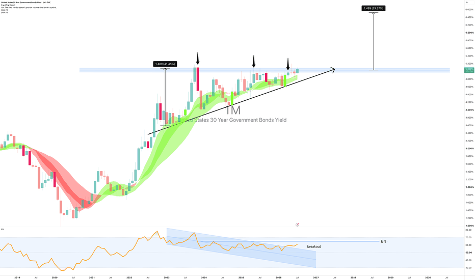
Markets Stay Sideways As Rising Treasury Yields, FOMC Minutes, aAfter a strong recovery over recent weeks, markets are taking a breather today as investors digest a combination of geopolitical developments, rising Treasury yields, and the upcoming release of the FOMC meeting minutes.
The first catalyst today comes from the Middle East. The U.S. military confirmed another round of strikes against Iran following attacks on vessels in the Strait of Hormuz. The renewed tensions have pushed crude oil prices higher, bringing energy markets back into focus and raising concerns that inflation risks may not disappear as quickly as many had hoped.
At the same time, traders are preparing for today’s release of the FOMC meeting minutes. While the Fed left policy unchanged, investors will be looking for additional insight into the committee’s thinking regarding inflation, the labor market, and the timing of future interest rate cuts. After a somewhat hawkish tone from Kevin Warsh two weeks ago, many market participants are choosing to reduce risk rather than aggressively add new positions ahead of the release.
Perhaps the most interesting development, however, is taking place in the bond market.
The U.S. 10-year Treasury yield is attempting to break above both its short-term channel and the major trendline that has capped yields since 2023. As shown in the chart below, today’s move represents an important technical test. A confirmed breakout would suggest that the recent decline in yields was merely corrective and that another leg higher may be underway.
Historically, higher Treasury yields tend to create headwinds for equities by increasing borrowing costs and making fixed-income investments relatively more attractive.
10 year US yields
For now, I continue to view the current environment as a broad summer trading range rather than the beginning of a major trend. Risk sentiment remains supported, but several cross-market signals—suggest that volatility is likely to remain elevated in the weeks ahead.
Grega