US 2-Year Yield: How to Read Fibonacci Extension After Reversal Market: TVC:US02Y US Government 2-Year Yield
Main lesson: Fibonacci extension is a projection tool, not a prediction tool.
Let’s dive into a chart that’s quietly telling a powerful story.
The US 2-year yield is giving us a textbook example of how traders can use the Fibonacci extension tool after a clean A-B-C structure forms. But this isn’t just about drawing lines and hoping for the best - it’s about understanding how trends evolve and where momentum might take us next.
Before we get into the fun stuff, one quick reminder; this chart shows yields, not bond prices. When yields rise, it usually reflects tighter rate expectations or stronger policy repricing. When they fall, it often signals easing expectations. Keep that in mind - it adds context to everything we’re about to explore.
What Is Fibonacci Extension?
Fibonacci tools can feel a bit mystical at first, but they’re actually pretty straightforward.
A retracement tells you how far price pulls back within a move, while the Fibonacci extension tool helps project where price might go next after a move and a correction.
Think of it like a three-step sequence:
A to B is the first push,
B to C is the pullback,
and from C onward, we project the next potential move.
The extension tool takes the size of that first push (A to B) and projects it forward from point C using Fibonacci ratios. It’s a simple concept, but when applied correctly, it becomes a powerful way to map potential future price zones.
Rules for Drawing Fibonacci Extension Correctly
To get meaningful levels, you need to draw the tool properly. While the process is straightforward, the quality of your inputs matters a lot.
First, you need to identify a clear trend shift or impulse. Point A should represent a meaningful swing low (in an uptrend) or swing high (in a downtrend), not just minor noise. From there, the move to point B should be a strong, directional impulse with visible momentum.
After that, you wait for a corrective pullback to form point C. Ideally, in an uptrend, this pullback holds above point A, confirming that the market structure is improving. Clean structure is key here - if price action is choppy or overlapping, extension levels tend to lose reliability.
Finally, it’s important to remember that Fibonacci works best when combined with other tools. Higher timeframes generally provide stronger signals, and confirmation from trend, momentum, and volatility indicators helps validate the levels.
The A-B-C Structure on This Chart
Here’s how the structure plays out on the chart.
Point A marks the four-month low near 3.376% in early March. This is where the previous decline in the 2-year yield stopped, and the market began to reverse higher.
From there, yields rallied sharply into Point B, around late March. This was the first strong upside impulse. The move was important because price broke away from the low, pushed above the 100-WMA, and showed that short-term rate expectations were being repriced higher.
After Point B, the market did not continue straight up. It corrected into Point C, near the 3.679% area in mid-April. This pullback is the key part of the structure. It held well above Point A, creating a higher low. That tells us sellers failed to return yields to the previous low, which is often an early sign that the market structure has shifted from decline to recovery.
Once yields bounced from Point C, the Fibonacci extension tool became useful. The tool takes the size of the first impulse from A to B and projects it upward from C. That gives traders a structured map of potential resistance levels.
The price action after Point C has respected this map well. Yields moved through the 38.2% and 50% zones, then held above the 61.8% extension near 4.088%, which is now acting as immediate support. The market is currently trading around 4.17%, just below the 78.6% extension near 4.199%, which is the next critical resistance.
How to Read the Extension Levels
Right now, the yield is hovering around 4.17%, sitting between two key Fibonacci levels:
• 61.8% extension at 4.088% (support)
• 78.6% extension at 4.199% (resistance)
This area acts as a decision zone. Holding above 4.088% keeps the recovery structure intact and suggests buyers are still in control. On the other hand, a break above 4.199% would signal stronger momentum and open the door for further upside.
The next major level above is the 100% extension near 4.341%, where the second move would match the size of the initial rally. Beyond that, the chart highlights additional resistance zones:
• January peak: 4.424%
• 127.2% extension: 4.521%
These levels help frame the potential path forward if momentum continues to build.
Why the 100% Level Matters
The 100% extension level represents symmetry in the market. It reflects a scenario where the move from point C matches the strength of the original A-to-B impulse.
In strong trends, price often reaches or exceeds this level. In weaker conditions, the move tends to stall earlier, typically around the 61.8% or 78.6% zones.
At the moment, the yield is approaching resistance but hasn’t fully broken through. That hesitation is important - it suggests the market is still deciding whether it has enough strength to continue higher.
Trend Context: The Recovery Is Still Constructive
Looking at the broader picture, the trend remains constructive, but it’s not accelerating aggressively.
The yield is holding above the 100-period weighted moving average, which indicates that the overall structure has improved since the March low. However, instead of trending sharply higher, price is beginning to move sideways near resistance.
This kind of behavior often reflects a pause - a period where the market consolidates before making its next directional move.
Bollinger Bands: Calm Before the Move?
The Bollinger Bands are tightening, signaling volatility compression. This typically means the market is entering a quieter phase, often followed by a larger move.
In general, narrow bands suggest low volatility and the potential for a breakout, while wider bands indicate that a trend is already in motion. Price positioning within the bands can also provide context, but it should always be interpreted alongside other tools.
In this case, the combination of compressed Bollinger Bands and nearby Fibonacci extension levels creates a clear setup. If the yield breaks above 4.199% and the bands begin to expand, it would support a move toward 4.341%. Conversely, rejection at resistance followed by a drop below 4.088% would weaken the structure.
PPO: Momentum Is Waiting
The PPO indicator is currently showing a lack of strong directional momentum. The lines are close together, and the histogram is hovering near zero, which is typical of a range-bound environment.
In general, the PPO helps identify shifts in momentum. Moves above the zero line suggest bullish conditions, while moves below indicate bearish pressure. Crossovers and changes in the histogram can signal strengthening or weakening momentum.
Right now, the key takeaway is that momentum hasn’t fully aligned with a breakout yet. For a stronger bullish signal, traders would typically look for a combination of factors:
• A clean close above resistance
• PPO turning higher
• Expanding histogram
• Bollinger Bands widening
• A successful retest of the breakout level
Until then, the structure remains constructive, but not fully confirmed.
Implied Volatility: Something’s Brewing
Implied volatility is starting to rise, which suggests the market may be preparing for a larger move.
Rising volatility often reflects expectations of increased price movement, while falling volatility points to stability or consolidation. When volatility increases near key support or resistance levels, it can signal that a breakout or rejection may be approaching.
In this case, the rise in implied volatility could be tied to upcoming macro catalysts such as inflation data, employment reports, or central bank communication. These factors can have a significant impact on short-term yield expectations.
Key Levels to Watch
The most important levels on the chart can be grouped into support and resistance zones.
Support levels:
• Immediate: 4.088%
• Secondary: 4.010%
• Deeper: 3.932%, 3.835%, 3.679%
Resistance levels:
• Critical: 4.199%
• Major extension target: 4.341%
• January peak: 4.424%
• Extended projection: 4.521%
At the moment, the key battleground lies between 4.088% and 4.199%. A breakout above this range could drive momentum toward 4.341%, while a breakdown below it may signal that the recovery is losing strength.
Educational Takeaway
The Fibonacci extension tool isn’t a crystal ball - it’s a roadmap. It highlights areas where price might react, not where it must go.
The real value comes from combining it with other elements of analysis, including trend structure, moving averages, momentum indicators, volatility signals, and, most importantly, price confirmation.
On this chart, the setup is clear. The structure is constructive, but the market is still in a decision phase. We’re sitting near a key inflection point, where the next move could define the direction of the trend.
Bottom line: Fibonacci gives you the map - but price action tells you when to move.
 Education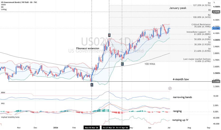
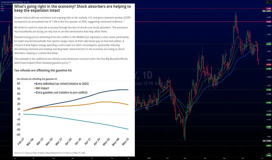
US 10Y TREASURY: Potential for extended declinesThe yield on the U.S. 10Y Treasury bonds moved lower during the week as investors digested the latest inflation data and continued to reassess the outlook for Federal Reserve monetary policy. Although yields started the week around 4,5% level, the strong move toward the downside, brought them down to 4,37% where they are closing the week. Softer Treasury yields reflected growing expectations that while inflation remains above the Fed's target, policymakers may be approaching the end of their tightening cycle, encouraging demand for government bonds.
This week's PCE data matched market expectations, but confirmed that inflationary pressures remain persistent, reinforcing expectations that interest rates could stay elevated for an extended period. Despite the inflation report, Treasury yields drifted lower toward the end of the week as investors focused on signs of moderating economic momentum and positioned ahead of next week's key labor market releases. Attention now shifts to the JOLTs job openings report, Nonfarm Payrolls (NFP), and the June unemployment rate, which are expected to play a crucial role in shaping expectations for future Federal Reserve policy. Stronger-than-expected employment data could renew upward pressure on Treasury yields, while weaker figures would likely support further declines in yields as markets increase expectations for future policy easing. As per current charts, the next level of 10Y yields could easily become the 4,3% level.
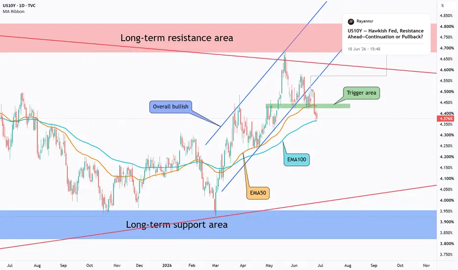
US10Y - Technicals Over Sentiment, Bearish Leg Starting?US10Y respected the technical structure despite the recent hawkish sentiment.
Price rejected the resistance area and the upper boundary of the weekly symmetrical red triangle, then broke below both the EMA50 and the green trigger area, which provided an early indication that a bearish leg may have started.
This move increases the probability that the recent reaction was driven more by technical factors than by the hawkish tone.
Price is now testing the EMA100, where a short-term reaction may develop and lead to a retest of the green area before continuation lower.
If the bearish scenario remains valid, the next area of interest becomes the lower boundary of the symmetrical triangle aligned with the support zone.
📌From a broader market perspective, US Treasury bonds are often considered lower-risk assets. Continued downside in US10Y yields may serve as an early signal that investors are gradually becoming more comfortable increasing exposure to higher-risk assets such as equities, cryptocurrencies, and other asset classes. However, confirmation across broader market conditions remains important.
The reaction around EMA100 may provide more clarity on whether the market is preparing for continuation lower, or if buyers still have room to challenge the breakdown.
⚠️ Disclaimer: This analysis reflects my personal market view and is not financial advice.
Rayan Nasser
#US10Y #Bonds #TechnicalAnalysis #PriceAction #EMA #MarketStructure #MacroAnalysis #Trading US interest rates Point & Figure says long term 14.1%At present, the Point & Figure (PnF) vertical count, using a 0.1 box size on a close-only basis, projects a very long-term target of 14.1% on the US 2-Year Treasury yield.
One of the reasons I pay close attention to the US 2-Year yield is my belief that the market leads the Federal Reserve, not the other way around. In particular, I believe the Fed largely follows the direction of the US 2-Year Treasury yield, which acts as the market's collective expectation of future monetary policy and inflation. By the time the Fed formally changes rates, the 2-Year yield has often moved well in advance.
Years ago, a Fed Governor publicly acknowledged that the market frequently leads the Fed's decisions rather than simply reacting to them. Whether intentional or not, that admission reinforced a view I had already held for many years: the bond market often tells us where policy is heading long before central bankers officially act.
If that relationship continues to hold, then PnF analysis of the US 2-Year yield can provide valuable long-term insight. Point & Figure charts do not tell us when a target will be reached, only that the underlying supply and demand dynamics imply a target exists. In this case, the chart suggests that 14.1% remains a possible long-term objective, particularly if inflation were to re-emerge as a major problem and policymakers were forced into another aggressive tightening cycle.
What makes this especially interesting is that the same methodology also identified the potential for yields to fall towards the historically low levels we eventually experienced. Looking back 20 years, very few market participants would have believed yields could decline as far as they did, yet the monthly PnF chart projected that possibility well in advance. The chart did not predict the timing, but it correctly identified the direction and scale of the move.
This is why I find Point & Figure analysis so powerful. It removes much of the day-to-day noise and focuses on the bigger structural moves that most market participants cannot yet imagine.
A note on the chart presentation: the green and red lines are the standard 45-degree PnF trend lines. Depending on your screen size and chart settings, they may not visually appear to be 45 degrees. This is simply a scaling issue caused by fitting decades of monthly data onto a single chart. If the chart is resized correctly, the trend lines retain their proper PnF geometry.
Good luck with your trading.
If you're based in the Caribbean, feel free to reach out. It's a part of the world I'd love to spend more time in and build some good friendships.
I'll always be involved in the markets because I genuinely enjoy trading and the challenge it brings. Long 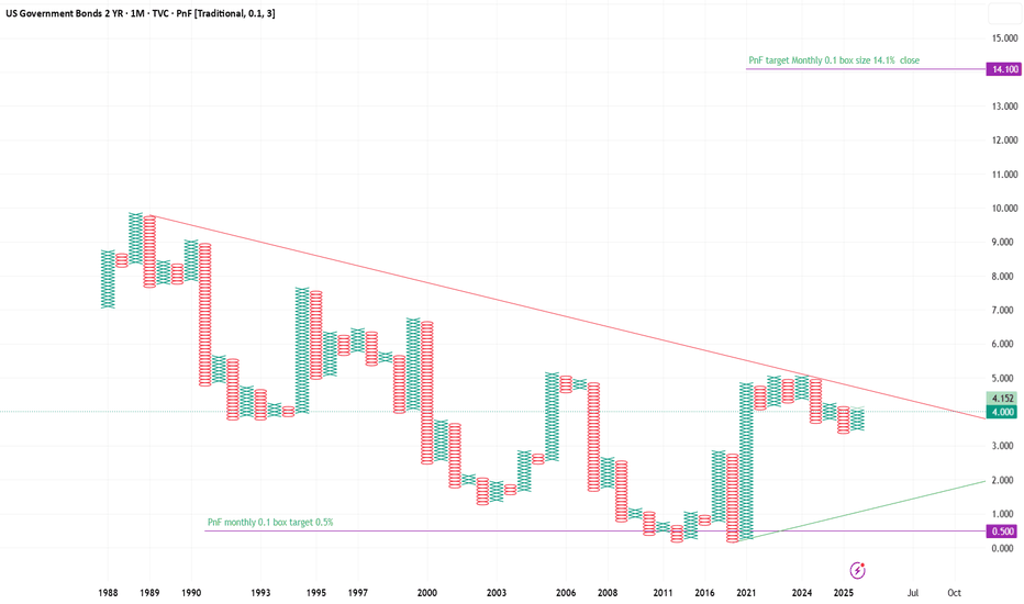
US interest rates target long term 14.1% At present, the Point & Figure (PnF) vertical count, using a 0.1 box size on a close-only basis, projects a very long-term target of 14.1% on the US 2-Year Treasury yield.
One of the reasons I pay close attention to the US 2-Year yield is my belief that the market leads the Federal Reserve, not the other way around. In particular, I believe the Fed largely follows the direction of the US 2-Year Treasury yield, which acts as the market's collective expectation of future monetary policy and inflation. By the time the Fed formally changes rates, the 2-Year yield has often moved well in advance.
Years ago, a Fed Governor publicly acknowledged that the market frequently leads the Fed's decisions rather than simply reacting to them. Whether intentional or not, that admission reinforced a view I had already held for many years: the bond market often tells us where policy is heading long before central bankers officially act.
If that relationship continues to hold, then PnF analysis of the US 2-Year yield can provide valuable long-term insight. Point & Figure charts do not tell us when a target will be reached, only that the underlying supply and demand dynamics imply a target exists. In this case, the chart suggests that 14.1% remains a possible long-term objective, particularly if inflation were to re-emerge as a major problem and policymakers were forced into another aggressive tightening cycle.
What makes this especially interesting is that the same methodology also identified the potential for yields to fall towards the historically low levels we eventually experienced. Looking back 20 years, very few market participants would have believed yields could decline as far as they did, yet the monthly PnF chart projected that possibility well in advance. The chart did not predict the timing, but it correctly identified the direction and scale of the move.
This is why I find Point & Figure analysis so powerful. It removes much of the day-to-day noise and focuses on the bigger structural moves that most market participants cannot yet imagine.
A note on the chart presentation: the green and red lines are the standard 45-degree PnF trend lines. Depending on your screen size and chart settings, they may not visually appear to be 45 degrees. This is simply a scaling issue caused by fitting decades of monthly data onto a single chart. If the chart is resized correctly, the trend lines retain their proper PnF geometry. Long 
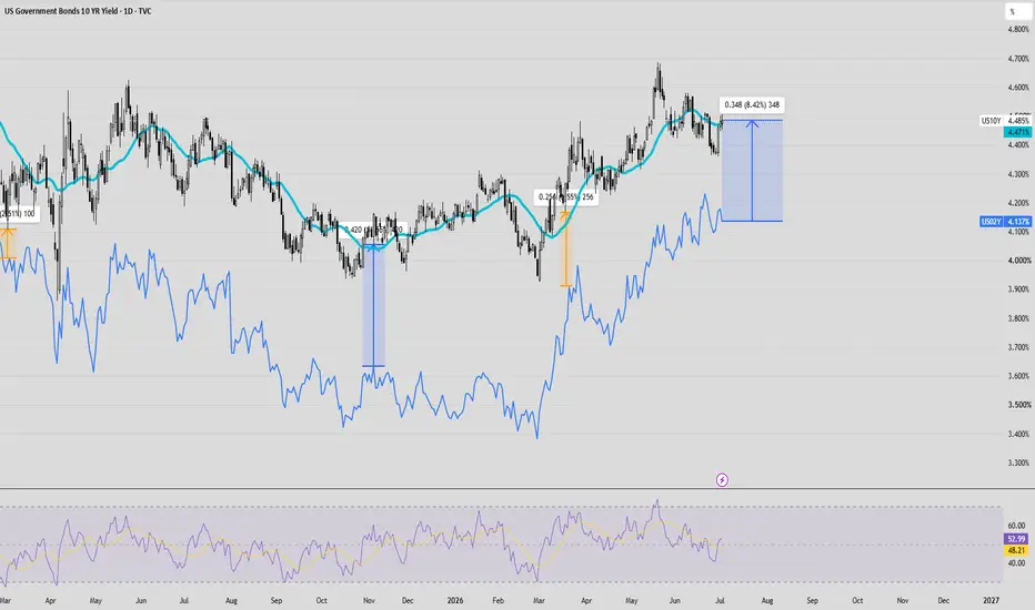
US10Y Holds Near 4.50%....US10Y Holds Near 4.50% — Breakout in Yields or Another Rejection Ahead?
US10Y is currently trading around the 4.48%–4.50% area after a period of choppy consolidation. The yield has recovered from the mid-June low near 4.42%, but it is now facing resistance around the 4.50% region. This area is important because a sustained move above it could signal renewed upside pressure in yields, while another rejection may keep the market locked inside the current range.
From a market structure perspective, US10Y is currently in a neutral-to-slightly bullish structure on the 4H chart. The strong rally in May pushed yields toward the 4.68% area, but since then the market has shifted into a broad consolidation phase. Recent price action shows higher short-term lows, suggesting that buyers are trying to defend the lower range, but the structure still needs a clean breakout above resistance before bullish momentum can be confirmed.
The first key resistance zone is 4.50%–4.52%. This is the immediate reaction zone where yields are currently struggling. If US10Y breaks and holds above this level, the next resistance area comes around 4.56%–4.58%. A stronger breakout above 4.58% could open the door toward 4.62% and possibly 4.68%.
On the downside, the first key support zone is 4.44%–4.42%. This area has recently acted as a short-term demand zone. If yields hold above this support, the market may continue to build upward pressure. Below that, the stronger support area sits around 4.38%–4.36%, which would become important if the current range breaks lower.
For the bullish scenario, US10Y needs to hold above 4.44%–4.42% and break above 4.52% with confirmation. If buyers can push yields above this zone, the next upside targets are 4.56%–4.58%, followed by 4.62% and 4.68%. A yield breakout could increase pressure on Gold, Nasdaq, and other rate-sensitive assets.
For the bearish scenario, rejection from 4.50%–4.52% would suggest that upside momentum is still limited. If yields then break below 4.42%, the market may move back toward 4.38%–4.36%. A deeper break below 4.36% would weaken the short-term recovery structure and suggest that yields are losing momentum again.
Market sentiment is currently neutral but leaning slightly bullish. Yields are no longer falling aggressively, and buyers have been defending the lower range. However, the market is still below the key breakout zone, so confirmation is needed before calling for a stronger upside move.
Right now, the key question is simple: can US10Y reclaim 4.52%, or will sellers defend the resistance again?
What do you think?
Will US10Y break above 4.52% and push toward 4.58%–4.62%? Or will yields reject from resistance and fall back toward 4.42%?
Share your view below — yield breakout or range rejection? Central Banks' Actions — Why Global Inflation Is Here to StayOver the past few months, I've repeatedly pointed your attention to the US bond market. Yields on 10-year and 30-year US Treasury bonds remain at levels that typically signal expectations of higher inflation and higher interest rates for a prolonged period of time.
But the most interesting part is that this is not just an American story.
If you look at the UK, Germany, Japan, and most other major economies 🔍
You'll notice the same trend. Long-term government bond yields are sitting near multi-year highs despite central banks spending years talking about bringing inflation back under control 💬
The bond market is sending a simple message:
Investors no longer believe we're quickly returning to the world of zero interest rates, cheap credit, and ultra-low inflation.
🤔 Why?
Because over the last 15 years, governments have accumulated enormous amounts of debt. As long as rates stayed near zero, this wasn't a major problem. Today, however, the situation has changed dramatically.
The higher rates go, the more expensive it becomes to service that debt.
This is why central banks have found themselves trapped. 🪤
On one hand, higher rates help contain inflation. On the other hand, they slow economic growth, increase government interest expenses, and create risks across the financial system.
One country stands out from the rest: China.
China faces a different problem. The economy is still dealing with the aftermath of its real estate crisis, consumer demand remains weak, and policymakers are focused on stimulating growth rather than fighting inflation. That's why Chinese bond yields haven't followed the same path as most of the world.
But today, China is the exception.
For most developed economies — and many emerging ones as well — the core issue remains the same: too much debt and increasingly expensive money.
🤖 Now add another major factor to the equation: AI.
At first glance, AI should be deflationary. Companies can produce more with fewer employees, reduce costs, and improve efficiency.
But there's another side to the story.
If AI continues replacing a meaningful share of the workforce, governments will face a new political challenge. Millions of people without stable income could mean weaker consumer spending, rising social tensions, and growing pressure on policymakers. ✊
In that environment, governments will likely face two choices:
Either allow the labor market to undergo a painful adjustment, or expand social programs, subsidies, benefits, and perhaps even move toward some form of universal basic income.
And that's where a new source of inflationary pressure emerges.
Not because AI itself creates inflation, but because the government's response to large-scale job displacement could lead to larger deficits, more debt, and eventually more money creation.
The result is a fascinating paradox:
Technology may be deflationary, while the political response to technology may be inflationary. 🤷♂️
📈 What does this mean for stocks and crypto?
As long as rates remain high, risk assets face headwinds. If investors can earn 4-6%+ annually in government bonds with relatively low risk, demand for growth stocks and cryptocurrencies naturally declines.
However, the long-term picture looks very different.
History shows that governments rarely solve debt problems through austerity alone. More often, debt is gradually reduced through years of moderate inflation.
Not hyperinflation.
Simply inflation that remains above official targets for an extended period of time 📈
❗️That's why I continue to closely monitor the bond market.
Today, high rates are creating pressure on stocks and crypto, but this environment cannot last forever. The longer governments operate with massive debt burdens and expensive debt servicing costs, the greater the probability that monetary policy will gradually become more accommodative in the years ahead.
If that scenario begins to unfold after 2027, investors may once again face a familiar challenge: how to preserve purchasing power in a world where money loses value faster than official inflation targets suggest.
Historically, capital tends to flow into scarce assets during such periods: stocks, gold, real estate, and Bitcoin. 💰
That's why my long-term outlook on Bitcoin remains bullish.
Not because Bitcoin magically goes up forever, but because its supply is fixed while the amount of money in the global financial system continues to expand over time.
_____
👉 If you want to trade like a professional and not like a gambler — follow for real insights and strategies 🚀 Short 
US 10Y TREASURY: Yields rise on rate-hike risksU.S. Treasury yields moved higher this week as markets reacted to the Federal Reserve’s more hawkish tone following Chair Kevin Warsh’s first policy meeting. Although rates were left unchanged, the Fed signaled that additional tightening remains possible if inflation proves persistent, prompting investors to reassess the outlook for monetary policy. This shift reinforced expectations of a “higher-for-longer” rate environment, pushing benchmark yields, the 10Y Treasury, upward closing the week at 4,48%. .
The 10Y yields remain a key focus for markets, serving as the primary barometer of shifting rate expectations and broader risk sentiment. Looking ahead, upcoming U.S. inflation data next week, the PCE report, will be critical in determining whether yields continue to trend higher or stabilize as markets reassess the Fed’s policy path. Current prospects are on the upside, as a strong shift on Friday, indicated that the market sentiment continues to hold toward the upside of the US 10Y yields. Current charts are showing the potential for yields to return back toward the 4,5% level, however, PCE data will most certainly bring back higher volatility to the market.
 Long
Long
US10Y — Hawkish Fed, Resistance Ahead—Continuation or Pullback?Following yesterday’s FOMC communication and the market’s interpretation of Kevin Warsh’s conference as relatively hawkish, Treasury markets reacted by repricing expectations toward a more restrictive path ahead. Markets focused less on the unchanged rate decision and more on the stronger commitment to price stability and reduced expectations for near-term easing. Short-term Treasury yields moved higher as investors reassessed future policy expectations.
From a technical perspective, US10Y remains in a broader bullish structure on the daily timeframe, but price is now approaching an important resistance area aligned with the upper boundary of the symmetrical triangle.
At the same time, yield action is currently compressed between the 20 EMA and 50 EMA — an area that often acts as a short-term decision zone.
EMA20 (20-period Exponential Moving Average) reacts faster to recent price action and reflects short-term momentum.
EMA50 tends to represent the intermediate directional trend.
When price becomes trapped between both averages, it often signals temporary equilibrium before expansion in either direction.
From here, two scenarios become relevant:
→ If yields lose support and break below the highlighted green area and the 50 EMA, downside momentum may gain probability. In that case, a break-and-retest sell setup could become attractive, with potential movement toward the next support zone and the lower boundary of the symmetrical triangle.
→ If yields hold above the current support and reclaim momentum, a break above the nearby resistance and upper boundary of the symmetrical triangle could signal continuation of the broader bullish structure. In this case, buyers may remain in control and the market could continue pricing a more persistent hawkish outlook.
For now, the key question is:
Will resistance and EMA compression trigger a bearish rotation, or will yields continue pricing a more persistent hawkish environment?
This is a scenario-based analysis — not a prediction.
Disclaimer: This analysis is shared for educational purposes only. It reflects personal market observations and does not constitute financial advice or a trading recommendation.
Rayan Nasser
#US10Y #TreasuryYields #Bonds #FOMC #InterestRates #TechnicalAnalysis #Macro #PriceAction US10Y (United States government 10 year treasury bond yield)US10Y refers to the U.S. 10-Year Treasury Note Yield (also called the 10-year Treasury yield). It is a key benchmark interest rate representing the yield (return) on the U.S. government’s 10-year debt obligation. 
• Current level Approximately 4.43%–4.44%
• It serves as a major economic indicator, influencing mortgage rates, corporate borrowing costs, stock valuations, and currency strength (e.g., higher US10Y often supports USD in pairs like GBP/USD). 
Bond Price vs. Bond Yield: The Inverse Relationship
• Bond Price: The current market value of the bond (what you pay to buy it). Bonds are typically issued with a face value (par value) of $1,000. Prices are quoted as a percentage of par (e.g., 99.5 means $995 for a $1,000 bond). 
• Bond Yield (specifically yield to maturity or current yield): The effective annual return an investor earns if they hold the bond to maturity, accounting for the purchase price, coupon payments, and face value repayment. It is expressed as a percentage. 
Key relationship: Bond prices and yields move in opposite directions (inverse relationship). 
• If bond prices rise (e.g., due to high demand or falling interest rates), yields fall.
• If bond prices fall (e.g., due to selling pressure or rising rates), yields rise.
Example:
• A bond with a $1,000 face value trading at par ($1,000) has a yield roughly equal to its coupon rate.
• If the price drops to $950, the yield increases (you get the same coupons + a gain at maturity for less upfront cost).
• If the price rises to $1,050, the yield decreases. 
This dynamic is central to how central bank policies and economic data affect markets.
What Is a Coupon?
The coupon (or coupon rate) is the annual interest rate that the bond issuer promises to pay the bondholder, expressed as a percentage of the bond’s face value. Payments are typically made semi-annually (twice a year). 
• Calculation: Coupon payment = Face value × Coupon rate.
• Example: A $1,000 bond with a 4.375% coupon pays $43.75 annually ($21.875 every six months). 
The coupon rate is fixed at issuance for most bonds and does not change. It determines the regular interest income you receive regardless of the bond’s market price. 
Coupon vs. Yield:
• Coupon rate: Fixed interest payment based on face value.
• Yield: Actual return, which varies with the purchase price. 
Types of Coupons
1. Fixed-Rate Coupons (most common):
• The interest rate stays the same throughout the bond’s life.
• Predictable payments. Dominant in U.S. Treasuries. 
2. Floating-Rate Coupons (Floating Rate Notes or FRNs):
• The coupon resets periodically (e.g., every 3–6 months) based on a benchmark rate (like SOFR or Treasury bill rate) + a fixed spread.
• Payments adjust with market rates, reducing interest rate risk for the holder. 
3. Zero-Coupon Bonds:
• No periodic interest payments (“zero coupon”).
• Issued at a deep discount to face value; the investor’s return comes entirely from the difference when the bond matures at par.
• Example: Buy for $800, get $1,000 at maturity—the $200 difference is the implied interest. 
#US10Y #bonds #yield Long