BTCUSD Liquidity Sweep & Bullish Recovery Setup
BTCUSD is showing signs of a potential bullish recovery after a strong intraday sell-off, with price reacting from the highlighted demand area near the recent weak low. The sharp decline appears to have swept downside liquidity before buyers stepped in, creating an opportunity for a short-term reversal.
The recent CHoCH followed by BOS suggests that market structure is beginning to shift in favor of buyers. As long as price continues to defend the demand zone and holds above the weak low, the current pullback can be viewed as a potential liquidity sweep and accumulation phase rather than a confirmed bearish continuation.
The key confirmation is a sustained reclaim of 64,107, which would strengthen bullish momentum. A successful break and hold above 64,433 could open the way toward the next upside liquidity around 64,900, while the larger strong high near 65,400 remains a major target if momentum expands.
However, the bullish scenario remains conditional. If BTC fails to hold the demand zone and breaks below the 63,182 weak low with strong selling pressure, the recovery setup would be invalidated and further downside could develop.  Long
Long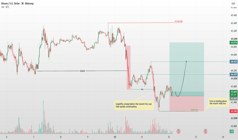
Part 2: The Breakout That Was Never Meant to ContinueHow Some Breakouts Exist Mainly to Trap Traders
A breakout looks exciting because it gives traders the feeling that something important has changed.
Price was stuck below resistance, and suddenly it moves above it.
Many traders see this and immediately think, “The resistance is broken. Price is going higher.”
But not every breakout is real.
Sometimes price breaks the level, attracts buyers, and then quickly reverses.
This is known as a false breakout.
1. What is a false breakout?
A false breakout happens when price moves above an important resistance level but cannot stay there.
For example:
A stock has been struggling around **$500** for several days.
Every time it reaches $500, sellers appear and push it lower.
Then one day, price suddenly moves to $510.
Traders see the move and start buying.
But instead of continuing higher, price falls back below $500.
The breakout has failed.
2. Why do traders get trapped?
Because the first move looks convincing.
When price crosses resistance, traders often believe that the market has finally changed.
They may buy because:
- Resistance has been broken.
- The chart looks bullish.
- They expect a bigger move.
- They do not want to miss the opportunity.
The problem starts when price cannot hold above the breakout level.
Now these traders are sitting in a position that is moving against them.
3. The breakout attracts buyers
This is what makes a false breakout dangerous.
The market may move just far enough above resistance to make traders believe the breakout is real.
For example, resistance is at **$500**.
Price moves to $505, then $510.
A trader sees this and enters at $510.
But instead of moving toward $520 or $530, price starts falling.
Suddenly, the trader who entered at $510 is trapped.
4. The old resistance becomes important again
One of the clearest signs of a failed breakout is when price comes back below the old resistance.
If $500 was resistance and price breaks above it, traders expect $500 to become support.
But if price falls back below $500, that is a warning.
It tells us that buyers were not strong enough to hold the breakout.
The market tried to move higher but failed.
5. Stop-losses can make the fall faster
Many breakout traders place their stop-loss just below the old resistance.
Suppose the breakout happens at $500.
A trader buys at $505 and places a stop-loss around $495.
If price falls back below $500, more traders may start exiting.
Once their stop-losses are triggered, additional selling can enter the market.
This can make the reversal much faster.
6. A failed breakout can move strongly in the opposite direction
This is one of the most interesting parts.
A normal rejection is one thing.
But when many traders have bought the breakout and then suddenly realize they are wrong, they may all try to exit around the same time.
That can create strong selling pressure.
So a failed breakout can sometimes produce a sharper fall than the original rejection.
7. Do not assume every breakout is a trap
This is equally important.
Not every breakout is designed to trap traders.
Many breakouts are genuine.
The point is not to become afraid of breakouts.
The point is to understand that **crossing a resistance level is not enough**.
You need to see whether price can actually hold above it.
8. What does a healthy breakout look like?
A stronger breakout usually shows acceptance above the old resistance.
For example:
Price breaks $500.
It moves to $505.
Then $510.
It pulls back slightly but remains above $500.
Buyers step in again.
Price starts moving higher.
This tells us that the market is accepting prices above the old resistance.
9. What does a weak breakout look like?
A weak breakout often has different behaviour.
Price breaks $500.
It moves to $505 or $510.
Then buyers stop pushing.
Price starts falling.
It comes back to $500.
Then it breaks below $500.
This is a warning that the breakout may have failed.
10. Watch the reaction, not just the breakout
This is one of the most important lessons.
Do not focus only on the moment price crosses resistance.
Watch what happens afterward.
Ask:
Can buyers keep price above the level?
If yes, the breakout becomes more convincing.
If no, the breakout becomes suspicious.
The reaction after the breakout often tells you more than the breakout itself.
11. Volume can give extra information
Volume can also help.
A breakout with strong volume can show that many traders are participating.
A breakout with very low volume may deserve more caution.
But volume alone does not prove that a breakout is real.
Even high-volume breakouts can fail.
Always look at the price behaviour along with volume.
12. Fear of missing out creates many bad entries
One reason traders get trapped is FOMO.
They see price breaking resistance and think:
“If I don't buy now, I will miss the move.”
So they enter immediately.
But the market does not care whether you entered or not.
Sometimes waiting for confirmation gives you a much better picture.
If the breakout is genuine, price can continue higher.
If it is false, waiting may keep you out of the trap.
13. The simple way to think about it
When price breaks resistance, do not immediately ask:
“Should I buy?”
First ask:
“Can price stay above this level?”
That one question can change the way you look at breakouts.
A breakout that holds can become a real move.
A breakout that quickly fails can become a trap.
14. The key takeaway
A breakout is not confirmed simply because price moves above resistance.
You need to see acceptance.
Watch whether price stays above the level.
Watch whether buyers continue to show strength.
Watch whether the old resistance turns into support.
And most importantly, watch what happens if price falls back below the level.
The first move gets your attention.
The reaction tells you whether the breakout was real.
By @BrightRally_Research Education 
Part 1: The Market Remembers Where It Was HurtMarkets have a memory. Not in the way people do, of course, but price often reacts around the same areas where it reacted strongly in the past.
This is why an old rejection zone can become important again.
Imagine a stock moving from ₹400 to ₹500. Buyers are excited and keep pushing the price higher. But when the stock reaches around ₹500, sellers suddenly become aggressive. The price struggles to move above that area and eventually falls back to ₹450.
That ₹500 area has now become important.
Months later, the stock starts moving higher again and comes back toward ₹500. At first glance, you might think, “That happened a long time ago. Why should this level matter now?”
The answer is simple: the traders who were involved in the earlier move may still remember what happened there.
Some traders may have bought around ₹500 and then watched the stock fall. They were trapped in a losing position. If the stock eventually comes back to ₹500, they may see it as a chance to get out without a loss.
They may simply think, “I have been waiting for this level. I am selling now.”
Now imagine many traders thinking the same thing.
That can create selling pressure when price reaches the old zone again.
But it is not only trapped traders who matter. New traders looking at the chart can also see the previous rejection. They know that sellers were strong around that area before. Because of this, some of them may expect another rejection and start selling when price gets close.
This is one reason old rejection zones can remain relevant for a long time.
However, there is an important difference between saying a level is important and saying price will definitely reverse there.
An old rejection zone is not a guaranteed sell signal.
It is simply an area where traders should start paying closer attention.
What matters most is how price behaves when it returns.
Suppose price approaches the old zone slowly. The candles become smaller, the stock struggles to move higher, and sellers begin appearing again. That tells us the old zone may still have influence.
Now imagine the opposite.
Price reaches the same zone with strong momentum. Buyers continue pushing higher, the stock breaks above the previous rejection area, and price stays above it.
That tells us something has changed.
The sellers who controlled that area in the past may no longer be strong enough to stop the buyers.
This is why you should never trade an old rejection zone blindly.
The old level gives you a place to watch. The current price action gives you the information you need.
Another important point is that these zones are usually areas, not exact numbers.
If a stock was rejected between ₹495 and ₹505, you should not assume that ₹500 is a special number. Markets do not always respect exact prices.
Price may move slightly above ₹500 before sellers appear. It may also turn around at ₹497 or ₹503.
What matters is the overall behaviour around the area.
You also need to look at the bigger picture.
An old rejection zone during a strong uptrend may eventually break because buyers keep getting stronger.
The same zone during a weak or falling market may lead to a much stronger rejection.
The level is the same, but the market around it has changed.
This is why old rejection zones should be treated as context, not certainty.
They tell us where the market struggled before.
They show us where buyers and sellers had a strong fight.
They can reveal where traders may still be trapped or waiting for an opportunity to exit.
And when price comes back to that area, all of those factors can come into play again.
The most important lesson is simple.
Do not assume the old reaction will repeat. Watch what price does when it reaches the old zone.
The past gives you the level to watch.
The present tells you whether that level still matters.
By @BrightRally_Research Education 
Long 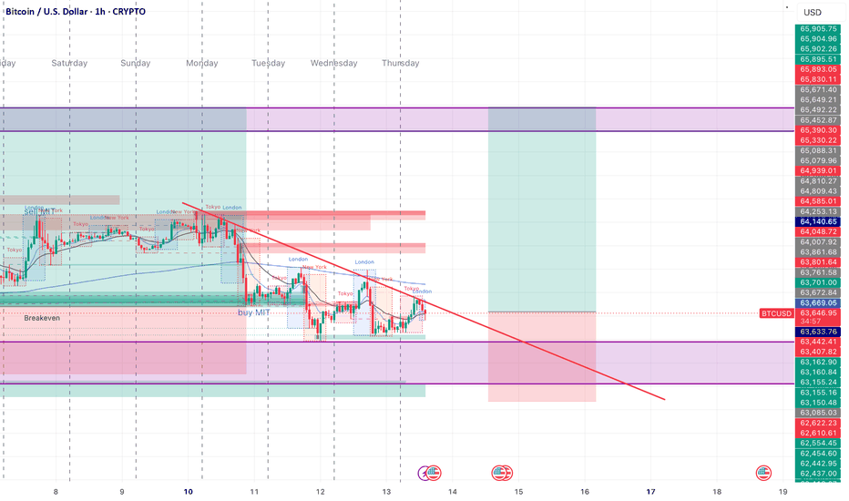
The Most Dangerous Candle Is Often the One Everyone LikesA large bullish or bearish candle is one of the most attractive things on a chart. When traders see a strong green candle breaking a resistance level, the immediate thought is often, “The trend has started.” When a large red candle breaks support, many immediately expect further downside. The candle looks powerful, clean and convincing. But sometimes, that is exactly what makes it dangerous.
The problem is not the candle itself. The problem is what happens after everyone notices it. A strong candle attracts attention because it shows urgency. Traders who were waiting for confirmation enter late, breakout traders jump in, and traders who were on the opposite side may rush to exit. This sudden increase in participation can push price even further, making the move look stronger than it really is.
A Strong Candle Can Hide Weak Positioning
Imagine a stock has been moving sideways for several days. Suddenly, a huge green candle breaks above the range. The candle closes near its high, volume increases and everything looks bullish.
A trader who sees this for the first time may think the safest decision is to buy immediately.
But there is an important question to ask:
Who is buying at this point?
Some traders may have bought much earlier near the bottom of the range. They are already sitting on profits. New buyers, however, are entering after price has already moved significantly.
This creates an interesting situation. The candle may represent genuine buying, but it may also become the point where late buyers enter just before existing holders start taking profits.
That is why a strong candle should not automatically be treated as a signal to enter.
The Candle Is Information, Not Confirmation
One of the biggest mistakes traders make is treating one candle as a complete story.
A candle only tells us what happened during a particular period. It does not tell us what will happen next.
A large breakout candle tells us that buyers were aggressive during that period. It does not guarantee that buyers will remain aggressive afterward.
The next few candles are often more important.
If price breaks resistance and continues holding above it, the breakout becomes more convincing. But if price quickly falls back below the breakout level, the meaning of that original candle changes completely.
What looked like strength may have been a trap.
The Real Danger Comes From Chasing
There is nothing wrong with buying a breakout. The danger comes from buying simply because the candle looks impressive.
This is where emotions take over.
A trader sees price moving quickly and feels that waiting means missing the opportunity. The candle becomes bigger, the fear of missing out becomes stronger, and the trader enters without thinking about where the trade is invalidated.
Ironically, the stronger the candle looks, the more tempting it can be to chase.
Good trading is often about doing the opposite: when everyone is excited, slow down and examine the structure.
Ask where price was before the candle appeared. Ask whether the breakout is happening from an important level. Ask whether the candle is closing outside the range or merely pushing through it temporarily.
These questions are more useful than simply asking whether the candle is bullish or bearish.
Watch What Happens After the Candle
The candle itself is not the final signal. The reaction after it is often more valuable.
Suppose a stock produces a massive bullish candle above resistance. Instead of buying immediately, watch what happens next.
If price pulls back slightly, holds the breakout area and then starts moving higher again, the market is showing that buyers are willing to defend the new level.
But if price quickly falls back into the previous range, the breakout deserves much more suspicion.
The same logic works on the downside.
A huge red candle breaking support may look extremely bearish. But if price immediately recovers and closes back above the broken support, the breakdown may have simply collected stop-loss orders before reversing.
This is why the candle after the big candle can sometimes tell you more than the big candle itself.
Look at the Location, Not Just the Candle
A large candle in the middle of nowhere is not the same as a large candle appearing at an important market structure.
This is one of the simplest ways to improve candle analysis.
A huge bullish candle after a long decline and near a major support zone has a different meaning from a huge bullish candle that appears after price has already rallied sharply into resistance.
The shape may be almost identical.
The context is completely different.
Instead of asking:
“Is this a strong candle?”
Ask:
“Where did this strong candle appear?”
That small change in thinking can prevent many impulsive trades.
Sometimes the Best Trade Is the Second Move
You do not have to catch the first move.
This is something many traders struggle to accept.
Markets give multiple opportunities. If a huge candle breaks a level, you can wait for the market to prove whether that breakout is genuine.
Sometimes price will retest the broken level. Sometimes it will form a small consolidation above it. Sometimes it will completely reject the breakout.
Waiting may mean entering at a slightly higher or lower price than the first candle, but you may gain something much more valuable: **better information**.
The goal is not to enter as early as possible.
The goal is to enter when the probability and risk make sense.
The Lesson:
A powerful candle deserves attention, but it does not automatically deserve a trade.
The most dangerous candle can sometimes be the one that looks perfect because it creates the strongest emotional reaction. Everyone sees it. Everyone talks about it. Everyone wants to participate.
That is exactly when a trader should stop and ask what the market is actually doing.
A candle is only one piece of information. Its location, the preceding structure, volume, follow-through and reaction around the breakout level all matter.
Don't trade the candle because it looks strong. Trade the story behind the candle.
The market does not reward the trader who reacts fastest to every impressive candle. It rewards the trader who understands why that candle appeared and what price does next. Education 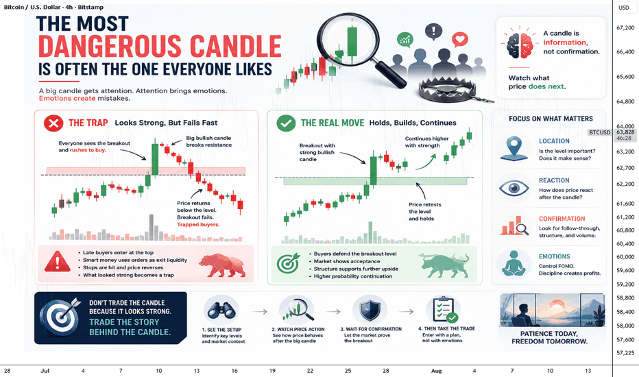
 Short
Short
Education

Long 
 Long
Long
 Short
Short
Short 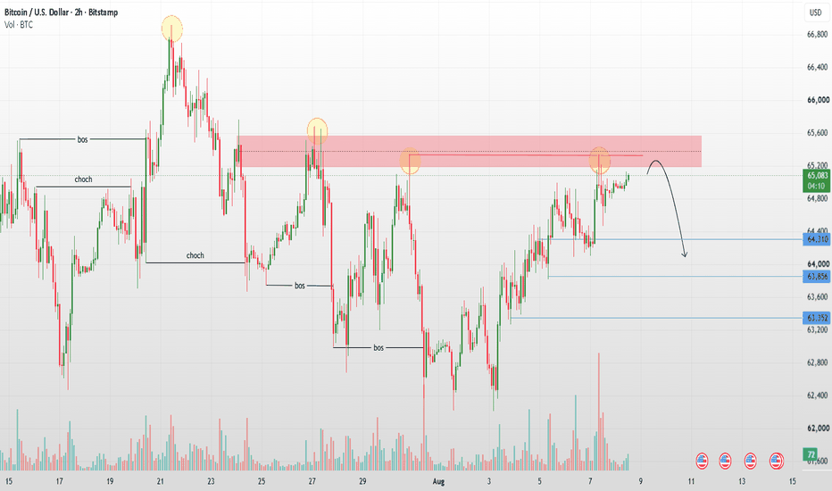
Short 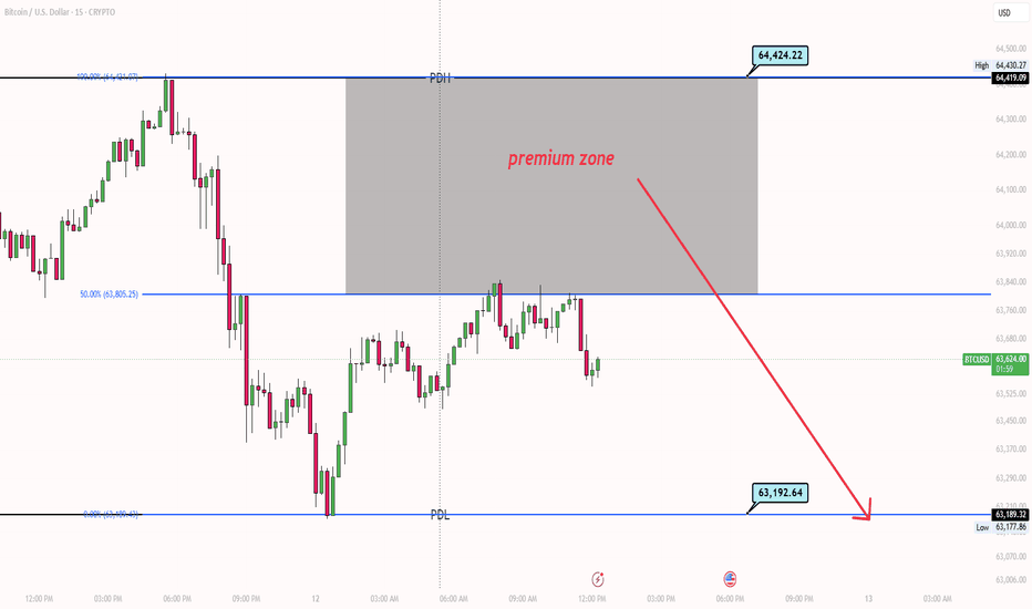
 Long
Long
The Last Buyer Sets The PricePrice moves every second, but what actually makes it move from one level to the next?
A common explanation is that price rises because there are more buyers than sellers. It sounds logical, but the reality is more interesting. Every completed trade still has a buyer and a seller. What changes is the price at which participants are willing to transact.
Think of the market as a continuous auction.
Someone is willing to buy at ₹100. Another participant accepts that price, and a trade happens. Then a buyer is willing to pay ₹101. If someone accepts that price, the market trades there. The process continues as long as participants are willing to transact at higher prices.
So What Actually Moves Price? :
The better question isn't simply, "Are there more buyers?"
Ask:
Who is willing to pay more? :
If the available sellers at ₹100 are taken and the next available sellers are at ₹101, a buyer willing to pay ₹101 helps move the traded price higher.
The same idea works in reverse.
When buyers stop accepting higher prices and sellers become willing to transact at lower levels, price can begin moving down.
When the Next Buyer Disappears :
Imagine price moving from ₹100 to ₹103.
At ₹100, buyers are willing.
At ₹101, they are still willing.
At ₹102, buyers continue accepting higher prices.
But at ₹103, the next buyer isn't willing to pay more.
The market may now struggle to continue higher.
This doesn't automatically mean a reversal is coming. It simply means the immediate willingness to keep bidding higher has weakened.
That's where the chart becomes interesting.
Read the Reaction :
Instead of focusing only on a breakout or a large green candle, watch what happens afterward.
Does price continue?
Does it hold above the level?
Does it repeatedly reject the same area?
Does it quickly return below the breakout?
The reaction often tells you more than the initial move.
A market can reach a new high and still fail to find enough willingness to continue higher.
Why This Matters
This perspective changes how you read price action.
Instead of asking only whether a candle is bullish or bearish, start asking:
Where did buyers accept higher prices?
Where did they stop accepting them?
Where did price struggle to continue?
What happened after the market reached an important level?
You don't need to predict every move. You need to understand what the market is accepting and what it is rejecting.
Conclusion :
Markets don't need everyone to agree.
They only need the next willing participant to transact at a different price.
That's why the next buyer can matter more than the number of buyers you see on a chart.
The next time you see price pushing higher, don't just ask why buyers are strong.
Ask:
Who is still willing to pay more?
Sometimes, the most important clue is not the buyer who arrived.
It's the buyer who never did. Education 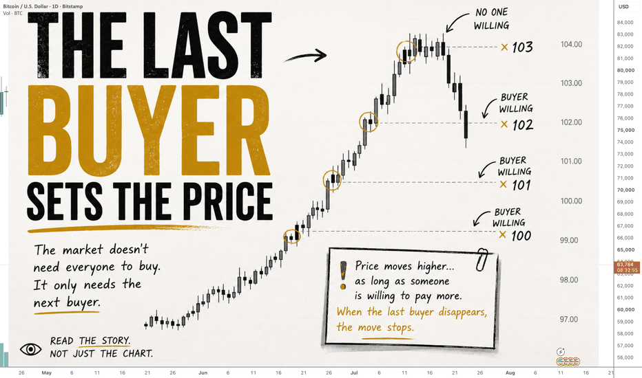

Long 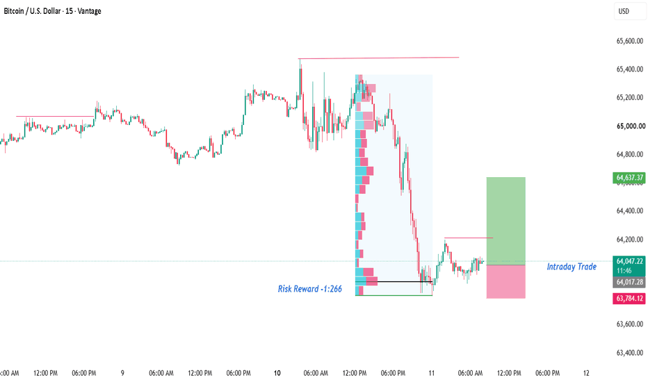
Bitcoin H2 - Bears Continue, Correction SignalBitcoin is trading around 64,900 USD, up slightly by about 106 USD on the day, but has not yet made a clear breakthrough.
Today's fluctuation range is only in the range of 64,696–65,348 USD, showing that BTC is inclined to accumulate rather than extend the trend.
On H2, Bitcoin recovered well from the $62,400–62,800 zone, but is now repeatedly blocked below the $65,300–65,500 resistance zone. The price continuously tried to break out but could not maintain above, while RSI also turned to cool down.
To me, this is a signal that short-term upward momentum is weakening.
If $65,500 continues to be defended, BTCUSD is likely to enter a correction back to the $63,200–$63,600 range before the market finds new momentum.
The notable thing this week is still the US CPI on August 12; Before this important data, the sideway state under resistance may continue. Short 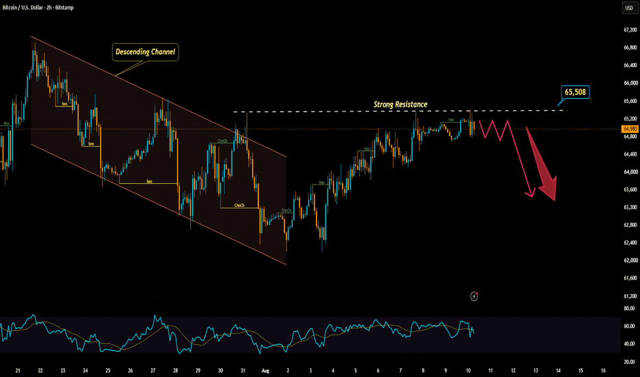
BTCUSDT: FED pressures the USD, Bulls keep pushing!Bitcoin is currently trading around 65,042 USDT. The current 8-hour (H8) candle shows a gain of approximately 140 USDT (+0.22%), indicating that buying pressure persists but lacks the strength to trigger a clear breakout. Prices are consolidating after recovering from the lows seen earlier this month.
The macroeconomic backdrop remains relatively favorable for Bitcoin this morning. Weak US labor data has dampened expectations of a Fed rate hike, thereby exerting downward pressure on the USD and bond yields—an environment that typically supports risk assets.
On the H8 timeframe, the short-term structure is improving as the price holds above both the EMA34 (around 64,445) and the EMA89 (around 64,243). I am keeping a close watch on the 62,500–63,800 USDT support zone.
In this scenario, strong buying interest from the support zone could drive BTCUSDT back to the 66,000–66,900 USDT range, with the 66,911 level serving as a key target on the chart.
Conversely, if the price breaks decisively below 62,500 and fails to recover, the bullish outlook will need to be re-evaluated.
Are you waiting for a BTC pullback to buy, or do you expect a direct breakout to 66,900? Long 
BTCUSD 4HChart Concept & Observation :
The highlighted box in this chart represents a potential support and resistance zone, where price has historically reacted and may continue to do so.
If any bullish or bearish price action pattern / candlestick formation appears near the upper or lower boundary of this box, it may indicate a possible reversal opportunity.
In some cases, the market may also respect the midpoint (50% level) of the box. Therefore, any significant price action signal forming around this level can also lead to a potential reversal.
Additionally, if liquidity zones/lines are marked above or below the box, price may be drawn toward those areas before reacting.
For better reversal confirmation, lower timeframe analysis can also be used to refine entries.
This framework helps in identifying key reaction zones, but it should always be used in conjunction with proper confirmation and risk management.
Disclaimer :
This chart is shared purely for educational and journaling purposes only. It reflects my personal market observations and thought process.
I am not a SEBI-registered financial advisor.
This is not a buy/sell recommendation, trading signal, or investment advice.
No calls or tips are being provided here.
I am simply documenting what I observe and how I interpret the market. BTCUSDT Rejects Resistance — Bearish Pullback Setup📊 ANALYSIS:
BTCUSDT maintains a short-term HH/HL structure after the recent bullish BOS, but price is now consolidating directly below the 65,177–65,568 supply zone.
The 65,568 area acts as key resistance, while 64,258 and 63,916 are the visible Fibonacci retracement levels.
The chart shows a bullish FVG around 62,800–63,200, which could act as a deeper demand/imbalance zone if the pullback accelerates.
Ichimoku cloud structure remains supportive below price, but rejection from supply could trigger a retracement toward the lower levels.
A decisive breakout above supply would shift momentum back toward continuation.
🎯 BULLISH SCENARIO:
A clean 2H close above 65,568 confirms resistance breakout → targets 65,750–66,000.
🔻 BEARISH SCENARIO:
Rejection below 65,177–65,568 followed by a break of 64,258 → targets 63,916, then the 62,800–63,200 FVG.
⚠️ INVALIDATION:
2H close above 65,568 invalidates the bearish pullback setup.
📌 BIAS:
Neutral → Bearish below 65,568; bullish on confirmed breakout.
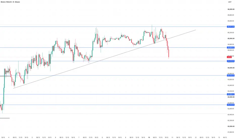
#BTC #BTCUSDT #CryptoTrading #PriceAction #TechnicalAnalysis #SmartMoneyConcepts #TradingView BTCUSDT – 45M Technical AnalysisBitcoin has broken below the rising trendline, showing increasing bearish momentum. Price has also moved below the 64,570–64,695 support zone and is now approaching the key 64,235 support level.
Key Levels:
🔴 Major Resistance: 65,397
🔴 Resistance Zone: 64,570–64,695
🔵 Support: 64,235
🔵 Next Support: 63,742
🔵 Lower Support: 63,098
Trade Outlook:
As long as BTC remains below 64,695, the short-term bias remains bearish.
A confirmed breakdown below 64,235 could open the way toward 63,742, followed by 63,098.
On the other hand, if BTC reclaims 64,695 and holds above it, the bearish setup could weaken and buyers may attempt another move higher.
⚠️ Wait for confirmation and manage your risk. This is not financial advice.
#BTC #Bitcoin #BTCUSDT #Crypto #TradingView #TechnicalAnalysis #PriceAction #CryptoTrading Short 
 Short
Short