Short
Short
XAU/USD | Tonight’s Fed Decision Could Change Everything! (READ)By analyzing the #Gold chart on the 6H timeframe, we can see that price continued its recovery from the important demand zone and is currently trading around $4351 . However, Gold is now approaching a descending trendline and nearby resistance.
Tonight, the Federal Reserve is widely expected to raise interest rates by 25 basis points , potentially marking its first hike since 2023. However, this move is largely priced in, so the Fed’s forward guidance will be just as important as the decision itself.
If the Fed raises rates and signals further tightening, the Dollar and Treasury yields could strengthen, putting pressure on Gold. In that case, the downside targets to monitor are $4325, $4285, $4250 and potentially $4224 .
If this analysis has been useful so far, give it a Boost to support my work . 🙌
However, if the Fed delivers a less hawkish message and buyers reclaim the nearby resistance, Gold could continue higher toward $4380, $4400, $4425 and potentially $4460 .
The nearest supply zones are around $4350 – $4380 , followed by $4400 – $4425 . On the downside, the important demand areas are $4310 – $4340 and $4224 – $4285 .
For now, my short-term bias is slightly bearish while Gold remains below the descending trendline, but tonight’s Fed announcement could completely change the picture. I prefer waiting for confirmation rather than chasing the initial news reaction. Short 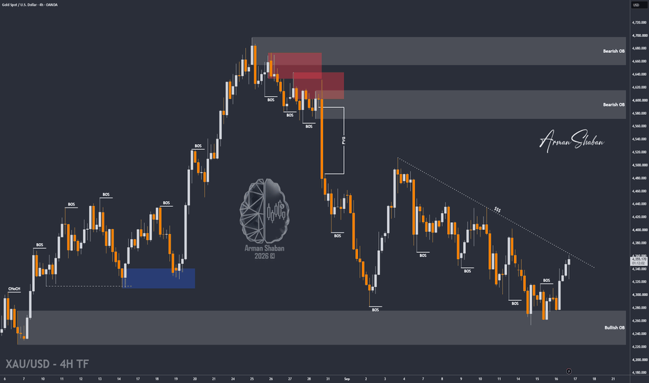
Gold Hits Support After the Fed — Is a Bullish Reversal Next?Gold ( OANDA:XAUUSD ) started to decline with strong bearish momentum following the Federal Funds Rate decision and remarks from Kevin Warsh.
The price is now trading inside the Heavy Support Zone, near the Support Lines and the major Potential Reversal Zone(PRZ) .
Can gold hold this support structure and trigger a bullish recovery?
Macro Outlook
The recent sell-off accelerated after the Federal Funds Rate decision and Warsh’s remarks increased pressure on gold.
However, gold has now reached an important technical area where buyers could attempt to regain short-term control.
Technical Analysis
From an Elliott Wave perspective, gold appears to have developed a corrective structure to the downside over the past 13 days, suggesting that at least a short-term bullish move could begin from the current area.
From a classical technical analysis perspective, gold also appears to have formed a Descending Broadening Wedge Pattern, which could support a potential bullish reversal.
A Positive Regular Divergence(RD+) is also visible between two Major Consecutive Valley Pivots, providing another sign that bearish momentum may be weakening.
💡 Educational Note: A Descending Broadening Wedge can signal weakening bearish control when price begins reacting strongly from its lower boundary, especially when supported by bullish divergence.
I expect gold to start moving higher from the Potential Reversal Zone(PRZ) and the Support Lines, with an initial target around $4,317.
If bullish momentum increases and gold breaks above the Resistance Lines, the recovery could extend toward $4,391.
Trade Setup
First Take Profit(TP): $4,317
Second Take Profit(TP): $4,391
Stop Loss(SL): $4,170
Key Trading Levels: $4,330 _ $4,400
Which level do you think gold will reach first?
🟢 $4,391
🔴 $4,170
📌 Gold Analysis(XAUUSD), 4-hour time frame.
🛑 Always use proper risk management and set a Stop Loss(SL) for every position.
🚀 If this analysis helps your trading plan, a BOOST would help more traders discover it. Long 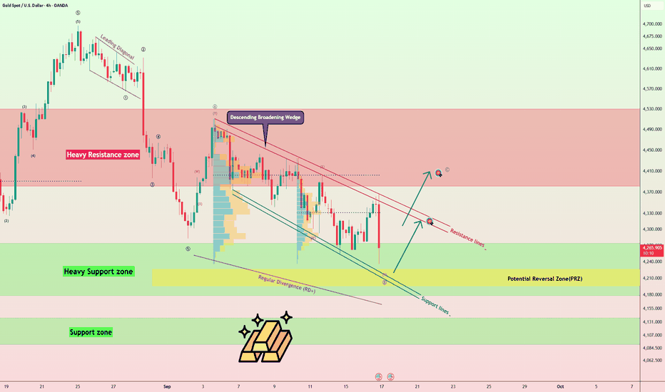
Super El Niño 2026–27: What Commodity Markets to Watch?Trade idea on NYMEX Henry Hub Natural Gas (NG); Also discussed: CBOT Wheat (ZW), Soybean Oil (ZL), Corn (ZC), Soybeans (ZS); COMEX Copper (HG)
A potentially historic El Niño is developing in the tropical Pacific. For commodity traders, however, knowing that El Niño is strengthening is only the beginning. The more important questions are: Which commodity markets are most exposed? Which expected impacts may already be reflected in futures prices? And where could the climate outlook still challenge the current market curve?
After comparing the major markets, I believe Henry Hub Natural Gas currently offers the cleanest way to express the El Niño thesis — not through a simple outright short, but through the winter-versus-spring calendar spread.
1. Latest NOAA Readings: El Niño Is Strengthening Rapidly
NOAA’s Climate Prediction Center (CPC) upgraded its assessment on September 10th: El Niño is strengthening, with 90% chance of a very strong event during the fall and winter of 2026–27.
By August, sea temperatures across the tropical Pacific were far above normal. The central Pacific was about 1.8°C warmer than average, while waters closer to Peru and Ecuador were more than 3°C warmer. NOAA found a large pool of warm water below surface, suggesting substantial heat supporting the El Niño.
NOAA’s September Relative Oceanic Niño Index (RONI) outlook is striking. For October–December 2026, the median forecast is +2.67°C, with the 25th–75th percentile range at +2.44°C to +2.90°C. CPC assigns a 98% probability that the OND RONI will be at least +2.0°C — its “very strong” category.
That does not guarantee any particular winter-weather outcome, but it does put the current event in the same conversation as the strongest El Niño in the modern record.
2. El Niño Basics — and What Makes One “Super”?
El Niño is the warm phase of the El Niño–Southern Oscillation (ENSO). Under normal conditions, tropical Pacific trade winds push warm surface water westward toward Asia. During El Niño, those trade winds weaken and warm water shifts eastward across the central and eastern equatorial Pacific.
That oceanic shift can reorganize tropical rainfall and the jet stream. During a typical El Niño winter, NOAA says the northern U.S. and Canada tend to be warmer and drier, while the southern U.S. is more likely to be wetter. El Niño can also increase drought risk in Australia and Indonesia and heavy-rain risk along parts of the west coast of South America.
What is a “Super El Niño”? The term is informal; NOAA Climate.gov has described ONI anomalies of about +1.5°C as strong and +2.0°C or higher as “very strong” or “historically strong.”
The strongest modern events include 1982–83, 1997–98 and 2015–16. NOAA lists peak ONI values of roughly +2.2°C, +2.4°C and +2.6°C, respectively, using the historical ONI series.
The 2026 event is notable not only for its projected strength but also for the speed of its transition. Niño-3.4 was still around +0.4°C in May, rose to about +1.2°C by July, and reached +1.8°C in August. The rapid development makes 1997–98 a useful historical analogue: NOAA documented that the 1997 event developed very rapidly during April–May and had already reached strong intensity by June.
The comparison is not a forecast that 2026–27 will reproduce 1997–98. Even the strong 2015–16 event produced a different atmospheric response from 1997–98. The lesson for traders is simple: use El Niño as a probability shift, not as a deterministic weather map.
3. Commodities With High El Niño Exposure
I screened the most plausible El Niño transmission channels, then compared them with current futures prices. The table below summarizes the markets that deserve the closest attention.
4. What Looks Already Priced In?
Wheat: December 2026 Chicago Wheat is near $7.33/bushel and roughly 30% higher year-to-date. Australian spring weather can still surprise, but a trader is no longer buying the drought story from a depressed price level. I would not make wheat the primary El Niño trade at this point.
Soybean Oil: December 2026 Soybean Oil is around 70.8 cents/lb, about 44% higher year-to-date and only modestly below its 2026 high. A delayed palm-oil production hit remains plausible, but the market has already moved a long way. I would not chase it as the main trade.
Copper: December COMEX Copper is around $6.48/lb and roughly one-third above year-ago levels. Peru-related flood disruption could add a weather premium, but electrification, grid investment, mine supply and macro factors are more important drivers. I would treat El Niño as a tail risk, not the core copper thesis.
Corn and Soybeans: El Niño can favor wetter growing conditions in Argentina and southern Brazil, which may pressure prices if yields improve. But planting progress, regional rainfall, U.S. crop conditions, biofuel policy and China demand are all large competing variables.
Natural Gas: The futures curve is already pricing substantial winter risk — January 2027 is about $1.09/MMBtu above April 2027. That is precisely why I prefer the calendar spread. The thesis is not that natural gas must fall; it is that a very strong El Niño could reduce the amount of winter premium ultimately required if the northern-U.S. winter is warmer than normal.
5. Trade Setup: Sell January 2027 / Buy April 2027 Henry Hub Natural Gas
Market snapshot used for this case study (September 16, 2026):
- Winter leg: January 2027 Henry Hub Natural Gas (NGF27), $3.843/MMBtu. SELL 1
- Spring leg: April 2027 Henry Hub Natural Gas (NGJ27), $2.752/MMBtu. BUY 1
- Calendar spread: January minus April, +$1.091/MMBtu. SELL the spread at +$1.09 or higher
The standard NYMEX Henry Hub Natural Gas futures contract represents 10,000 MMBtu. The minimum tick is $0.001/MMBtu, or $10 per contract. Because both legs have the same contract size, every $0.01/MMBtu change in the Jan/Apr spread is worth $100 per spread.
Illustrative order: Enter the two legs as one calendar-spread order where supported: SELL January 2027 / BUY April 2027 at a Jan-minus-Apr spread of +$1.09/MMBtu or higher. A spread order is preferable to legging into the two contracts separately because it reduces execution risk between the legs.
Why January versus April? January sits near the center of the U.S. heating season. April is after the peak winter demand period. If El Niño produces the typical warmer northern-U.S. winter pattern, storage withdrawals may disappoint relative to the winter risk currently embedded in January prices. The spread can narrow even if the entire natural-gas market does not fall.
Three Hypothetical Pricing Outcomes
Gas lower / warm-winter thesis works: $3.20(F7), $2.80(J7),+$0.40(S), +$6,910 (P/L)
Outright market broadly sideways: $3.80(F7), $2.85(J7), +$0.95(S), +$1,410 (P/L)
Gas higher / winter risk dominates: $5.25(F7), $3.20(J7), +$2.05(S), −$9,590 (P/L)
The examples above exclude commissions, exchange fees, bid/ask spread, margin effects and daily mark-to-market cash flows. They illustrate the economics of the calendar spread, not expected returns.
6. How I Would Hedge and Manage the Risks
First exposure: the April long leg. An outright January short is exposed to bullish natural-gas shock: production losses, LNG demand, geopolitics and broad changes in Natgas. Buying April against January short offsets a meaningful portion of that flat-price exposure and focuses the trade on winter seasonality.
Price stop: I would use a spread-based risk limit rather than a stop on either leg. From a +$1.09 entry, a close above roughly +$1.35/MMBtu would represent adverse widening of about $0.26/MMBtu, or $2,600 per standard spread before costs. That would be my initial level for reassessing or exiting the position.
Climate-thesis stop: The position should be reviewed if NOAA materially reduces the expected strength of El Niño or if U.S. seasonal temperature outlook stops favoring warmth across the northern tier. A climate trade should be reconsidered when the climate premise changes, even before the price stop is reached.
Cold-snap risk: A strong El Niño does not eliminate Arctic outbreaks. One severe January cold event can cause nearby gas to reprice violently. Traders who want a defined cap on that tail risk could add an out-of-the-money January call, or replace part of the futures exposure with options; the strike and premium should be selected from the live options chain at execution.
Position size: The standard NG contract is large. CME also lists Micro Henry Hub Natural Gas futures at 1,000 MMBtu — one-tenth the standard contract size — for traders who want to scale the same market view with smaller notional exposure.
Conclusion
A Super El Niño does not translate into one universal “buy commodities” or “sell commodities” rule. The transmission mechanism differs by region and market: Australia can face crop stress while parts of South America receive beneficial rainfall; Peru can face flood risk while a warmer northern-U.S. winter can reduce heating demand.
The more useful trading question is: where does the climate probability differ from what the futures market is already charging? Wheat and soybean oil have already rallied sharply. Copper has too many dominant non-weather drivers. Corn and soybeans have a less direct and more regionally complex ENSO relationship.
Henry Hub Natural Gas has the cleanest first-order link to U.S. winter temperatures. Rather than simply shorting gas, I prefer expressing the thesis through the winter curve: short January 2027 and long April 2027 around a +$1.09/MMBtu spread. The position is a bet that an exceptionally strong El Niño ultimately reduces the winter risk premium embedded in January gas.
Happy Trading.
Disclaimers
*Trade ideas cited above are for illustration only, as an integral part of a case study to demonstrate the fundamental concepts in risk management under the market scenarios being discussed. They shall not be construed as investment recommendations or advice. Nor are they used to promote any specific products, or services.
Sources and Data Notes
• NOAA Climate Prediction Center, ENSO Diagnostic Discussion, September 10, 2026: www.cpc.ncep.noaa.gov
• NOAA CPC, Official RONI Outlook and ENSO Strength Probabilities, September 2026: www.cpc.ncep.noaa.gov and www.cpc.ncep.noaa.gov
• NOAA Ocean Service / Climate.gov explanations of El Niño impacts and historical strength: oceanservice.noaa.gov and www.climate.gov
• NOAA CPC historical 1997–98 El Niño summary: www.cpc.ncep.noaa.gov
• CME Group Henry Hub Natural Gas contract specifications: www.cmegroup.com
• September 16, 2026 futures-price snapshots: Barchart and TradingView. Market prices are intraday/delayed snapshots and should be refreshed immediately before publication or execution.
 Short
Short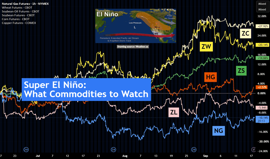
Market Structure Analysis: BOS, CHoCH & Liquidity
SMART MONEY AUTO ANALYSIS
Smart Money Auto Analysis is a market-structure and price-action analysis tool designed to help traders read the market candle by candle.
The main purpose of this indicator is to transform raw price movement into a clearer visual market structure by analyzing important highs, lows, liquidity areas, structural breaks, and potential changes in market behavior.
Instead of treating every green or red candle as an immediate BUY or SELL signal, this approach focuses on understanding WHY price is moving and WHERE that movement is happening.
━━━━━━━━━━━━━━━━━━━━
CANDLE-BY-CANDLE MARKET ANALYSIS
━━━━━━━━━━━━━━━━━━━━
Every candle is part of a larger price story.
A single candle should not be analyzed independently. Its meaning depends on:
• Previous candles
• Current market structure
• Swing highs and swing lows
• Liquidity
• Supply and demand
• Break of Structure
• Change of Character
• Price reaction at important levels
This indicator is designed to make these relationships easier to visualize on the chart.
━━━━━━━━━━━━━━━━━━━━
WHAT DOES EACH CANDLE TELL US?
━━━━━━━━━━━━━━━━━━━━
A bullish candle generally shows that price closed above its opening price, while a bearish candle generally shows that price closed below its opening price.
However, candle color alone is not enough.
A bullish candle inside a strong downtrend does not automatically mean the market has become bullish.
Likewise, a bearish candle inside a strong uptrend does not automatically mean the trend has reversed.
The location of the candle and the structure around it are important.
For every important candle, consider:
1. Where did the candle form?
2. What was the previous market structure?
3. Did price create a Higher High or Higher Low?
4. Did price create a Lower High or Lower Low?
5. Did price break an important swing?
6. Was liquidity taken?
7. Did price react from supply or demand?
8. Did the candle close beyond the important level?
9. What happened on the candles that followed?
This creates a more complete market analysis.
━━━━━━━━━━━━━━━━━━━━
BULLISH MARKET STRUCTURE
━━━━━━━━━━━━━━━━━━━━
A bullish market structure is commonly represented by:
HH = Higher High
HL = Higher Low
When price creates a sequence of Higher Highs and Higher Lows, it indicates that price is structurally moving upward.
Candle Reason:
When a candle pushes above a previous important high and establishes a new Higher High, it shows that price has moved beyond the previous swing high.
When the following pullback holds above an important previous low and forms a Higher Low, the bullish structure may remain intact.
A temporary bearish candle during this pullback does not automatically invalidate the bullish structure.
━━━━━━━━━━━━━━━━━━━━
BEARISH MARKET STRUCTURE
━━━━━━━━━━━━━━━━━━━━
A bearish market structure is commonly represented by:
LH = Lower High
LL = Lower Low
When price creates Lower Highs and Lower Lows, the market is showing a downward structural pattern.
Candle Reason:
When a candle moves below an important previous low and creates a new Lower Low, it shows that price has broken below the previous structural area.
When a subsequent retracement fails below the previous high and forms a Lower High, the bearish structure may remain intact.
A temporary bullish candle during a bearish retracement does not automatically mean the entire trend has reversed.
━━━━━━━━━━━━━━━━━━━━
BREAK OF STRUCTURE — BOS
━━━━━━━━━━━━━━━━━━━━
BOS stands for Break of Structure.
A BOS occurs when price breaks an important previous structural high or low.
Bullish BOS
Price breaks above a relevant previous swing high.
The candle responsible for the break shows that price has moved beyond an established structural level.
Bearish BOS
Price breaks below a relevant previous swing low.
The candle responsible for the break shows that price has moved below an established structural level.
BOS can provide information about potential continuation of the existing market structure, but it should not be treated as a guaranteed future movement.
━━━━━━━━━━━━━━━━━━━━
CHANGE OF CHARACTER — CHoCH
━━━━━━━━━━━━━━━━━━━━
CHoCH stands for Change of Character.
It is commonly used in Smart Money Concepts to identify a potential change in market behavior.
For example, during a bearish structure, price may begin breaking an important previous high.
This can indicate that the previous bearish behavior is weakening and that a potential structural transition is developing.
Likewise, during a bullish structure, a break below an important previous low may indicate a potential change in behavior.
Candle Reason:
The candle that breaks the relevant opposing structural level is important because it provides evidence that price behavior has changed.
However, CHoCH is a potential structural change, not a guarantee of a complete reversal.
━━━━━━━━━━━━━━━━━━━━
LIQUIDITY ANALYSIS
━━━━━━━━━━━━━━━━━━━━
Liquidity is an important part of Smart Money Concepts.
Previous highs and lows can become areas of interest because many traders may place orders or stops around obvious levels.
BSL = Buy-Side Liquidity
SSL = Sell-Side Liquidity
Buy-side liquidity is commonly discussed above important highs.
Sell-side liquidity is commonly discussed below important lows.
Candle Reason:
When price approaches a previous high or low, the reaction of the candles becomes important.
Price may:
• Reject the level
• Break the level
• Move through the level
• Return back below/above the level
• Continue toward another structural area
The following candles help determine whether the movement was simply a test of liquidity or part of a larger structural move.
━━━━━━━━━━━━━━━━━━━━
SUPPLY & DEMAND
━━━━━━━━━━━━━━━━━━━━
Supply and demand zones provide additional market context.
SUPPLY ZONE
A supply area is generally associated with an area where selling pressure may become relevant.
When price returns to a supply area, traders can observe the candle reaction for signs of rejection or continuation.
DEMAND ZONE
A demand area is generally associated with an area where buying pressure may become relevant.
When price returns to a demand area, traders can observe whether buyers respond or whether price continues lower.
Zones are areas of interest, not guaranteed reversal points.
━━━━━━━━━━━━━━━━━━━━
PRICE ACTION CONTEXT
━━━━━━━━━━━━━━━━━━━━
The indicator is designed to help users move from simple candle-color analysis toward contextual price analysis.
For example:
A green candle + bullish structure + bullish BOS
provides a different context from:
A green candle + bearish structure + resistance/supply nearby.
Similarly:
A red candle + bearish structure + bearish BOS
provides a different context from:
A red candle + bullish structure + demand nearby.
This is why the surrounding candles and structure matter.
━━━━━━━━━━━━━━━━━━━━
HOW TO READ THE CHART
━━━━━━━━━━━━━━━━━━━━
STEP 1 — Identify the current structure.
Look for HH/HL or LH/LL.
STEP 2 — Mark important swing highs and lows.
These levels help define the current structure.
STEP 3 — Watch for BOS.
A structural break can provide information about continuation.
STEP 4 — Watch for CHoCH.
A structural change can indicate a potential transition in market behavior.
STEP 5 — Observe liquidity.
Check important previous highs and lows.
STEP 6 — Observe supply and demand.
Look at how price reacts when it reaches these areas.
STEP 7 — Analyze the candle close.
A completed candle provides more information than an unfinished candle.
STEP 8 — Wait for confirmation.
Do not rely on one candle or one label alone.
━━━━━━━━━━━━━━━━━━━━
THE REASON BEHIND EVERY CANDLE
━━━━━━━━━━━━━━━━━━━━
The indicator does not assume that every candle has the same meaning.
Each candle can be interpreted according to its relationship with the surrounding structure.
A candle may represent:
• Continuation
• Pullback
• Rejection
• Breakout
• Liquidity interaction
• Structure formation
• Structural break
• Potential change in character
• Consolidation
The important question is not simply:
“Is this candle green or red?”
The better question is:
“WHAT IS THIS CANDLE DOING WITHIN THE CURRENT MARKET STRUCTURE?”
This is the core idea behind Smart Money Auto Analysis.
━━━━━━━━━━━━━━━━━━━━
EDUCATIONAL MARKET FRAMEWORK
━━━━━━━━━━━━━━━━━━━━
A simple framework for analyzing price is:
PRICE ACTION
↓
MARKET STRUCTURE
↓
LIQUIDITY
↓
SUPPLY / DEMAND
↓
BOS / CHoCH
↓
CONFIRMATION
↓
MARKET PLAN
This framework can help make chart analysis more organized and reduce emotional decisions based on individual candles.
━━━━━━━━━━━━━━━━━━━━
DESIGNED FOR MULTIPLE TIMEFRAMES
━━━━━━━━━━━━━━━━━━━━
Market structure can be studied on different timeframes.
Higher timeframes can provide broader structural context, while lower timeframes can show more detailed price movement.
Always remember that the same candle can have different significance depending on the timeframe being analyzed.
━━━━━━━━━━━━━━━━━━━━
IMPORTANT DISCLAIMER
━━━━━━━━━━━━━━━━━━━━
Smart Money Auto Analysis is an educational and technical-analysis tool.
The information displayed by the indicator is based on algorithmic analysis of price data and should not be considered a guarantee of future market movement.
BOS, CHoCH, liquidity, supply, demand and candle patterns can produce false or incomplete signals.
No indicator can predict every candle or guarantee profitable results.
Always perform your own analysis, test the indicator on historical data, and understand the logic before using it in any trading decision.
Trade with knowledge, patience and a clear transmission of monetary policyThe Fed Hiked. So Why Didn't Gold Stay Down?
The Federal Reserve raised its policy rate by 25 basis points to 3.75%–4.00% on September 16, as the chart shows. Gold initially sold off sharply as higher rates, a stronger dollar and higher yields weighed on the non-yielding metal.
But the pressure did not last.
The key reason: the markets that transmit the Fed's policy signal into gold began moving the other way.
The rate hike itself was largely anticipated Because an August inflation report came in hot at 3.4% and energy costs have been surging due to the U.S.-Iran war, investors and traders had already priced in a 90%+ probability of this hike. As a result, the execution didn't shock Wall Street, and major stock indexes initially held relatively flat before pulling back slightly due to the Fed's ongoing hawkish tone, so the announcement did not create a completely new shock to expectations.
The more important question became what happened to the U.S. dollar, Treasury yields and inflation expectations afterward.
By September 17, the dollar had weakened from its post-Fed high and the 10-year Treasury yield had fallen. At the same time, oil prices declined, reducing some of the immediate inflation pressure that had supported higher yields. Gold subsequently rebounded more than 2% from its post-Fed low.
This is why the initial selloff failed to sustain:
Fed hike → dollar/yields rise → gold sells off
then:
dollar/yields retreat + oil falls → pressure on gold eases → gold recovers.
The Fed therefore did not become irrelevant to gold. The market simply stopped reinforcing the initial bearish transmission.
A rate hike alone is not a complete gold thesis.
Watch the U.S. dollar and real Treasury yields alongside the Fed decision. If they continue rising, the rate-hike pressure on gold can persist. If they reverse, gold can recover even with the Fed maintaining a tighter policy stance.
The headline was the catalyst. The cross-market reaction determined whether the move lasted. Education 
Short 
XAUUSD — Bullish Recovery Toward 4,410Gold is showing a bullish recovery after reacting strongly from the lower liquidity area. From Kelly’s view, the chart suggests that XAUUSD may be forming a new upside Elliott Wave structure after breaking out from the lower side of the previous bearish channel.
The key idea is simple: if gold continues to hold above the Buy zone liquidity, the recovery structure can continue toward the next resistance levels.
⟡ Market structure
Gold is currently trading around 4,310–4,318, after bouncing from the Buy zone liquidity near 4,275–4,290. This reaction shows that buyers are trying to defend the lower support area and build a new bullish base.
The first resistance to watch is around 4,340–4,355, marked as the short-term sell scalping area. If gold breaks above this zone, the next important level is the strong resistance near 4,367.
A clean move above 4,367 would strengthen the bullish structure and open the way toward the 4,405–4,415 Resistance done wave 5 zone. If momentum continues, the larger upside target remains near 4,485–4,500.
➤ Key levels
◌ Current price area: 4,310–4,318
◌ Buy zone liquidity: 4,275–4,290
◌ Short-term resistance: 4,340–4,355
◌ Strong resistance: 4,367
◌ Main wave 5 target: 4,405–4,415
◌ Extended bullish target: 4,485–4,500
◌ Bullish invalidation: below 4,255
⌁ Elliott Wave view
The chart shows a possible bullish Elliott Wave recovery.
Wave (1) may have started from the lower liquidity area and pushed price toward 4,317.
Wave (2) may have completed after the retest near 4,275–4,290.
If this buy zone holds, wave (3) may continue toward 4,340–4,355 and 4,367.
Wave (4) could create a short pullback after testing resistance.
Wave (5) may then extend toward 4,405–4,415.
If buyers remain strong above that area, gold may later attempt the larger resistance zone around 4,485–4,500.
▸ Trading scenario
Preferred bullish scenario
Entry: Buy around 4,275–4,290 if price gives bullish confirmation from the liquidity zone
Stop Loss: Below 4,255
Take Profit 1: 4,340–4,355
Take Profit 2: 4,367
Take Profit 3: 4,405–4,415
Take Profit 4: 4,485–4,500
Alternative entry
If gold breaks above 4,340–4,355 and retests this area as support, buyers may look for continuation toward 4,367 and 4,405–4,415.
◌ Invalidation
The bullish view becomes weaker if gold breaks below 4,255 and fails to reclaim the buy liquidity zone. In that case, the recovery structure may fail and price could return to the lower bearish channel.
⌁ Kelly’s view
Kelly’s main view is bullish while gold holds above 4,275–4,290. The market is showing a strong reaction from the lower liquidity area, and the current pullback may only be preparation for the next upside wave.
If buyers defend the buy zone and price breaks above 4,340–4,355, gold may continue toward 4,367, then 4,405–4,415. The larger bullish target remains near 4,485–4,500 if momentum expands.
Do you think gold will break above 4,367 first, or retest the buy zone once more before the next rally? Long 
Long 
Long 
Short 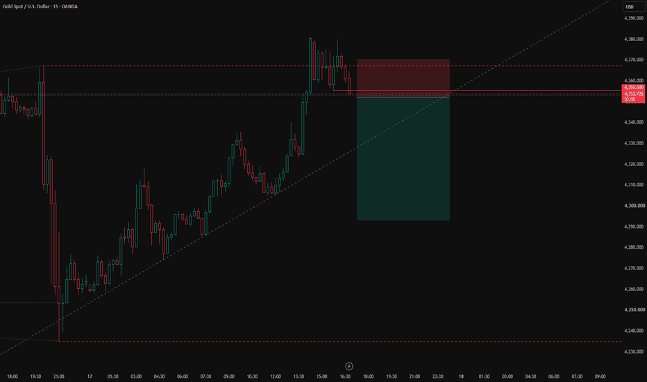
XAUUSD H4 Major Resistance Pullback & Bullish Continuation SetupXAUUSD H4 — Detailed Educational Description
This chart is created for educational purposes, focusing on market structure, support/resistance, pullback behavior, trend direction, and price-action confirmation.
Step-by-Step Candle Education
1. Initial bullish phase
The early candles show buyers gradually gaining control. Higher lows are formed, while bullish candles push price upward. The green trend structure confirms that buying pressure is developing.
2. Breakout and strong bullish candles
A series of strong bullish candles breaks above previous swing highs. These candles show momentum and a shift toward a stronger bullish structure.
3. Higher-high formation
Price continues printing higher highs and higher lows. Each bullish candle confirms continuation as long as the previous swing low remains protected.
4. Exhaustion near the high
Around the 4,689 area, candles become more corrective and show reduced bullish continuation. This area is marked as Major Resistance / Final Target, where a reaction can occur.
5. Bearish reversal candles
Large bearish candles appear after the high, showing that sellers have temporarily taken control. The Supertrend also changes structure, supporting the corrective move.
6. Consolidation phase
Several candles move sideways between approximately 4,435 and 4,283. This teaches an important lesson: when candles overlap and momentum decreases, the market is consolidating rather than trending strongly.
7. Resistance reaction
The 4,435 level acts as an important resistance area. Repeated candle reactions around this level demonstrate how previous price levels can become decision zones.
8. Key support reaction
Around 4,283, candles show repeated reactions from the lower area. This is marked as the Key Support / Pullback Zone. A bullish reaction here would indicate that buyers are defending support.
9. Current price action
The latest candles are trading around 4,309, between the key support and resistance levels. This is an important decision area where traders should wait for clear price-action confirmation rather than assuming the next move.
10. Bullish continuation concept
If price holds the support area and produces strong bullish candles, the educational path shown on the chart points toward 4,358 → 4,435 → 4,555 and potentially the 4,689 major resistance.
11. Deep pullback concept
If support breaks and bearish candles gain momentum, the next important area is around 4,224. This demonstrates how traders can map deeper pullback levels instead of reacting emotionally to individual candles.
Key Lesson
Every candle should be read in context: candle direction + previous swing + support/resistance + trend structure. A single bullish or bearish candle is not enough by itself; confirmation from subsequent candles and key levels makes the price action more meaningful.
Educational purpose only — this chart illustrates technical-analysis concepts and is not a guarantee of future price movement. Long 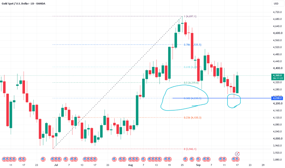
XAUUSD H1 Elliott Wave Bullish Scenario – Wave 2 XAUUSD is showing a potential bullish Elliott Wave structure after breaking out of the descending channel. Wave 1 may have completed near the recent high, while price is currently consolidating and could develop a Wave 2 corrective move.
The main retracement zone for Wave 2 is around 4,308–4,291, corresponding to the 50%–61.8% Fibonacci retracement area. If buyers defend this zone and the bullish structure remains intact, the next impulsive move could develop into Wave 3, with the 161.8% Fibonacci extension near 4,544 as a potential target.
After Wave 3, a Wave 4 correction could retrace toward approximately 4,488, followed by another bullish continuation into Wave 5.
Key levels:
Wave 2 zone: 4,308–4,291
Wave 3 projection: 4,544
Wave 4 potential retracement: 4,488
Current short-term support: around 4,336
This is a projected Elliott Wave scenario, so confirmation from price action around the retracement zone is important before assuming Wave 3 has started. Long 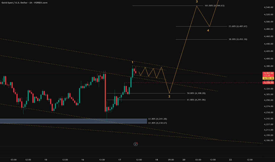
CRT + TIME + PO3 | INSTITUTIONAL PRICE DELIVERY FRAMEWORK
CRT + TIME + PO3 | INSTITUTIONAL PRICE DELIVERY FRAMEWORK
CRT, TIME and PO3 can be combined to understand how price develops around a defined candle range and how liquidity may be manipulated before the market delivers its intended directional move.
CRT — CANDLE RANGE THEORY
CRT begins with a clearly defined candle range. The high and low of the reference candle create important liquidity boundaries.
Rather than entering immediately, observe how price interacts with the range:
Range Formation → Liquidity Sweep → Reclaim → Directional Delivery
A sweep of the previous high or low does not automatically mean reversal. The important confirmation is how price reacts after taking liquidity and whether it reclaims the range.
TIME — WHEN THE MOVE MATTERS
Time provides context for price delivery. Certain market sessions and key time windows can produce increased volatility and liquidity.
The objective is to identify whether the range expansion and liquidity manipulation occur during a meaningful trading window.
Right Level + Right Time + Confirmation = Better Execution
Avoid forcing trades outside your planned session or entering simply because volatility suddenly increases.
PO3 — POWER OF THREE
PO3 describes a three-phase market sequence:
1. ACCUMULATION
Price builds a range and liquidity forms around obvious highs and lows.
2. MANIPULATION
Price temporarily moves beyond one side of the range, taking liquidity and triggering stops.
3. DISTRIBUTION
After the manipulation, price may deliver toward the opposite side or the next significant liquidity target.
The sequence is not guaranteed on every setup, so confirmation remains essential.
COMPLETE MODEL
TIME → CRT RANGE → LIQUIDITY → MANIPULATION → RECLAIM / STRUCTURE → DISTRIBUTION → TARGET
For a bullish scenario, price may take sell-side liquidity below the range, reclaim the range and show bullish displacement before delivering higher.
For a bearish scenario, price may take buy-side liquidity above the range, reject the expansion and show bearish displacement before delivering lower.
RISK MANAGEMENT
Risk must be defined before execution.
• Set the invalidation level before entering.
• Keep position size consistent with account risk.
• Never widen the stop-loss after entry.
• Do not increase risk after a losing trade.
• Avoid revenge trading and overtrading.
• Wait for confirmation instead of predicting the manipulation.
• Maintain a realistic risk-to-reward structure.
STRONG DISCIPLINE
Do not trade the concept — trade the confirmation.
A CRT range alone is not an entry.
A time window alone is not an entry.
A liquidity sweep alone is not an entry.
A PO3 assumption alone is not an entry.
Wait for the complete sequence and let price prove the setup.
No confirmation = No trade.
The professional objective is not to catch every manipulation. It is to identify a clear range, understand the timing, recognize the liquidity event and execute only when price confirms the intended delivery.
Protect capital first. Execute with patience. Let the market come to your level.
Educational framework only. Backtest and validate the model before applying it with real capital. Education 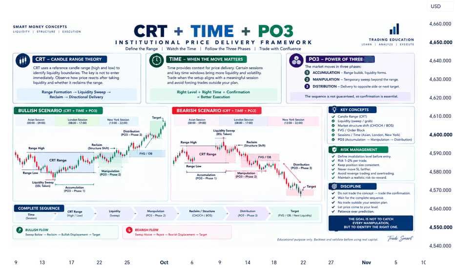
 Long
Long
Education 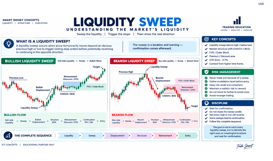
Long 
Long 
Gold 1D: six months of gaps nobody came back forFour areas above this chart have been sitting untouched since March. Gold has not traded into any of them in six months.
This is gold on the daily with our imbalance layer on it. It marks the areas price left behind when it moved too fast for both sides to be there, and leaves them on the chart until the market comes back for them. A zone stretches to the right for as long as it goes untouched, so its width is its age.
What February and March left. The decline off the February high was fast enough to leave four gaps behind it, stacked between roughly 4,860 and 5,260. None of them has been revisited. Six months, four areas, and the market has done nothing about any of them. The nearest sits about eleven percent above where gold closed today.
What has been filled. The grey bands are the gaps price did come back for, and they are the more useful half of this chart, because you can read how long each one waited. The band near 4,620 stayed open from February until August. The one around 4,390 stayed open until this month. They are still drawn, because we do not delete the ones that resolve - a record you can only see when it flatters the tool is not a record.
What August left. The move off the July lows produced one gap on the way up, between roughly 4,150 and 4,210, and it is six weeks old and untouched. So the picture is lopsided in a way worth noticing: the market has cleaned out the middle of this range and left both edges alone. One unfilled area sits under four percent below today's close. The nearest one above is eleven percent up.
Where price is now. Gold spent September giving back most of the August advance. Today it opened at 4,260, traded down to 4,257 and closed at 4,368, near the day's high, inside the band where most of the filled zones sit.
What this does not tell you. Which of the open areas matters, or whether either gets traded into at all. An unfilled gap is not a target and this layer does not treat it as one. It marks where the market left something behind, and stops there.
One caveat, always. This is a chart where the zones are legible and the history is long, which makes it a clean illustration of how they get recorded - not evidence that gaps get filled. Plenty never are. Four of them are on this chart.
Educational market commentary - not financial advice.